
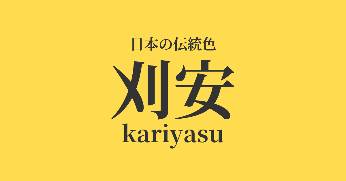
| Japanese color name | Kariyasu |
|---|---|
| reading | kariyasu |
| HEX | #FFDB4F |
| RGB | 255, 219, 79 |
What is Kariyasu? Origin and etymology
Kariyasu is a bright, vivid yellow dye made from the perennial grass "Kariyasu" (scientific name: Arthraxon hispidus), which closely resembles Japanese pampas grass. This plant grows wild in the mountains and fields throughout Japan, and it is said that the name "Kariyasu" comes from the fact that the entire plant is cut and dried before the seed heads appear in autumn.
Kariyasu has excellent properties as a yellow dye, and by changing the mordant, it was possible to dye a wide range of colors, from greenish yellow to reddish yellow.
Historical background of Kariyasu
Dyeing with Japanese knotweed is believed to have been practiced since the Nara period, and fabrics dyed with Japanese knotweed remain among the treasures of the Shōsōin. During the Heian period, its vibrant yellow color was highly valued as a noble color. In particular, the Engishiki (a legal code) designated it as the color for the Crown Prince's robe, second only to "kōrozen" (a yellow dye used for the Emperor's robe). Because of this, Japanese knotweed was such an important color that its use was restricted, and it was even designated as one of the forbidden colors.
During the Edo period, it began to be used for dyeing cotton among common people and became more widely popular. Along with safflower and turmeric, it was used as a representative yellow dye for various items such as kimonos and accessories. In modern times, its use decreased with the spread of chemical dyes, but its beautiful color is still cherished and passed down in the world of traditional crafts today.
Related literature, waka poetry, and seasonal words
Due to its bright color, the Japanese laurel (Kariyasu) has appeared in literary works. In classical literature such as "The Tale of Genji," it is sometimes described as the color of clothing worn by noble characters. Also, because the Japanese laurel itself is an autumn plant, it was sometimes used in the world of waka poetry to depict autumn scenes. However, it is said that there were not many instances where it was directly used as a color name, and that the sense of the season was mainly expressed through the appearance of the plant used as a dye.
As a seasonal word, "kariyasu" or "kariyasu no hana" (kariyasu flowers) are used as autumn seasonal words. These words evoke the charm of a plant that grows quietly in the mountains and fields, and the vibrant yellow color it produces, giving a sense of the deepening of autumn.
A cricket chirps, forgetting the sound of the Japanese quince.
Color scheme preview
This is to check the readability of the text when this color is used as the background.
Kariyasu's color scheme proposal
Dark purple (#4D264F)
Dark purple is the color of the highest rank in the Twelve Levels of Court Rank and is considered a noble color. When combined with kari-yasu, which was also used for the Crown Prince's robe, it creates a dignified and elegant impression. The two colors complement each other, resulting in a color scheme reminiscent of the aristocratic culture of the Heian period.
Light green (#A9D159)
Moegi is a vibrant yellowish-green, reminiscent of the fresh leaves of spring. When combined with the bright yellow of Kariyasu, it creates a refreshing and lively impression that evokes the breath of nature and youthfulness. This color scheme is well-suited to expressing the seasonal feeling from spring to early summer.
Indigo (#274A78)
The deep indigo and vibrant Japanese yew are almost complementary colors, enhancing each other's beauty. The calm impression of the indigo balances the brightness of the Japanese yew, creating an intelligent and sophisticated atmosphere. Because it gives a traditional yet modern impression, it is easy to apply to contemporary designs.
Practical Scenes
In the world of kimono, the yellow-green color is considered a dignified color due to its historical background. Incorporating it into the patterns of formal kimono such as visiting kimono or formal kimono can create a celebratory yet elegant look. It pairs particularly well with classic patterns, adding a touch of splendor suitable for celebratory occasions.
In interior design, it is most effective when used as an accent color. Incorporating Japanese knotweed into cushions, curtains, and accessories creates a bright and warm atmosphere throughout the space. When combined with light wood and other natural materials, it harmonizes naturally with Japanese modern spaces.
In web and graphic design, its brightness and high visibility make it suitable for areas where you want to draw attention. Placing it against a dark background further enhances the vibrancy of the color, creating a modern and striking design. It is also suitable as a key color for websites dealing with traditional themes.