
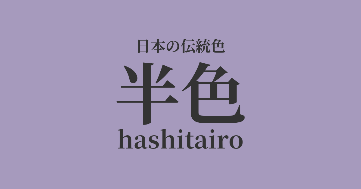
| Japanese color name | half color |
|---|---|
| reading | hashitairo |
| HEX | #A69ABD |
| RGB | 166, 154, 189 |
What is "hanshoku"? Origin and etymology
The origin of the term "hashitairo" (half-color) is said to come from "hashitairo" (edge color). "Hashi" refers to something in between or incomplete, and it is said that the name was given because it was an intermediate color between dark purple and light purple, or an intermediate color between purple and other colors. Specifically, it was a color that was produced when there was a shortage of dye in dyeing using the expensive gromwell root, or when the dyeing method was intentionally simplified.
Therefore, it is believed that the term also carried the connotation of being an "in-between color" that was not a formal shade of purple.
Historical background of half-color
During the Heian period, purple was a forbidden color, permitted only to a very limited number of high-ranking individuals, such as the emperor and members of the imperial family. Half-purple was positioned as the next most important color after the forbidden colors of deep purple and light purple, and was permitted for wear by court nobles and others. According to the Engishiki, it was designated as the color of the robe worn by court nobles of the fourth rank, and played an important role in indicating social status in the clothing regulations of the time.
As time went on, the system of forbidden colors became a mere formality, but half-colors were passed down to later generations as colors symbolizing the elegant culture of the Heian period.
Related literature, waka poetry, and seasonal words
In Heian period literature, shades of purple often appear as colors symbolizing noble status and refined aesthetics. For example, in "The Tale of Genji," shades of purple are frequently depicted as the colors of the characters' clothing, effectively expressing their status, feelings, and the atmosphere of the scene. While the term "shade" itself is not often used directly, it is considered an important color for understanding the color sensibilities of the aristocratic society of the time, as it is a color of nobility second only to purple.
While there are many waka poems expressing longing for the purple gromwell, no famous works have been found that focus on the gromwell itself as the main subject.
Color scheme preview
This is to check the readability of the text when this color is used as the background.
Half-color scheme proposal
White training (#FEFFBFB)
This color scheme features a noble and calming purple, complemented by a pure and clean white. It evokes the refined and elegant atmosphere of Heian period court attire. The beautiful contrast allows for a balance of cleanliness and sophistication.
Kutsuha color (#917347)
The withered leaf color is a calm, reddish-brown reminiscent of fallen autumn leaves. The coolness of the purple in the half-tone and the warmth of the earth in the withered leaf color complement each other, creating a color scheme that evokes a deep autumn scene. It gives a natural and gentle yet profound impression.
Light green (#A9D159)
Moegi-iro is a bright, vibrant yellow-green, reminiscent of the fresh leaves of spring. The youthfulness of Moegi-iro adds a fresh and cheerful touch, like the arrival of spring, to the quiet, mature impression of Han-iro. While both colors are classic, they also create a modern atmosphere.
Practical Scenes
In the world of traditional Japanese clothing, half-tone is used in formal kimonos, solid-colored kimonos, and obi sashes, giving an elegant and refined impression. Its subdued color is considered suitable for formal tea ceremonies and celebratory occasions. When combined with white, silver, or pale gold, its noble quality is further enhanced.
In interior design, incorporating accent walls, cushions, curtains, and other fabrics brings a sense of calm and sophistication to a space. It blends well with both Japanese-style rooms and modern Western-style rooms, creating a refined and deep atmosphere. It pairs particularly well with white, gray, and wood-grain furniture.
In web and graphic design, this color is effective when you want to convey a sense of reliability and sophistication. It is used as a key color for websites related to traditional crafts or history, or for high-end brands. Using this color as an accent against a white or light gray background can create a refined impression.