
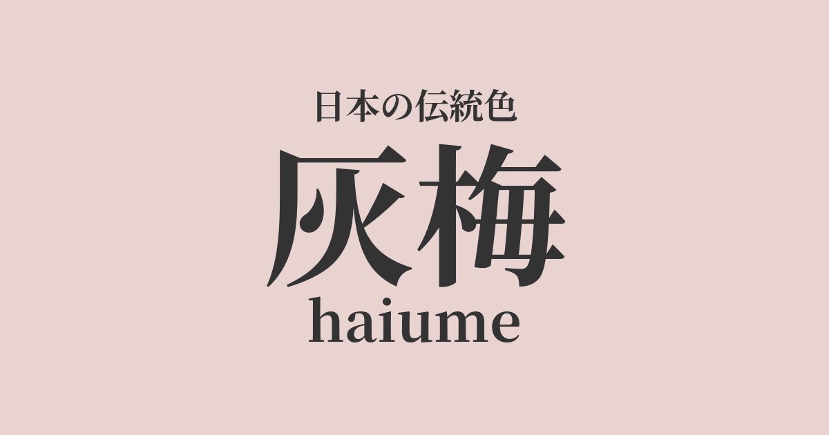
| Japanese color name | Gray plum |
|---|---|
| reading | haiume |
| HEX | #E8D3D1 |
| RGB | 232, 211, 209 |
What is Haibai? Origin and etymology
Haiume is a traditional Japanese color referring to a pale, grayish red. Its name is said to originate from "umezome," a dyeing method that uses the bark and roots of the plum tree. The shade of umezome varies depending on the type of mordant used, and the slightly reddish, muted tone produced when iron is used as a mordant came to be called haiume.
It reflects people's aesthetic sensibilities as one of the subtle intermediate colors, exemplified by the "48 shades of brown and 100 shades of gray" that were popular during the Edo period.
Historical background of the ash plum
The color ash plum became widely known from the mid-Edo period onward. Repeated sumptuary laws restricted the use of bright colors among commoners. As a reaction to this, a culture emerged that found enjoyment in finding subtle differences in shades of muted colors such as brown and gray. Ash plum was one of the colors that arose during this trend, and it is said that it was favored as a stylish and refined color, especially in the clothing and accessories of the townspeople.
Related literature, waka poetry, and seasonal words
There are not many famous literary works that directly mention the color name "ash plum." However, the image associated with this color is deeply connected to the worldview of many waka and haiku poems that feature plum blossoms. For example, the sight of plum blossoms beginning to bloom in the still chilly early spring evokes the quiet and understated beauty of ash plum. In literature, plum blossoms are often depicted as symbols of nobility and perseverance, and their refined hue has captured people's hearts.
Color scheme preview
This is to check the readability of the text when this color is used as the background.
A color scheme proposal for ash plum.
Soot bamboo (#6F514C)
The reddish-gray hue of the ash plum blossom and the subdued brown of the sooty bamboo harmonize beautifully, creating a very calm and elegant impression. This color scheme emphasizes a Japanese aesthetic, creating a quiet and tasteful atmosphere.
White training (#FCFAF2)
The muted hues of the ash plum are complemented by the pure and warm white of the white porcelain. This color scheme achieves both cleanliness and elegance, bringing brightness and depth to the space.
Rusty light green (#86A8A0)
The warm, muted tones of the gray plum blossom color contrast with the cool, muted tones of the rusty light blue color, yet they complement each other. The subdued saturation of this combination creates a sophisticated and modern impression.
Practical Scenes
Ash plum is a very popular color for kimonos and obi sashes. While not flashy, it gives an elegant and refined impression, making it suitable for a wide range of occasions and ages. In particular, incorporating it into everyday wear such as komon or tsumugi kimonos creates a stylish look.
In interior design, incorporating it into fabrics such as wallpaper, curtains, and cushions brings a sense of calm and warmth to the space. It pairs well with wooden furniture and natural colors such as white and beige, and blends seamlessly into Japanese modern and Scandinavian-style interiors.
In web design, using these colors as background or accent colors can give the entire site a gentle and elegant impression. They are particularly effective when you want to express a calm and sophisticated world, such as on websites for traditional crafts, cosmetics, or lifestyle brands.