
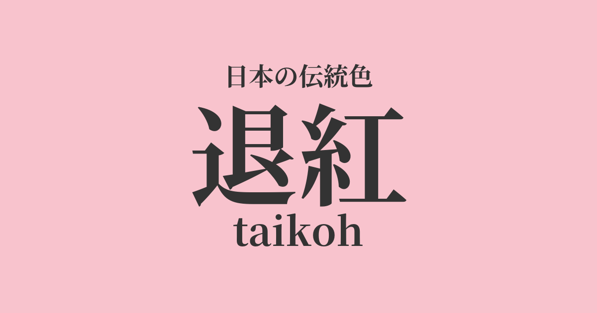
| Japanese color name | Fading red |
|---|---|
| reading | taikoh |
| HEX | #F8C3CD |
| RGB | 248, 195, 205 |
What is "taikou"? Origin and etymology
Taikou literally means "a faded red color," and is a color name that describes the appearance of cloth dyed with safflower, an expensive dye, that has faded due to sunlight and washing. Originally, it was an accidental color that arose unintentionally, but its ephemeral and delicate beauty resonated with the Heian aristocratic aesthetic of "mono no aware," and it became established as a distinct color. In particular, it is said to have been loved as an elegant color symbolizing spring because it is reminiscent of cherry blossoms.
Historical background of the decline of red
Taikou is known as a color that was particularly popular during the Heian period. Its name can be found in the "Nui-dono-ryo" (Bureau of Sewing) section of the Engishiki (a set of regulations compiled in the Heian period), and it was also prescribed as the color of clothing used in official ceremonies. At the time, there was a trend to value dark colors, but there was also the concept of "fading beauty," which found beauty in the process of colors fading. Taikou played an important role in the world of literature and clothing as a color that reflected the delicate sensibilities and sense of impermanence of the aristocracy.
Related literature, waka poetry, and seasonal words
Faded red frequently appears in Heian period literature. In "The Tale of Genji," it is depicted as the color of clothing that Hikaru Genji gives to young women, and is effectively used as a symbol of youthfulness and loveliness. Also, in "The Pillow Book," it is listed as an undesirable example in the section on "abominable things," but is counted as one of the beautiful colors in the section on "auspicious things," suggesting that it was deeply rooted in the lives of people at that time.
Often likened to the color of cherry blossoms, it was an indispensable color when depicting spring scenes.
Color scheme preview
This is to check the readability of the text when this color is used as the background.
Color scheme proposal for faded red
Light green (#ADDE79)
The pale pink of fading cherry blossoms and the bright green of young leaves are a classic color combination that heralds the arrival of spring. Also known as "Sakura Moegi," this combination can be seen in the layered color schemes of the Heian period. It harmonizes vitality and loveliness, giving a cheerful impression.
White training (#FFFFFF)
When combined with pure white, the delicate and pure qualities of faded red are further enhanced. This color scheme, which combines cleanliness and elegance, gives an impression of innocence. It creates a minimalist and sophisticated atmosphere whether used in layered kimonos or in modern designs.
Dark color (#452443)
Deep purple, known as "koki-iro," is considered a noble color, and when combined with a pale reddish-brown, it creates a striking contrast that enhances each other. This dignified combination, also seen in Heian period attire, is an elegant color scheme that exudes both tranquility and splendor.
Practical Scenes
Faded red, with its gentle and elegant hue, is widely used in the world of traditional Japanese clothing. It is especially often incorporated into kimonos, obi sashes, and accessories during the spring season, creating an outfit befitting the cherry blossom season. In interior design, using it in fabrics such as wallpaper, curtains, and cushions creates a soft and tranquil atmosphere throughout the room.
In web and graphic design, using this color as a background or accent color can create a feminine and elegant impression. It is particularly well-suited for beauty, fashion, and bridal-related websites. By combining it with other light colors, it is also possible to express a delicate and ephemeral worldview.