
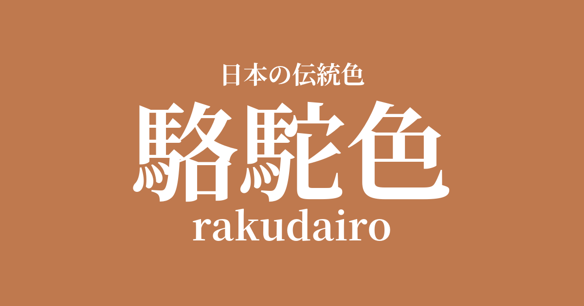
| Japanese color name | camel color |
|---|---|
| reading | rakudairo |
| HEX | #BF794E |
| RGB | 191, 121, 78 |
What is camel color? Origin and etymology
Camel color, as the name suggests, is a slightly reddish, light yellowish-brown color derived from the color of a camel's hair. It is considered a relatively new traditional color that became established in Japan after the Meiji era, as a translation of the English color name "camel." Before that, similar shades in Japan were called by existing color names such as ochre or withered leaf, but it is said that with the influx of Western culture, this color name, which has a more concrete image, became widespread.
The historical background of camel color
The color camel yellow only became widely known in Japan after the Meiji era. At that time, camel hair fabrics were imported from the West and became particularly popular as fabrics for overcoats and blankets. Its unique, warm hue was recognized as "camel yellow," and along with the spread of Western clothing culture, it became popular as a modern and elegant color. From the Taisho to the Showa era, it was a favored color for Western clothing for both men and women.
As modernization progressed, camel yellow became established as a color with a sophisticated, Western image. Rather than being a color associated with traditional Japanese clothing, it was a hue that symbolized a Western lifestyle. Even today, it remains a popular staple color, especially for autumn and winter fashion items, and is widely used in trench coats, knitwear, and other garments. Due to its historical background, it can be said to be a color with a timeless appeal that is classic yet never feels outdated.
Related literature, waka poetry, and seasonal words
Since the color "camel" (rakuda-iro) became established after the Meiji era, it does not appear directly in classical literature or waka poetry from the Heian or Edo periods. However, in modern literature, it is sometimes used effectively to describe the modern urban landscapes of the Meiji and Taisho periods, or to depict people wearing Western clothing. For example, a description of a fashionable gentleman wearing a camel-colored overcoat in a novel of that time is an important element in conveying the atmosphere of that era.
Although it is not designated as a seasonal word, its color is often used to evoke autumn and winter scenes.
Color scheme preview
This is to check the readability of the text when this color is used as the background.
Camel color scheme proposal
Indigo (#243A6A)
The warmth of camel gray and the deep blue of indigo complement each other, creating an intelligent and sophisticated color scheme. The beautiful contrast gives a modern impression, regardless of whether it's Japanese or Western in style. It's ideal for creating a refined atmosphere in fashion and interior design.
Moss color (#69821B)
Camel gray and moss green are both earth tones found in nature and complement each other very well. This color scheme evokes a sense of calm and tranquility, making it ideal for natural-style decor and interiors. It creates a peaceful and comfortable space.
Grape color (#640125)
The combination of camel-colored tawny brown and deep grape-colored reddish-purple creates a rich and full-bodied impression. This warm color combination, reminiscent of the autumn harvest, exudes both warmth and elegance, adding depth to the outfit.
Practical Scenes
In the world of fashion, camel yellow is a widely popular staple color, especially for autumn and winter coats and knitwear. Incorporating it into trench coats and sweaters creates a warm and elegant impression. Coordinating it with beige or brown tones to create a gradient effect is also a popular trend.
In interior design, using this color in large areas such as sofas, curtains, and rugs brings a sense of calm and warmth to the space. It pairs exceptionally well with wooden furniture and contributes to creating natural modern or classic style rooms. Incorporating it as an accent color in cushions and other items is also effective.
In web design and graphic design, using it as a background or key color can convey an impression of trustworthiness and reliability. It is particularly suitable for brands that deal with natural materials or for content themed around history and tradition. Combining it with white, black, or dark green can create a highly visible design.