
| Japanese color name | Koji dust |
|---|---|
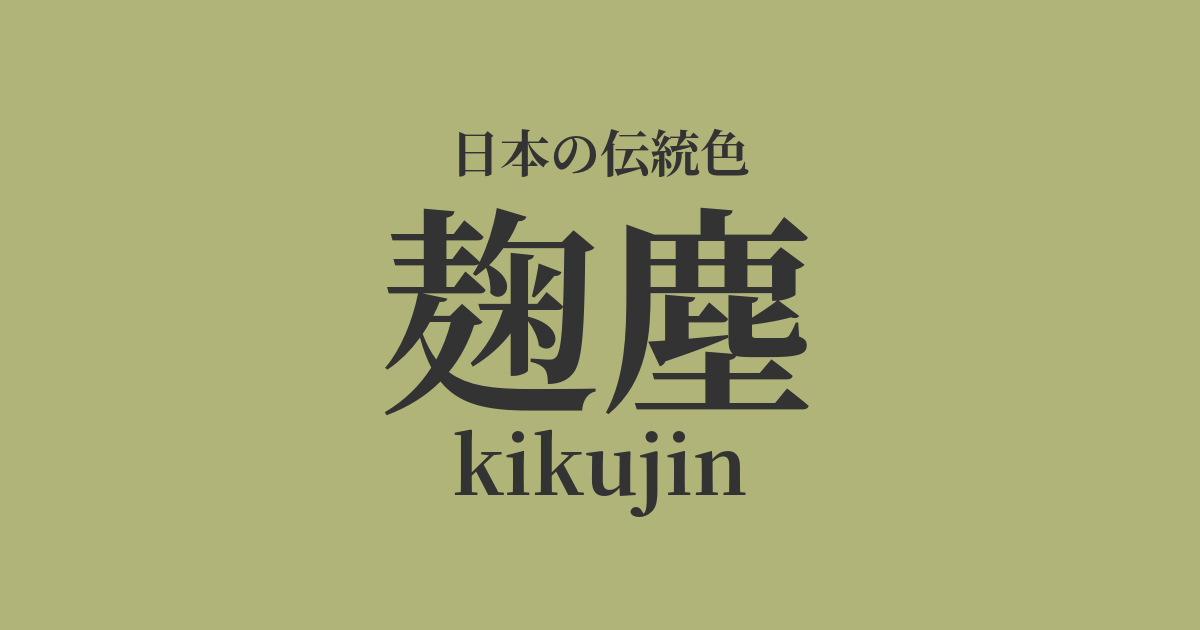
| reading | kikujin |
| HEX | #B1B479 |
| RGB | 177, 180, 121 |
What is kojijin? Origin and etymology
Kojijin is a traditional Japanese color referring to a dull yellowish-green. There are several theories about the origin of its name, but one theory is that it comes from the color of koji mold that grows on koji, which is used in sake brewing. The word "jin" (dust/dust) describes the dull hue. As a dye, it is said that this deep and complex color was created by using kariyasu (a type of sedge) as the main ingredient, dyeing with lye as a mordant, and adding a small amount of indigo.
Another theory suggests that it originates from a Chinese legend. The legend tells of King Mu of Zhou, who, upon visiting Mount Kunlun in the west, was presented with a "garment of chrysanthemum dust" by the immortal Xi Wangmu. The "dust" in this legend means chrysanthemum and is said to represent the color of chrysanthemum flowers and leaves. Since "dust" and "dust" are homophones, it is thought that they were later confused and eventually became established as the color of the emperor.
Historical background of koji dust
Koji-jin was an extremely noble color designated as the color of the robe worn daily by the emperor during the Heian period. Its name appears in legal codes such as the Engishiki, and it was one of the "forbidden colors" that no one other than the emperor was permitted to wear. This color was said to have iridescent properties, appearing green, yellow, or bluish depending on how the light hit it, and its mystique was thought to symbolize the emperor's authority.
Koji-jin was designated as the color of the Emperor's robe, but as time went on, the system of forbidden colors gradually relaxed. However, its noble image was not lost, and it continued to be recognized as a special color. Even today, due to its subdued hue and historical background, it is sometimes used in situations where formality is important.
Related literature, waka poetry, and seasonal words
The color of kojijin also appears in Heian period literature as a color symbolizing the emperor's attire. For example, in "Utsuho Monogatari" and "Eiga Monogatari," descriptions of the emperor's clothing include "kikujin no onzo" and "kikujin no onnaoshi." These descriptions indicate that kojijin was not merely a color name, but functioned as a cultural symbol indicating the highest social status.
In these stories, characters clad in koji-jin (a type of ochre-colored garment) are depicted as possessing sanctity and inviolable authority. Readers could instantly understand the formality of the scene and the status of the characters simply by seeing the name of the color. In this way, koji-jin plays an important role in conveying the profound depth of Japanese color culture, even in the world of literature.
Color scheme preview
This is to check the readability of the text when this color is used as the background.
Color scheme proposal for Kojijin
Kutsuha color (#917347)
The calm green of the koji-jin color and the reddish-brown of the withered leaves are both earth tones derived from nature. This color scheme, reminiscent of an autumn forest or withered plants, creates a gentle and profound harmony, giving the viewer a sense of peace and the season.
Suou (#9E3D3F)
The quiet green of Kojijin and the deep reddish-purple of Suou are almost complementary colors, vividly enhancing each other's beauty. This combination evokes the "kasane no irome" (layered colors) of Heian period aristocratic attire, creating an elegant and dignified impression.
Off-white (#FBFBF4)
The subtle nuances and complex colors of the koji-jin (fermented rice flour) are gently enhanced by the soft, natural white of the off-white color. This clean yet warm color scheme is suitable for modern Japanese spaces and designs, giving an elegant and sophisticated impression.
Practical Scenes
In the world of kimono, due to its noble origins, koji-jin (a type of ochre-colored kimono) is used for solid-colored kimonos, formal kimonos, and obi sashes. It is considered a particularly suitable color for the autumn season, creating an outfit that is both calm and dignified. It is also a suitable color for formal occasions such as tea ceremonies.
In interior design, incorporating it as an accent in wallpaper, curtains, cushions, etc., brings a Japanese aesthetic and tranquility to the space. It pairs very well with wooden furniture and natural materials, helping to create a peaceful and relaxing atmosphere.
In web and graphic design, using it as a background or key color creates an elegant and trustworthy impression. It is particularly effective in expressing the worldview of websites showcasing traditional culture, history, or natural products and services.