
| Japanese color name | Deutzia color |
|---|---|
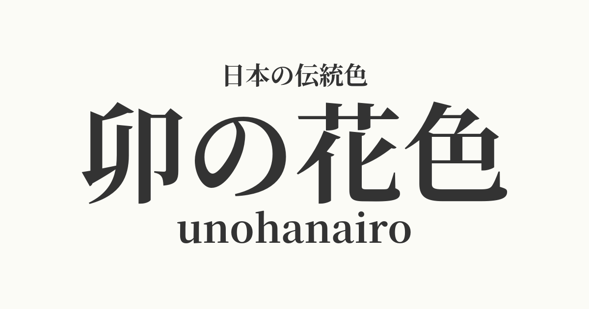
| reading | unohanairo |
| HEX | #FBFBF6 |
| RGB | 251, 251, 246 |
- What is the color of the deutzia flower? Origin and etymology
- The historical background of the color of deutzia.
- Related literature, waka poetry, and seasonal words
- Color scheme preview
- A proposed color scheme in the color of deutzia flowers.
- Practical Scenes
- FAQ
- Japanese colors similar to the color of the deutzia flower.
What is the color of the deutzia flower? Origin and etymology
The name "Utsugi" (卯花色) originates from the flowers of the Deutzia shrub, a deciduous shrub belonging to the hydrangea family, which blooms in early summer. Deutzia is also called "U no Hana" (卯花) because it blooms in "Uzuki," the fourth month of the lunar calendar. The color of its flowers is not pure white, but a soft white with a slight yellowish tint, and this delicate hue was named "U no Hana" (卯花色). It has long been considered a symbol of purity and innocence, and has been cherished as a color name that reflects the Japanese view of nature and aesthetic sense.
The historical background of the color of deutzia.
The color "U-no-hana" (deutzia flower) is an ancient color name that has appeared in literary works since the Heian period. Numerous poems about deutzia flowers can be found in the Manyoshu and Kokin Wakashu anthologies, and it is clear that the whiteness of the flower has been loved by the Japanese people since ancient times, often compared to snow. Heian aristocrats incorporated this pure color into the "kasane no irome" (layered colors) of their clothing and enjoyed it as "U-no-hana." In the Edo period, it is said to have been a popular color among commoners as well, for summer kimonos and yukata.
Related literature, waka poetry, and seasonal words
Deutzia flowers frequently appear in literature as a symbol announcing the arrival of summer. In the Manyoshu anthology, they are often paired with the cuckoo, and are an important element in evoking summer scenes. In Sei Shonagon's The Pillow Book, their beauty is praised with the line, "Among the flowers of the trees... deutzia flowers, how lovely." In the world of haiku, "deutzia flowers" is a seasonal word for summer, and a hedge overflowing with deutzia flowers is called an "unohana-gaki" (deutzia flower hedge), showing how deeply they are associated with the quintessential Japanese landscape.
A beautiful kimono with deutzia blossoms adorning her hair.
Color scheme preview
This is to check the readability of the text when this color is used as the background.
A proposed color scheme in the color of deutzia flowers.
Light green (#A9D159)
Moegi-iro is a vibrant yellowish-green, reminiscent of young leaves. When combined with the pure color of deutzia, it creates a natural and lively color scheme that evokes the refreshing scenery of early summer fields and mountains. It emphasizes a Japanese aesthetic while giving a bright and clean impression.
Brown (#2763A1)
Indigo is a deep blue with a slight purplish tint. When combined with a near-pure white deutzia color, it creates a cool and sophisticated impression reminiscent of a clear summer sky or a pristine stream. The contrast is beautiful, resulting in a dignified and elegant combination.
Iris color (#674196)
Iris purple is a vibrant purple color reminiscent of the iris flower. When combined with deutzia purple, the two colors complement each other, creating an elegant and refined atmosphere. It is a noble and sophisticated color scheme that evokes the aristocratic culture of the Heian period.
Practical Scenes
The color of the deutzia flower, known for its pure and elegant hue, is widely used in kimonos and Japanese accessories. It is particularly popular as a base color for summer kimonos and yukata, giving a cool and refreshing impression. It is also favored in traditional Japanese crafts such as scroll mountings, washi paper, and ceramic glazes, where it enhances the texture of the materials.
In interior design, incorporating it into wallpaper, curtains, and bedding brings brightness and a sense of cleanliness to a space. It pairs well with natural wood and other Japanese colors, making it suitable for creating a calm and tranquil Japanese modern atmosphere. Because it's not an overpowering color, it also works excellently as a base color to highlight accent colors.
In web and graphic design, using it as a background color enhances content readability and creates a clean, sophisticated impression. It is particularly effective when expressing minimalist designs or a natural brand image. It harmonizes well with other colors, making it a highly versatile color.