
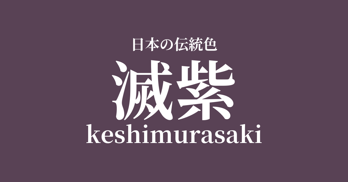
| Japanese color name | dark purple |
|---|---|
| reading | keshimurasaki |
| HEX | #594255 |
| RGB | 89, 66, 85 |
What is Metsushi? Origin and etymology
Metsumurasaki is a dull reddish-purple color achieved by dyeing a purple color with gromwell root and then layering dyes such as oak (Tsurubami) over it to dull the hue. As the name suggests, it is said to have been named with the meaning of "destroying" the noble shade of purple. Purple was a forbidden color that only those of high rank were permitted to wear since ancient times, and it is said that this dyeing technique was created as a way to circumvent that prohibition.
This color name reflects a uniquely Japanese aesthetic and social context, intentionally concealing the inherently vibrant purple color.
The etymology of "metsu-murasaki" (滅紫) means to erase color or remove luster. Metsu-murasaki is not simply a matter of mixing colors, but rather a sophisticated dyeing technique that involves layering another color on top of a previously dyed color, thereby suppressing the vibrancy of the original color and giving it depth and complexity. Unlike "mordanting," this technique strongly intends to change the color itself, reflecting the delicate sense of color of the people of that time and their wisdom within a strict social hierarchy.
Historical background of Metsushi
The history of muted purple is deeply intertwined with the clothing color system of the Heian period. At that time, deep purple and light purple dyed with gromwell root were "forbidden colors" that only the emperor, members of the imperial family, and high-ranking nobles were permitted to wear. However, people longed to wear purple, a color they admired, and devised ways to make it less forbidden by layering other dyes on top of the purple to dull the color. This is considered the origin of muted purple, and its noble yet understated hue was secretly favored among the Heian aristocracy.
The Engishiki, a collection of laws from the mid-Heian period, contains a description of dyeing with a combination of gromwell root and acorn. It has been suggested that this may have been the dyeing method for muted purple. Acorn is a dye extracted from the nuts of acorns and other plants, and it produces a dark color. Through this technique, the vibrant purple was transformed into a calm, deep color, achieving an exquisite shade that retained the elegance of purple while avoiding prohibition.
Related literature, waka poetry, and seasonal words
The color "Metsu-murasaki" (meaning "dark Metsu-murasaki") also appears in "The Tale of Genji," a masterpiece of Heian literature. In the chapter "Wakamurasaki" (Young Murasaki), in a memorable scene where Hikaru Genji first sees the girl who will later become Murasaki no Ue, it is noted that the girl is wearing "a dark Metsu-murasaki fabric." This description is said to symbolize the girl's noble origins and the hidden charm she possesses despite her young age. Its use at a crucial turning point in the story effectively conveys the refined yet noble image of Metsu-murasaki.
In Sei Shōnagon's "The Pillow Book," dark purple is also listed as an object of praise. In the section on "things to be admired," "deep dark purple" is described as beautiful, along with deeply dyed grape-dyed colors. This indicates that dark purple was not merely a color used to circumvent prohibitions, but was accepted by the refined aesthetic sensibilities of the Heian aristocracy as a beautiful color in itself.
Through literary works, it can be seen that Metsushi played an important role in the culture of that time.
Color scheme preview
This is to check the readability of the text when this color is used as the background.
A proposed color scheme for "extinction of purple"
White training (#FFFFFF)
The pure white enhances the nobility and serenity of the deep purple. This clean and elegant combination evokes a classic atmosphere reminiscent of Heian period attire. The clear contrast beautifully complements each other's colors.
Pine green (#839B5C)
The reddish-purple shade of mutsu-purple and the greenish-pine-green shades of pine are close to complementary colors, enhancing each other's beauty. This combination evokes the color schemes of nature, creating a calm and profound harmony. It's a classic yet somewhat modern combination.
Soot bamboo color (#6F514C)
Similar to the muted purple, combining it with the dull shade of sooty bamboo creates a sense of unity throughout. This color scheme creates a sophisticated, calm, and mature atmosphere. Because both colors have depth, it gives a weighty and refined impression.
Practical Scenes
In the world of kimono, dark purple is used for formal visiting kimonos, solid-colored kimonos, and obi sashes. Its understated yet dignified hue is considered suitable for tea ceremonies and other formal occasions. Depending on how it is combined with other colors, it is a traditional color that can be worn elegantly by people of all ages and is highly valued.
In interior design, incorporating this color into accent walls, cushions, and curtains adds a sense of calm and depth to a space. It harmonizes well with both Japanese-style rooms and modern Western-style rooms, creating a sophisticated atmosphere. The way its appearance changes dramatically depending on the lighting is another appealing aspect of this color.
In web design and graphic design, using it as a background or accent color can convey a sense of luxury and trustworthiness. It is particularly well-suited for websites related to traditional crafts and history, as well as brand websites dealing with high-priced products. When combined with white or gray tones, it creates an elegant design while maintaining readability.