
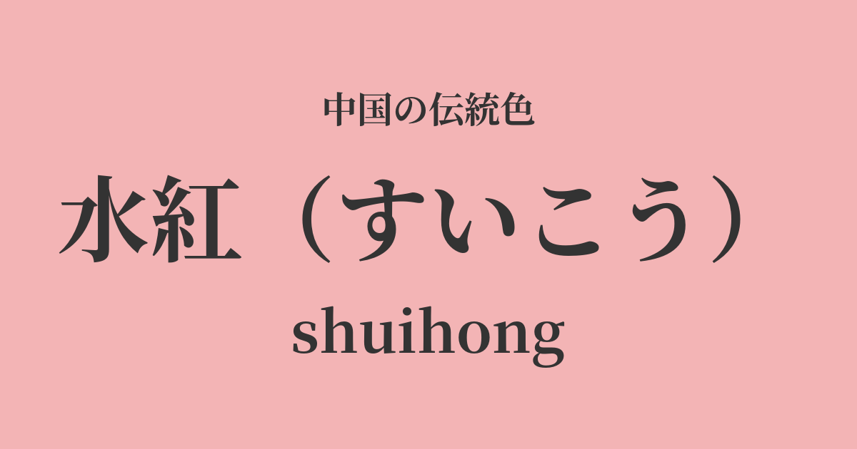
| Color name | water red |
|---|---|
| reading | Suiko |
| pinyin | shuihong |
| HEX | #F3B4B5 |
| RGB | 243, 180, 181 |
What is "Mizubeni"? Origin and etymology
Suikou, as the name suggests, refers to a pale, translucent crimson color, as if diluted with water. This elegant name poetically expresses the very nature of how the color is formed.
This color is deeply connected to safflower, which has been used as a dye since ancient times. By diluting the vibrant red pigment extracted from safflower with water, this delicate and soft hue is created. It evokes a fleeting and beautiful image, as if a single drop of red had been dropped into pure water.
Furthermore, it is believed that the color name was inspired by natural landscapes. For example, the way the dawn sky is reflected on the water's surface, tinged with a pale crimson, or the sight of lotus or peach blossoms swaying on the water's surface—scenes woven from water and crimson have long inspired the sensibilities of many poets and painters. Mizubeni is an emotionally rich color that captures such natural beauty.
The historical background of Suibeni
Shuihong (a type of red pigment) was particularly popular during the Tang Dynasty, a period when culture flourished. In the internationally diverse capital city of Chang'an, women competed to enhance their beauty, and sophisticated makeup and clothing became fashionable.
Women at the time applied "red makeup" as blush and lipstick, and among these, pale shades like water red were favored for giving an elegant and refined impression. Not only rich and glamorous beauty, but also modest and natural beauty was an important aspect of the aesthetic sense of the Tang Dynasty.
This color was popular not only among court ladies but also among women of the general public as a choice for clothing. Poetry from the Tang Dynasty often depicts women wearing shaved red garments, conveying the fashion of the time. Elegant yet light, shaved red likely brightened people's hearts as a color that heralded the arrival of spring.
Water red in Chinese art and crafts
In fashion culture, suibeni (a type of red dye) was particularly favored for women's clothing. Lightweight, sheer silk fabrics dyed in suibeni, such as san (jackets) and kun (skirts), swayed gracefully with the wearer's movements, enhancing the feminine allure. It was especially popular in spring and summer attire, as its cool hues evoked a sense of the season.
In the field of art, in portraits of beautiful women from the Tang Dynasty onward, particularly in the Gongbi style (a type of painting using fine brushwork), the color of rosary is depicted as the color of women's clothing and makeup. By applying a pale rosary to translucent white skin, it expressed good complexion and youthfulness, giving the figure a sense of life. In paintings, this color plays a role in symbolizing the gentleness and grace of women.
Mizuko Suiko's small details
Color scheme preview
This is to check the readability of the text when this color is used as the background.
Light red color scheme proposal
Moon white (#D9D6C3)
When combined with the pale, cool light blue, the warmth of the light red is enhanced, creating an elegant and sophisticated impression. This color scheme is recommended when you want to create a quiet, calm, and intellectual atmosphere.
Willow green (#B8CE9E)
Adding willow green, the color of young willow leaves, creates a vibrant and fresh color scheme that evokes the arrival of spring. It gives a natural, approachable, bright, and light impression.
Fukari (#EDD1D5)
The lotus root color, Ouga, has a hue similar to that of Suibeni, so when combined, it creates a very harmonious, gentle, and calm impression. It is an ideal color scheme for expressing femininity and delicacy.
Practical Scenes
In the world of fashion, incorporating a shade of red into items such as dresses, blouses, and scarves brightens the complexion and gives a gentle, feminine impression. It is a particularly flattering shade for those with a spring or summer personal color type. It also pairs exceptionally well with natural materials such as cotton, linen, and silk.
In interior design, using it as an accent color in bedrooms or living rooms brings warmth and tranquility to the space. Incorporating it into fabrics such as cushion covers, curtains, and rugs, or painting just one wall in this shade, can create a comfortable and relaxing atmosphere.
In the world of web and graphic design, vermilion is a viable option. When used in designs for women's products and services, wedding-related items, or baby products, it visually conveys concepts such as elegance, happiness, and love. It's easy to use as both a main color and an accent color, and when combined with neutral colors like white, gray, and beige, it creates a sophisticated design.