
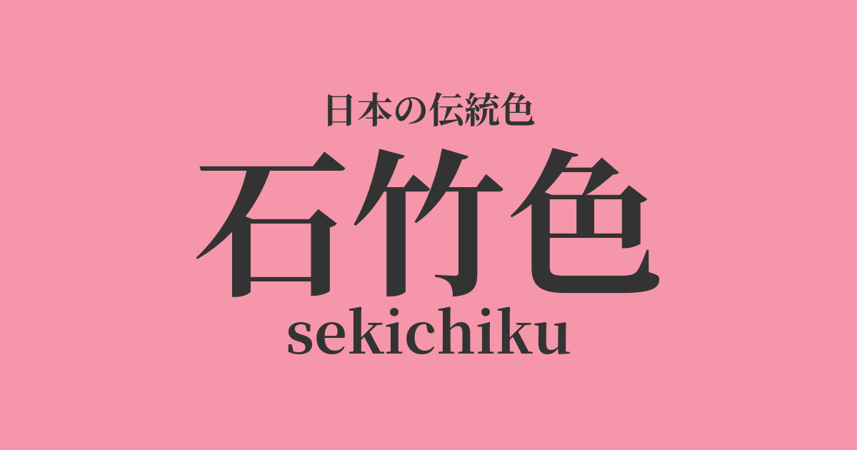
| Japanese color name | stone bamboo color |
|---|---|
| reading | sekichiku |
| HEX | #F596AA |
| RGB | 245, 150, 170 |
What is carnation green? Origin and etymology.
The name "Dianthus green" originates from the color of the flower of the Dianthus superbus, a perennial plant belonging to the carnation family. Dianthus is believed to be native to China and was introduced to Japan during the Heian period. It was named "Dianthus" because it has leaves as strong as bamboo, even in harsh environments such as between rocks. This color name captures the delicate and gentle pink color of its petals and has become established as one of Japan's traditional colors derived from natural plants and flowers.
The historical background of the carnation color
The name "Dianthus green" appears in literature relatively recently, dating back to the mid-Edo period or later. During this time, gardening became very popular among the common people, and Dianthus flowers were widely cultivated as ornamental plants. In particular, it was popular as a color for women's and children's clothing, and its lovely hue was cherished within the townspeople's culture of Edo. Even in modern times, its gentle and calming impression has led to its continued use as a color name for Japanese clothing accessories and cosmetics.
Related literature, waka poetry, and seasonal words
Dianthus, also known as "Kara-nadeshiko," has long been a subject of waka and haiku poetry. As a seasonal word, it represents summer, and its delicate appearance has been loved by many poets. For example, it appears in the haiku of Masaoka Shiki, showing its familiarity in the world of literature. However, the color name "Dianthus color" itself is rarely used directly in poetry; it mainly appears in contexts praising the beauty of the flower itself.
Carnations and red mixed with white, white mixed with red
Color scheme preview
This is to check the readability of the text when this color is used as the background.
Carnation-colored color scheme proposal
Willow Rat (#8D8D73)
By combining it with a muted green willow gray reminiscent of the leaves and stems of the carnation, it creates a natural and calm impression. This color scheme enhances the delicate beauty of the carnation color while creating an overall elegant and serene atmosphere.
White training (#EDEBE8)
When paired with Shironeri, a soft white reminiscent of refined silk, the gentleness and cleanliness of the carnation color are further enhanced. It gives a refined and elegant impression, making it suitable for feminine designs and Japanese-style clothing coordination.
Bellflower color (#564787)
By combining it with a deep blue-violet reminiscent of a bellflower, the sweetness of the carnation color gains elegance and tranquility. The colors complement each other, creating a sophisticated and mature impression that is both vibrant and refined.
Practical Scenes
In the world of kimono, carnation green was particularly favored for young women's kosode (short-sleeved kimono), obi (sash), and juban (undergarments). Its lovely and gentle hue added a touch of elegance to spring attire and celebratory occasions. Even today, it remains popular as a color that creates a refined and feminine look, incorporated into patterns of visiting kimonos and furisode (long-sleeved kimono), as well as in Japanese accessories.
In interior design, using carnation green as an accent color can add warmth and gentleness to a space. Incorporating it into cushions, curtains, and accessories will give the entire room a bright and soft atmosphere. Combining it with neutral colors such as white, beige, and light gray will create a sophisticated and comfortable space.
In web and graphic design, the feminine and gentle impression of carnation green makes it suitable for beauty, fashion, and bridal-related websites. Using it as a main color can create a very sweet impression, so it's more effective when used as an accent color or in background gradients. It's a useful color when you want to achieve both approachability and elegance.