
| Japanese color name | browning |
|---|---|
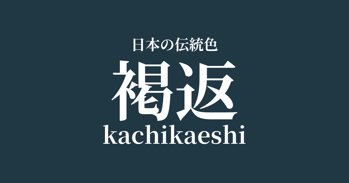
| reading | kachikaeshi |
| HEX | #203744 |
| RGB | 32, 55, 68 |
What is "Kagaeshi"? Origin and etymology
Kagaeshi is a deep blue-green color, almost black, achieved by repeatedly dyeing fabric with indigo. "Kachi" refers to the dark brown color of the indigo dye, and "kaeshi" is said to represent the repeated dyeing process. This deep, robust color is created by repeatedly immersing the fabric in an indigo vat, exposing it to air, and allowing it to oxidize and develop its color.
The name of this color is said to originate from a garment called "kachie," originally worn by samurai. Kachie was made from durable fabrics such as hemp, dyed deeply with indigo, and was widely accepted by the samurai class due to its practicality and powerful color. The color name itself tells the story of its manufacturing method and use.
Historical background of browning
The color brown became widely used from the late Heian period to the Kamakura period, coinciding with the rise of the samurai class. It is said that samurai wore brown clothing daily because it was inconspicuous on the battlefield and durable. This color symbolized the practical and functional spirit of the samurai class.
Because the color "kaku" (brown) sounds similar to "kachi" (victory), it was favored as an auspicious color for armor and clothing. This martial spirit was passed down through the Muromachi and Sengoku periods, and kaku became established as one of the colors symbolizing the samurai. It was a color imbued with strength and a wish for victory.
With the advent of the Edo period, indigo dyeing spread among the common people along with the popularization of cotton. Dark indigo colors, such as the brownish-brown shade, were used for firefighters' jackets and work clothes due to their durability, and the color became popular not only among samurai but also among people from a wide range of social classes.
Related literature, waka poetry, and seasonal words
Although there are few waka poems that directly mention the color name "kakugaeshi," war chronicles such as "Heike Monogatari" and "Taiheiki" depict many samurai wearing brown armor or hitatare (a type of formal robe). These descriptions suggest that it was a common color for samurai attire at the time.
In literary works, this color symbolizes the practical and robust spirit of the samurai. In contrast to the dazzling attire of the court nobles, the practical and powerful brown clothing strongly reflects the culture and values of the samurai class.
Color scheme preview
This is to check the readability of the text when this color is used as the background.
Color scheme proposal for brown-back
White training (#FDFBF6)
By combining a deep, rich brown with a pure and elegant white, the colors complement each other. This creates a dignified and refined color scheme that evokes the integrity and robust spirit of a samurai.
Scarlet (#D3381C)
The quiet strength of the brown-red is enhanced by the addition of fiery crimson, creating a dynamic energy. This color scheme, often seen in the lacing of armor, is well-suited to expressing the fighting spirit and passion of a samurai.
Kutsuha color (#917345)
The deep indigo color of "kachigaeshi" and the withered leaf color of "kuchiba-iro" are both earth tones derived from nature. The combination of these subdued colors evokes the Japanese landscape and gives a calm and profound impression.
Practical Scenes
In the world of traditional Japanese clothing, brown-colored kimono, hakama (trousers), and obi (sash) are used for men's kimonos, hakama, and obi, creating a sense of calm and gravitas. It is particularly often chosen for the uniforms of martial arts practitioners and for formal occasions. Its deep hue enhances the wearer's dignity and refinement.
In interior design, using it in accent walls, heavy furniture, or rugs can bring a sense of calm and depth to a space. Combining it with white or wood-grain materials creates a modern and sophisticated Japanese-style space. It is suitable for places where you want to spend time quietly, such as a study or bedroom.
In web design and graphic design, using this color as a background or main color can convey a sense of reliability and sophistication. It offers good contrast with white or light gray text, resulting in high visibility. It is also effective as an image color for corporate websites and brands dealing in traditional products.