
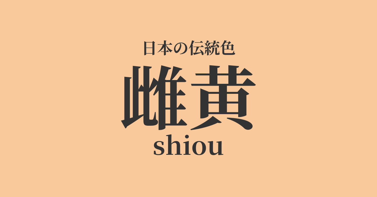
| Japanese color name | female yellow |
|---|---|
| reading | shiou |
| HEX | #F9C89B |
| RGB | 249, 200, 155 |
What is orpiment? Origin and etymology
The name "orpiment" (女黄) derives from the color of a pigment made from powdered orpiment, an arsenic sulfide mineral. Orpiment is also known as "realgill" (鶏冠石), and is said to have been named for its vivid color resembling the comb of a rooster. Although this mineral is poisonous, its beautiful color has made it highly valued as a paint and dye since ancient times. The characters "女黄" (female yellow) are thought to have been chosen because it is the counterpart to "male pith" (雄黄), another arsenic sulfide mineral.
While orpiment is a greenish-yellow, orpiment is characterized by a more reddish, vibrant yellow.
Historical background of orpiment
Orpiment is a pigment that was introduced from ancient China, and there are records of its use in Japan since ancient times. Artifacts colored with orpiment can be found among the treasures of the Shōsōin, indicating that it was already recognized as a valuable pigment during the Nara period. During the Heian period, it was used in picture scrolls and Buddhist paintings for the clothing and decorations of figures, adding vibrancy to the images. Furthermore, orpiment was believed to have insect-repelling and antibacterial properties, and is said to have been used to dye paper for copying Buddhist scriptures.
However, due to its toxicity, its use declined over time, and safer pigments such as yellow ochre became the mainstream.
Related literature, waka poetry, and seasonal words
Although the color name "oriole" is rarely mentioned directly in Japanese poetry, its raw material, oriole, sometimes appears in literary works as a valuable pigment. Classical literature such as "The Tale of Genji" suggests that this vivid yellow pigment was used to describe the colors of luxurious furnishings and buildings. Furthermore, the vivid yellow of oriole is a color that evokes images of autumn rice fields and ripe fruit.
Although it is not directly registered as a seasonal word, it can be interpreted in connection with the worldview of haiku and waka poetry as a color that represents the abundance of autumn.
Color scheme preview
This is to check the readability of the text when this color is used as the background.
A proposed color scheme for orpiment.
Uguischa (#715C1F)
The bright yellow of the orpiment is balanced by the subdued, calming green of the nightingale tea. This color combination evokes the plants and light of nature, giving it a distinctly Japanese feel. The colors complement each other, creating an elegant and refined impression.
Lapis Lazuli (#1F4788)
The vibrant oryellow and deep lapis lazuli create a strong contrast, almost like complementary colors. This gives a magnificent and opulent impression, reminiscent of the colorings found in Heian period picture scrolls and temple architecture. The two colors enhance each other, resulting in a powerful and striking color scheme.
Suou (#9E3D3F)
The warm yellow of orpiment and the deep red of sappanwood create a unified and warm impression. This color scheme evokes the autumn foliage and the twilight sky, creating an emotional and calming atmosphere. It can produce a traditional yet modern impression.
Practical Scenes
In the world of kimono, oreskiel is used as an accent color for formal kimonos, obi sashes, and accessories. It pairs particularly well with classical patterns, and incorporating this color into auspicious motifs creates a bright and dignified atmosphere. Its vibrancy makes it a popular choice for adding a touch of elegance to celebratory occasions.
In interior design, incorporating it as an accent color in cushions and accessories brings brightness and warmth to a space. When used in wallpaper or curtains, combining it with calm wood-grain furniture or natural colors such as white or off-white can create a sophisticated Japanese modern space.
In web and graphic design, the bright and positive impression of orthioglans can be utilized. It is effective as a background color for buttons and banners to attract attention. However, because it is a strong color, it should not be used excessively, and it is best to use it as an accent in combination with background colors such as white or dark blue.