
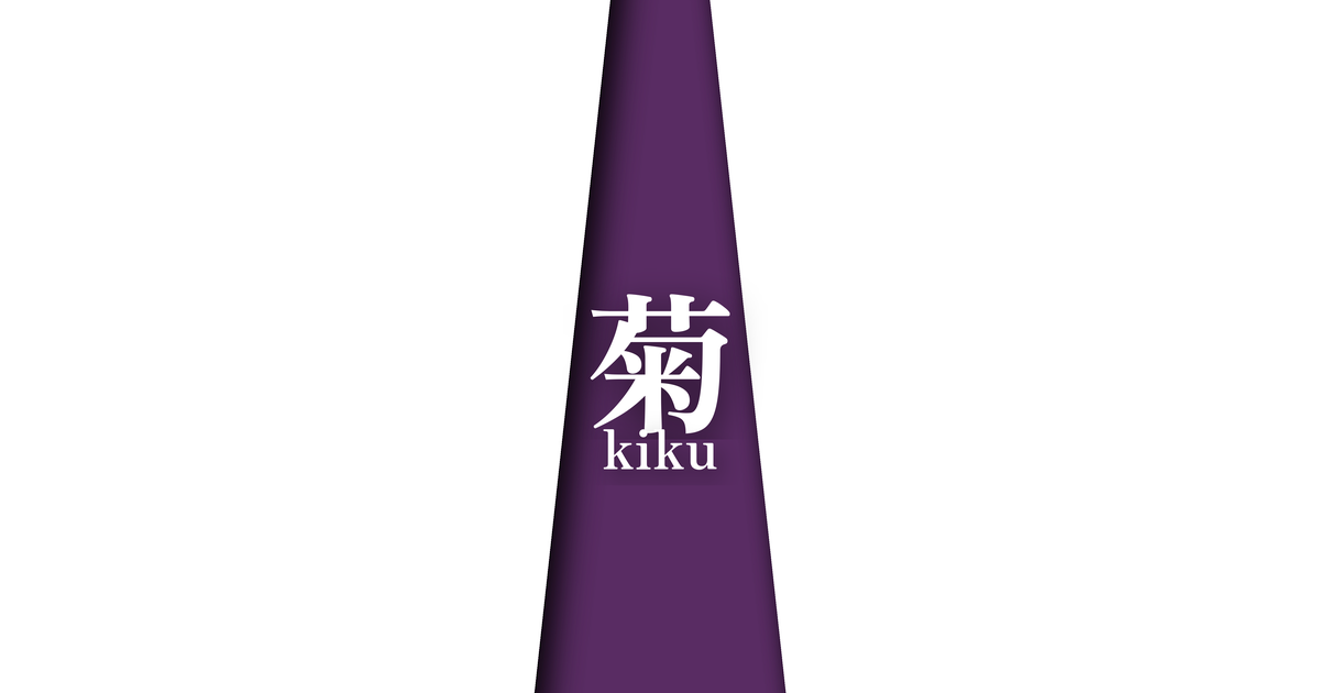
| Japanese color name | 菊 |
|---|---|
| reading | kiku |
| season | 秋 |
| Color of the table | White (shiro) |
| Back color | Purple (murasaki) |
What is a chrysanthemum? Origin and etymology
The layered color combination "Kiku" (chrysanthemum) is, as its name suggests, derived from the chrysanthemum flower that blooms in autumn. The white on the outside represents the pure, blooming petals of the white chrysanthemum, while the purple on the inside represents the color of the chrysanthemum's center, or the appearance of the "fading chrysanthemum" when the edges of the petals have taken on a faint purple tint after its peak bloom. This color combination not merely replicates the colors of the flower, but captures the beauty of nature that changes with the passage of time, from its noble bloom to its eventual fading, embodying a delicate Japanese aesthetic.
The concept of "transience" in particular is connected to "mono no aware," which forms the core of the Heian aristocracy's aesthetic sensibilities. It is thought that the sensibility that finds beauty not only in the beauty of full bloom, but also in the process of gradual fading and wilting, culminated in this combination of white and purple. Chrysanthemums are auspicious flowers that symbolize longevity, but they are also flowers that evoke a sense of autumnal melancholy, and this duality of charm adds depth to this elegant and refined color scheme.
Historical background of chrysanthemums
Chrysanthemums were introduced from China during the Nara period as a medicinal herb, and during the Heian period, they became widely popular among the aristocracy as ornamental plants. In particular, the Choyo Festival on the 9th day of the 9th month of the lunar calendar was also called the "Chrysanthemum Festival," and court ceremonies were held where people drank chrysanthemum sake, in which chrysanthemum flowers were floated, and prayed for longevity. Against this backdrop, clothing and colors featuring chrysanthemums played a very important role in expressing the feeling of autumn.
The chrysanthemum color, used as a layered color combination, is said to have been worn mainly around the ninth month of the lunar calendar. In the layered uchiki (outer robes) worn by women of the imperial court, this combination of white and purple created a quiet and elegant atmosphere that came with the deepening of autumn. Sensitively perceiving the changing seasons and expressing them through the colors of clothing was an important aspect of education for Heian aristocrats, and the chrysanthemum was a prime example of this.
Related literature, waka poetry, and seasonal words
Chrysanthemums frequently appear in Heian period literature, including "The Tale of Genji" and "The Pillow Book," and are depicted as an important flower that adorns autumn scenes. In "The Tale of Genji," there are scenes of chrysanthemum banquets hosted by Hikaru Genji, and characters exchanging waka poems about chrysanthemums. Through these stories, we can see how much chrysanthemums were loved by the aristocracy of the time.
Furthermore, in the section "Flowers of the Grass" in "The Pillow Book," Sei Shonagon lists the chrysanthemum as one of the autumn flowers. In literary works, chrysanthemums are not merely depicted as plants, but are treated as symbols of seasonal emotions and the subtleties of the human heart. This literary background further enriches the elegance and narrative quality of the chrysanthemum color combination.
I wonder if I should break it off, just as the first frost has confused the white chrysanthemum blossoms.
Chrysanthemum season and scenery
The layered color combination "Chrysanthemum" expresses the crisp air and tranquility of autumn, especially late autumn. The white of the outer layer symbolizes the purity of white chrysanthemums blooming in the cold morning light, and the transience of the first frost that falls on the fields and mountains. On the other hand, the purple of the inner layer evokes the deep hues of chrysanthemums, as well as the color of the autumn evening sky as the sun begins to fade. This color scheme skillfully expresses the unique atmosphere of autumn, which feels both vibrant and somewhat melancholic.
This color scheme was worn primarily during the Chrysanthemum Festival in the ninth month of the lunar calendar. By incorporating the elegance and vitality of chrysanthemums, which are at their most beautiful in bloom, into their attire, the Heian aristocracy's aesthetic sense of becoming one with nature is evident. It is thought to have been particularly favored at elegant events such as autumn chrysanthemum viewing parties and moon-viewing banquets.
Chrysanthemum color scheme proposal
Joroka (#F2D544)
By combining it with the vibrant yellow of the Patrinia scabiosifolia, another flower representative of autumn, the rich colors of autumn fields and mountains can be expressed. The addition of vibrancy to the calm tones of white and purple creates a color scheme that is both classic and lively.
Dark color (#452437)
By combining a deep purple, a similar shade to the lining color, a sophisticated gradation is created. This creates a sense of unity throughout, giving off a more noble, dignified, and calm adult atmosphere. This color scheme is said to have been favored by high-ranking figures during the Heian period.
Blue dull (#6C706F)
The dull blue-green hue, reminiscent of the approaching winter, adds a sense of serenity and intellectual sophistication to the white and purple of the chrysanthemums. It evokes the cold, crisp air and melancholic scenery of autumn, while also possessing a modern sensibility, resulting in a refined and stylish color scheme.
Practical Scenes
In traditional Japanese clothing, incorporating the chrysanthemum color scheme into autumn kimonos, obi sashes, and accessories such as obiage and obijime creates an elegant and seasonally appropriate look. Its charm is particularly evident in occasions requiring a calm atmosphere, such as tea ceremonies, theater performances, and art appreciation. The combination of white and purple enhances the wearer's grace and intelligence.
The chrysanthemum color scheme can be effectively utilized in modern fashion and design. White and purple evoke an image of nobility and sophistication, making them ideal for incorporating into websites, advertisements, and packaging designs to effectively convey a brand image that values tradition and formality. It's perfect for creating a quiet and calm atmosphere.
In interior design, using this color scheme for cushion covers, tablecloths, or parts of wallpaper can bring a Japanese aesthetic and the tranquility of autumn to a space. It looks great not only in Japanese-style rooms but also as an accent color in minimalist modern interiors, creating a sophisticated atmosphere.