
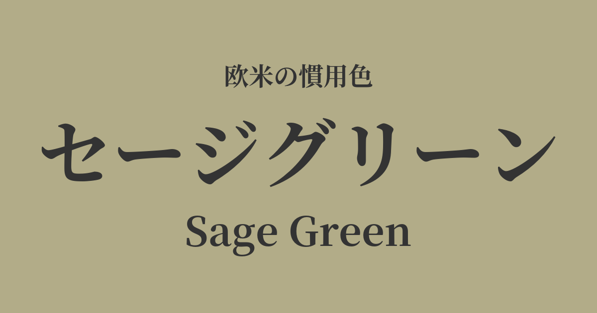
| Original English name | Sage Green |
|---|---|
| Japanese notation | Sage Green |
| HEX | #B2AC88 |
| RGB | 178, 172, 136 |
What is sage green? Origin and etymology
Sage green, as the name suggests, is derived from the color of the leaves of sage, a type of herb. In particular, it is a grayish, calming green that is reminiscent of the slightly whitish color of dried sage leaves.
The English word "sage" originates from the Latin words "salvus," meaning "health" or "safety," and "salvere," meaning "to save" or "to heal." Over time, these words came to mean "wise person" or "scientific."
Sage has long been valued as a medicinal herb, believed to heal the mind and body, and considered a symbol of wisdom and longevity. The color sage green, named after sage, also embodies nuances of calmness, healing, and intelligence.
This color possesses an unadorned charm, capturing the raw beauty of nature. Its understated and thoughtful expression, distinct from vibrant greens, brings a sense of peace and comfort to the viewer.
The historical background and culture of sage green
Sage green is not a color invented in a specific era, but rather a color that has existed in nature since ancient times and has been a part of people's lives. In particular, the hues of plants such as olives and sages that grow naturally in the arid lands of the Mediterranean coast are one of the quintessential colors of the European and American landscape.
Historically, this color has been used to create a calm and elegant atmosphere rather than to convey ostentation or extravagance. In 18th-century French and English homes, it was favored as a wallpaper and textile color to create a graceful and tranquil ambiance.
In the Arts and Crafts movement of the early 20th century, earth tones like sage green gained renewed attention as the value of handcrafted work and the beauty of nature were re-evaluated. In modern times, these colors resonate with values such as minimalism and sustainability, and are widely loved in the world of interior design and fashion as colors that symbolize a fulfilling life.
Sage green in design and art
In the field of interior design, sage green is a very popular color. When used as a wall color, it brings a sense of calm and tranquility to a space, creating a relaxing atmosphere. It is also effective when used as an accent color in furniture, curtains, cushions, and other fabrics.
In the world of fashion, it's a popular color that symbolizes a natural and effortless style. It pairs exceptionally well with natural materials like linen and cotton, and is used in a variety of items such as shirts, dresses, and pants. It's also a genderless color that's easy for anyone to incorporate into their wardrobe.
In product design, these colors are used in items that are part of everyday life, such as kitchenware, home appliances, and stationery. Their gentle hues blend naturally into any environment.
Furthermore, it's a classic choice for weddings with a natural and sophisticated theme, and is widely used in bridesmaid dresses, floral arrangements, and invitation designs.
Sage advice is better than gold.
Color scheme preview
This is to check the readability of the text when this color is used as the background.
Sage green color scheme proposal
Cream (#FFFDD0)
When combined with a soft, warm cream, it creates a bright, cozy, and natural atmosphere throughout the entire space. It's recommended for relaxing bedrooms and living rooms.
Charcoal Gray (#36454F)
The deep charcoal gray complements the gentle sage green, creating a modern and sophisticated impression. It's perfect for urban and stylish interiors and office spaces.
Dusty Rose (#DCAE96)
Adding a muted pinkish-pink dusty rose creates an elegant and slightly feminine atmosphere. It makes a sophisticated and stylish impression when used in fashion or wedding color schemes.
Practical Scenes
In interior design, this wallpaper is ideal for spaces where you want to relax, such as living rooms and bedrooms. Not only can it be used on all walls, but incorporating it as an accent wall on just one wall adds depth to the space. When used as the color for kitchen cabinets or doors, it can accommodate a wide range of styles, from warm country to modern.
In fashion, sage green is a versatile color that can be both the star of an outfit and a great supporting player. A sage green dress alone creates an elegant style, and simply layering a sage green cardigan over a white T-shirt and jeans gives a sophisticated look. It also pairs perfectly with basic colors such as beige, brown, and gray.
In web design, using it as a background color gives users a sense of security and improves content readability. It is particularly suitable for expressing the worldview of brand websites themed around organic products, wellness, and lifestyle.