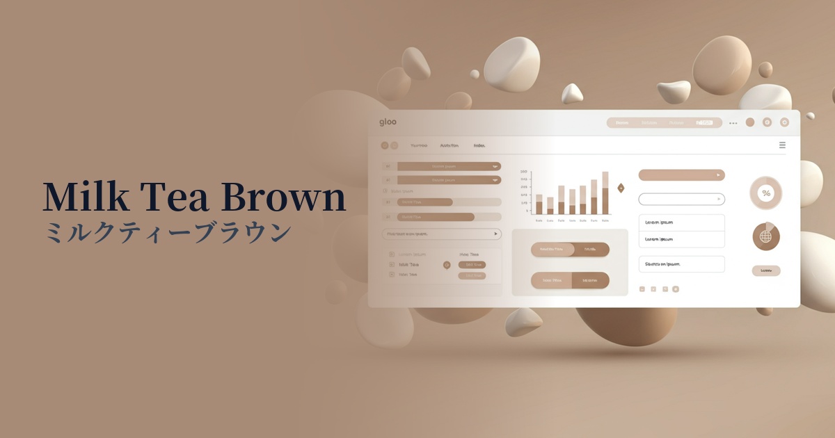
| English name | Milk Tea Brown |
|---|---|
| Katakana | Milk Tea Brown |
| HEX | #C4A891 |
| RGB | 196, 168, 145 |
| Design Theme | Muted colors & earth tones |
Why is it a trend? (Background and reasons)
In line with recent design trends such as "Quiet Luxury" and "Organic Modern," natural and calming earth tones like milk tea brown are gaining attention. They match the modern mood, which prioritizes comfort and essential value over flashiness.
This color has gained popularity in the lifestyle and fashion sectors on social media, especially Instagram and Pinterest, and its influence is now spilling over into web design. Incorporating pleasant colors that users see in their daily lives into your website can create a sense of familiarity and security, and is expected to increase engagement.
As more users experience digital fatigue, there is a growing demand for neutral colors that are easy on the eyes and less tiring to look at for extended periods. Milk tea brown is appealing because it has a warmth that white and gray lack, while striking a perfect balance that doesn't interfere with the content being viewed.
The psychological effects of design and UX
Milk tea brown, as its name suggests, evokes images of warm beverages and inspires positive emotions in users such as "comfort," "relaxation," and "comfort." It pairs well with themes like organic, natural, and handcrafted, and helps convey the brand's trustworthiness and integrity.
From a UI/UX perspective, this color functions as an excellent background or secondary color. Because it's not too assertive, it brings a sense of unity and sophistication to the entire screen without compromising the visibility of the main content or important CTAs (Call To Action).
In terms of accessibility, when using a color as a background, attention must be paid to the contrast ratio with the text color. For example, while sufficient contrast can be ensured when combined with pure black (#000000), it may become difficult to read with light gray text. Aim for color schemes that meet WCAG standards.
Visibility testing (UI component example)
Practical usage (best practices)
This color is ideal as the main color or background color for lifestyle brands, cosmetics, interior design, and food-related e-commerce sites. It enhances the natural appeal and quality of the products and effectively creates a brand identity.
By using it in UI elements such as sidebars and headers in SaaS dashboards and management screens, it can reduce eye strain for users and provide a comfortable operating environment even during prolonged use. When combined with a white background, it helps to gently distinguish between different levels of information.
On landing pages (LPs), this color is effective when used in the background of the main visual or in sections where you want to convey credibility, such as customer testimonials and case studies. Because it is not a strong color, when using it as an accent color, combining it with a more saturated color will create contrast.
In button design, using this color for secondary buttons (such as "Cancel" and "Back") or as the background color for ghost buttons, rather than primary buttons, can intuitively convey the priority of actions without confusing the user.
Recommended color scheme suggestions
Slate Gray (#708090)
Combining it with the intelligent and calming slate gray creates a sophisticated and modern atmosphere. The warmth of milk tea brown is complemented by the coolness of gray, making it ideal for B2B websites and portfolio sites where trustworthiness and expertise are required.
Antique White (#FAEBD7)
Using a warm antique white background and milk tea brown for text and accents creates a very soft and organic design. It's perfect for creating a comfortable space that is minimalist yet doesn't feel cold.
Terracotta (#E2725B)
This combination features warm, earthy tones. The reddish hue of the terracotta adds an accent, giving the overall design vitality and energy. This color scheme is effective when you want to add human warmth and passion to a calm milk tea brown base.