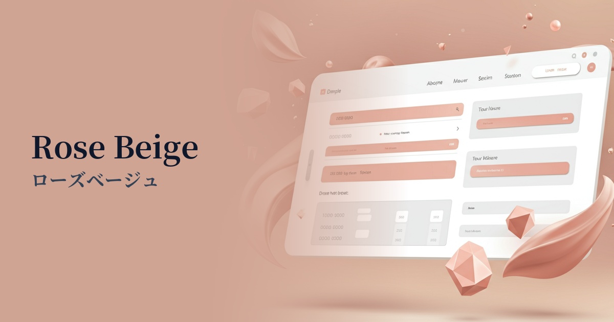
| English name | Rose Beige |
|---|---|
| Katakana | Rose Beige |
| HEX | #D6B8B3 |
| RGB | 214, 184, 179 |
| Design Theme | Muted colors & earth tones |
Why is it a trend? (Background and reasons)
In recent years, minimalism and a natural aesthetic have become major trends in web design. Within this trend, earth tones based on colors found in nature and muted colors with reduced saturation are gaining popularity. Rose beige is one of the colors that perfectly symbolizes this trend. Combining the calmness of beige with the subtle elegance of rose, it gives an organic yet sophisticated impression.
Furthermore, as we are exposed to a vast amount of digital information every day, there is a growing demand for designs that are easy on the eyes and minimize psychological strain from a "digital wellness" perspective. Neutral colors like rose beige are less tiring to look at even after prolonged screen time, providing users with an unconscious sense of security and comfort. This characteristic is why they are highly valued in blogs where you want users to focus on the content, and in e-commerce sites where you want to create a relaxed atmosphere.
The growing popularity of genderless color palettes in the fashion and interior design industries is also boosting the popularity of rose beige in web design. Neither overly sweet nor sterile, this color appeals to a wide range of users regardless of gender. It's an ideal color for building a modern and inclusive brand image across diverse fields such as beauty, wellness, and lifestyle.
The psychological effects of design and UX
Rose beige is a color that combines the "stability" and "calmness" of beige with the "gentleness" and "happiness" of pink. It is expected to have a psychological effect of giving users a sense of security and easing tension. In particular, it helps to reduce user anxiety on a site they are visiting for the first time and helps to form a positive first impression.
Because the colors are muted, they don't come across as flashy or overly assertive, giving off an impression of "elegance" and "sophistication." When combined with a minimalist layout and high-quality typography, it creates a world that is both luxurious and approachable, striking a perfect balance.
Warm, skin-tone-like hues reduce the psychological distance between the user and the brand, fostering a sense of intimacy and empathy. This helps convey the human side of a brand in portfolio sites that tell personal stories and service sites that prioritize building trust with customers.
A calm tone conveys a sense of trust and sincerity to users. Because it is non-aggressive and neutral, it can simultaneously infuse websites for services where reliability is crucial, such as consulting and education, with both softness and trustworthiness.
Visibility testing (UI component example)
Practical usage (best practices)
Using it as the background color for the entire site creates an elegant base that gently enhances the content. In particular, it has a warmer feel than a white background and maintains a moderate contrast with the text, providing a pleasant reading experience without compromising readability.
Using it as an accent color for CTA buttons or important links can subtly encourage user action without disrupting other elements. It's particularly effective in clean designs based on white or gray tones, allowing for understated yet effective eye-tracking.
It's also effective to use it as the background color for specific elements in card-style UIs that display multiple pieces of information, or in comparison tables of pricing plans. It visually divides information blocks gently, giving the overall image a sense of rhythm and cohesion.
By incorporating it as a key color in illustrations and icons, you can unify the tone and style of the entire site. You can intuitively convey the brand's values, such as "gentleness" and "sophistication," to users through visual language.
Using it as a band in the header, footer, or as a section break brings stability and unity to the entire page. It functions as a visual accent on long pages that tend to be monotonous.
Recommended color scheme suggestions
Slate Gray (#708090)
The warmth of rose beige is complemented by the sophisticated and calm impression of slate gray. This modern and elegant combination is ideal for B2B websites where trustworthiness is essential, or for refined portfolio sites.
Verde Salvia (#728C69)
The combination of earth tones creates a very natural and comfortable atmosphere. It's ideal for wellness, cosmetics, and lifestyle brand websites, as it conveys an organic and reassuring worldview.
Antique White (#FAEBD7)
By using rose beige as the main color and combining it with antique white, a sense of openness and brightness is created in the space. It's a very elegant color scheme that gives a minimalist and clean impression without losing warmth.