| English name | Light Greige |
|---|---|
| Katakana | Light greige |
| HEX | #D8D2C9 |
| RGB | 216, 210, 201 |
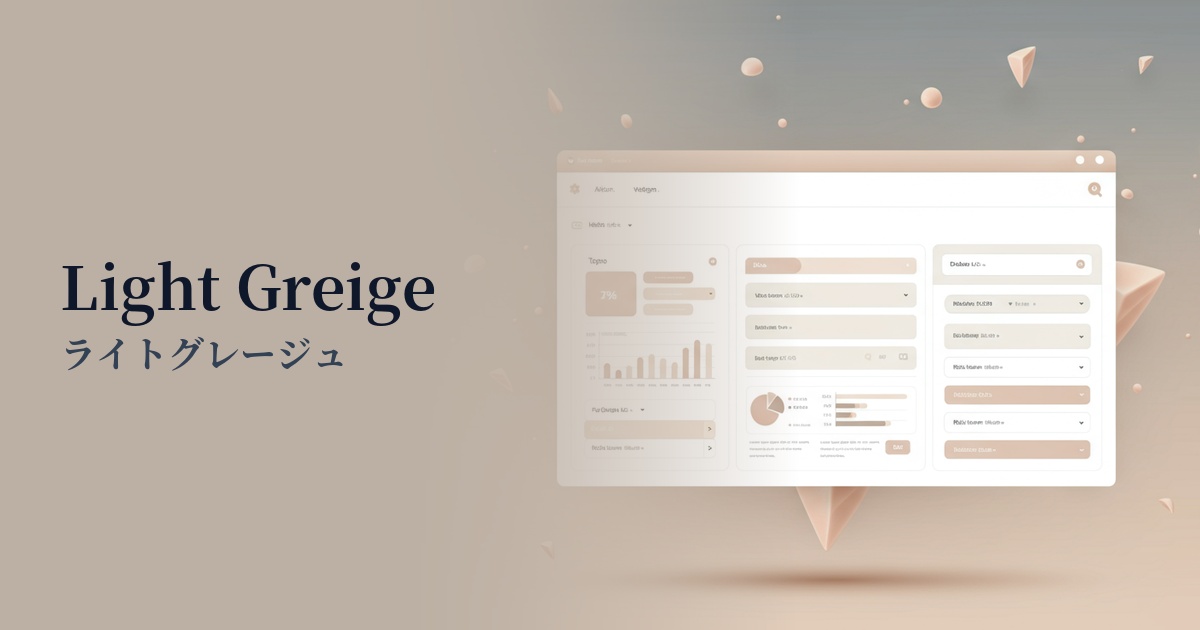
| Design Theme | Muted colors & earth tones |
Why is it a trend? (Background and reasons)
In recent years, interest in minimalism and sustainability has grown in web design, and gentle "earth tones" reminiscent of those found in nature have gained attention. Among these, light greige is particularly popular as a color that gives a sophisticated impression.
In today's information-saturated digital society, users tend to seek "quietness" and "comfort" online. Neutral colors like light greige, which are less stimulating, reduce eye strain and provide a calm visual experience that makes it easier to concentrate on content.
This color is incredibly versatile and plays a key supporting role, enhancing the beauty of other colors. Its ability to harmonize beautifully with both vibrant accent colors and deep, dark shades makes it an excellent base color for many designers.
The psychological effects of design and UX
Light greige combines the "solidity" and "sophistication" of gray with the "warmth" and "naturalness" of beige. This exquisite balance gives users an intelligent, calm, and reassuring feeling.
From a UI/UX perspective, this color is excellent as a background color. Because it's not overly assertive, it doesn't interfere with the readability of key content such as text and images. Users can unconsciously focus on the information, creating an interface that is less stressful even during prolonged use.
Its neutral stance—neither too cold nor too sweet—has the advantage of being easily accepted by a wide range of people regardless of gender or age. It proves effective in various projects, from brand websites that want to project a sense of luxury to B2B services where reliability is crucial.
Visibility testing (UI component example)
Practical usage (best practices)
Using it as the background color for your entire website easily creates a clean and unified aesthetic. It works especially well with minimalist layouts that make good use of white space.
Using a light greige background for a card-type UI that displays multiple pieces of information side-by-side makes the information on each card appear organized and visually clean. The whitespace between cards also stands out effectively.
It's ideal as a background color to highlight accent colors such as CTA buttons and links. For example, if you place bright blue or green buttons, a light greige background will make those colors stand out, naturally drawing the user's attention.
When applied to UI components such as input forms and dropdown menus, it creates a user-friendly interface that doesn't overwhelm the user. It's also easy to use as a color for disabled states.
Recommended color scheme suggestions
Slate Blue (#6A5ACD)
The gentle tone of light greige is complemented by the intellectual and calm atmosphere of slate blue. This combination is ideal for creating a sophisticated impression in SaaS UIs where reliability is paramount, or for corporate websites.
Rosy Brown (#BC8F8F)
Light greige, which has beige undertones, and reddish rosy brown are a perfect match. They create a warm, somewhat nostalgic atmosphere. Recommended for lifestyle-related e-commerce sites and blogs.
Sage Green (#8F9779)
The combination of earth tones creates a very natural and comfortable space. This reassuring color scheme is perfect for brands that focus on sustainability or for wellness-related services.