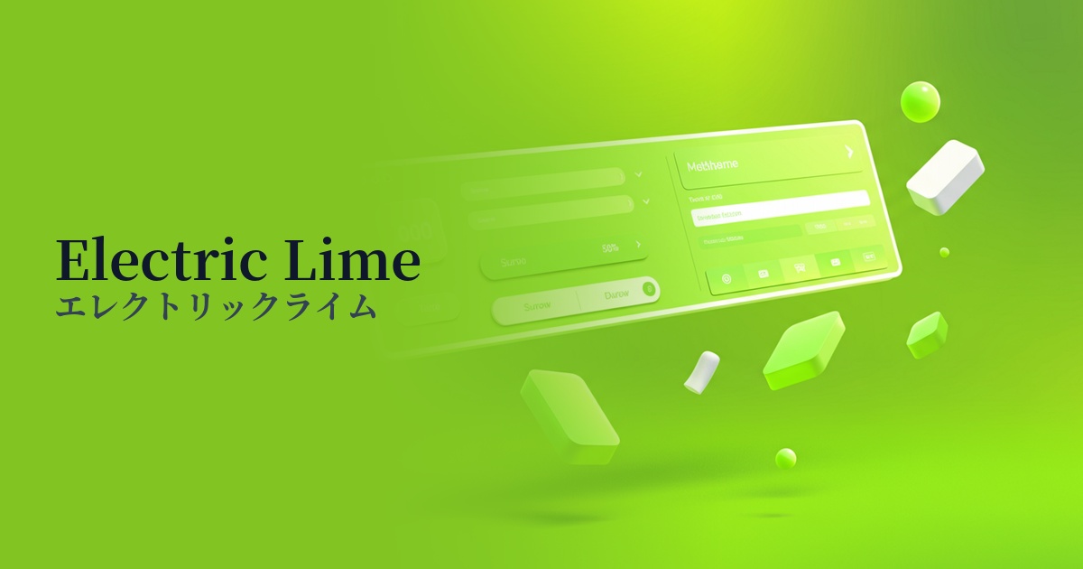
| English name | Electric Lime |
|---|---|
| Katakana | Electric Lime |
| HEX | #CCFF00 |
| RGB | 204, 255, 0 |
| Design Theme | Neon & Cyberpunk Colors |
Why is it a trend? (Background and reasons)
The rise of electric lime stems from the widespread adoption of concepts like technology, AI, and the metaverse, and the resulting dominance of a digital, futuristic worldview in design. This color plays a central role in aesthetics such as "cyberpunk" and "synthwave," which symbolize virtual spaces and digital art.
In today's information-saturated digital environment, the ability to instantly capture a user's attention is crucial. Electric Lime's intense saturation and brightness stand out from other elements, making it a powerful tool in branding and marketing. It is increasingly being adopted by technology companies and creative services that want to showcase their innovativeness.
Furthermore, the resurgence of appreciation for the retro-futuristic worldview depicted in the 1980s and 90s is also contributing to the popularity of this color. Its unique atmosphere, where nostalgia and novelty coexist, is providing fresh inspiration to creators and users of all generations.
The psychological effects of design and UX
Electric Lime strongly conveys impressions of "energy," "innovation," and "pioneering spirit." It is effective in building a futuristic and bold brand image that is not bound by conventional thinking. It can create a sense of anticipation in users that "something new is about to begin."
In UI/UX design, the most significant psychological effect of this color is its "attention-grabbing" ability due to its high visibility. Using it for CTA buttons that prompt users to take specific actions, important notifications, and indicators that show an active state supports intuitive operation and can lead to improved conversion rates.
On the other hand, because it's a color that doesn't easily exist in nature, it also gives off an "artificial" or "digital" impression. This characteristic makes it very compatible with content themed around technology or virtual reality. Depending on how it's used, it can also create a slightly rebellious and playful atmosphere.
Visibility testing (UI component example)
Practical usage (best practices)
The most effective way to use it is as an accent color against dark, achromatic backgrounds such as dark gray or off-black. By limiting its use to interactive elements such as CTA buttons, icons, links, and loading bars, its vibrancy stands out and naturally guides the user's eye.
It's also effective to incorporate it partially into the hero section or key visuals that determine the first impression of a website. Instead of using it entirely, highlighting parts of the typography or arranging it as a geometric graphic element will create a modern and impactful design.
In SaaS dashboard and data visualization design, colors are used to highlight important metrics and alerts. However, it's crucial to consider color vision diversity and design the system so that information is conveyed not only through color but also through shapes and icons.
Due to its high brightness, it should be avoided when used as a background color or body text color for large areas. It can strain the user's eyes and significantly reduce readability. If you need to overlay text, choose a bold, large black font that meets WCAG contrast standards.
Recommended color scheme suggestions
Charcoal (#36454F)
When combined with dark charcoal, the vibrancy of electric lime is maximized. This color scheme is ideal for creating a futuristic and sophisticated cyberpunk world and building a highly visible UI.
Fuchsia (#FF00FF)
The combination with vibrant fuchsia evokes 80s synthwave, creating a bold and energetic impression. It's recommended for creative projects that want to balance playfulness and cutting-edge design.
Gainsboro (#DCDCDC)
Using Electric Lime as an accent against a bright Gainsboro background creates a clean, modern tech site impression. It effectively highlights key elements within a minimalist layout.