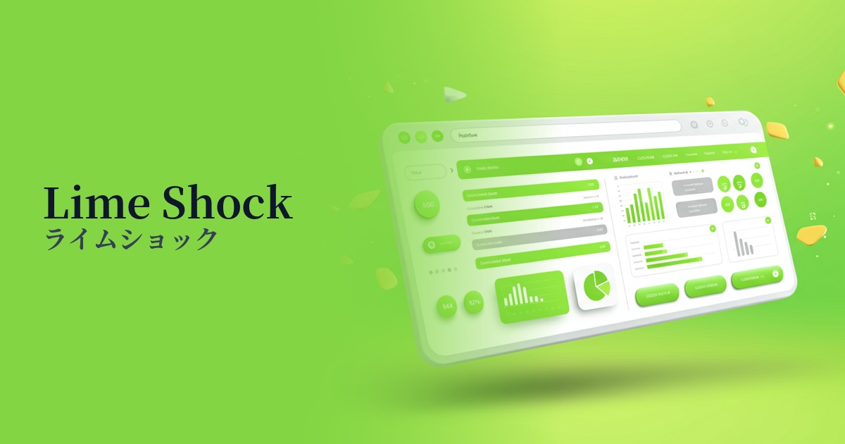
| English name | Lime Shock |
|---|---|
| Katakana | Lime Shock |
| HEX | #AEFF00 |
| RGB | 174, 255, 0 |
| Design Theme | Neon & Cyberpunk Colors |
Why is it a trend? (Background and reasons)
The trend of vibrant neon colors, like those seen in Lime Shock, stems from technological advancements and a growing interest in future-oriented design. Cultures such as the metaverse, AI, and cyberpunk are having a significant impact on the creative scene, and these colors are gaining attention as symbols of a digitally advanced worldview.
Another major factor is the revival of Y2K fashion and rave culture from the late 90s and early 2000s. Neon colors are being re-evaluated as key colors when incorporating the pop and energetic atmosphere of that era into modern designs. This nostalgic yet fresh sensibility is particularly popular among younger generations.
In today's information-saturated world, capturing users' attention on digital content is a crucial challenge. High-saturation, highly visible colors like lime shock have an overwhelming presence on screen. For this reason, they are being adopted by many companies and creators as a strategic move to improve brand awareness and increase engagement.
The psychological effects of design and UX
Lime Shock evokes a strong sense of energy and vitality in viewers. Its extremely bright and vibrant colors symbolize youthfulness, freshness, and positive energy. It is effective for branding fitness apps that want to give users an active impression, or for startups that are showcasing innovative ideas.
The artificial, light-like hues characteristic of neon colors are strongly associated with concepts such as "advancement" and "technology." Using them in technology companies with a futuristic vision, or in SaaS dashboards, can intuitively convey the innovative image of a service.
In UI/UX design, this color has a powerful "attention-grabbing" and "eye-tracking" effect. Because it is very noticeable, using it for CTA buttons, important notifications, and error messages can reliably direct the user's attention to specific elements. However, overuse can lead to visual fatigue, so the general rule is to use it only on important points.
Visibility testing (UI component example)
Practical usage (best practices)
One of the most effective uses is as a Call To Action (CTA) button. Especially when used in a dark mode UI or a minimalist design based on neutral colors, the button stands out, naturally guiding users to click. This is a crucial technique that directly leads to improved conversion rates.
It's recommended to use it as an accent color rather than as the main color for the entire site. By limiting its use to an area of approximately 2-51 TP3T, such as a portion of the logo, icons, heading decorations, or hover effects, it creates a sophisticated impact and rhythmic feel in the overall design.
If you want to strongly emphasize your brand's individuality, one approach is to use it boldly in the hero area or key visuals. This is especially effective for youth-oriented fashion brands, music events, and creative portfolio websites, as it can create a powerful first impression and build a unique worldview.
Because it is a very bright color, special attention must be paid to accessibility. For example, if you place white text on a Lime Shock background, the contrast ratio will be insufficient and it will be difficult to read. To meet WCAG standards, when using it as a background, use very dark colors such as black or dark blue for the text, and when using it as text, choose a dark background color.
Recommended color scheme suggestions
Charcoal (#36454F)
Placing Lime Shock against a dark charcoal gray background maximizes its vibrancy. This combination creates a modern and sophisticated impression while maintaining high visibility, making it ideal for technology websites and dark mode UIs.
Deep Pink (#FF1493)
The combination with vibrant deep pink creates a bold and energetic impression reminiscent of the 80s and cyberpunk. It's recommended for event websites, fashion brands, and other designs that want to strongly express individuality, allowing you to create a playful and imaginative world.
Alice Blue (#F0F8FF)
Using a clean, slightly bluish Alice Blue as a base and accenting it with Lime Shock creates a fresh, light, and modern impression. It's perfect for adding a touch of edge to a minimalist design.