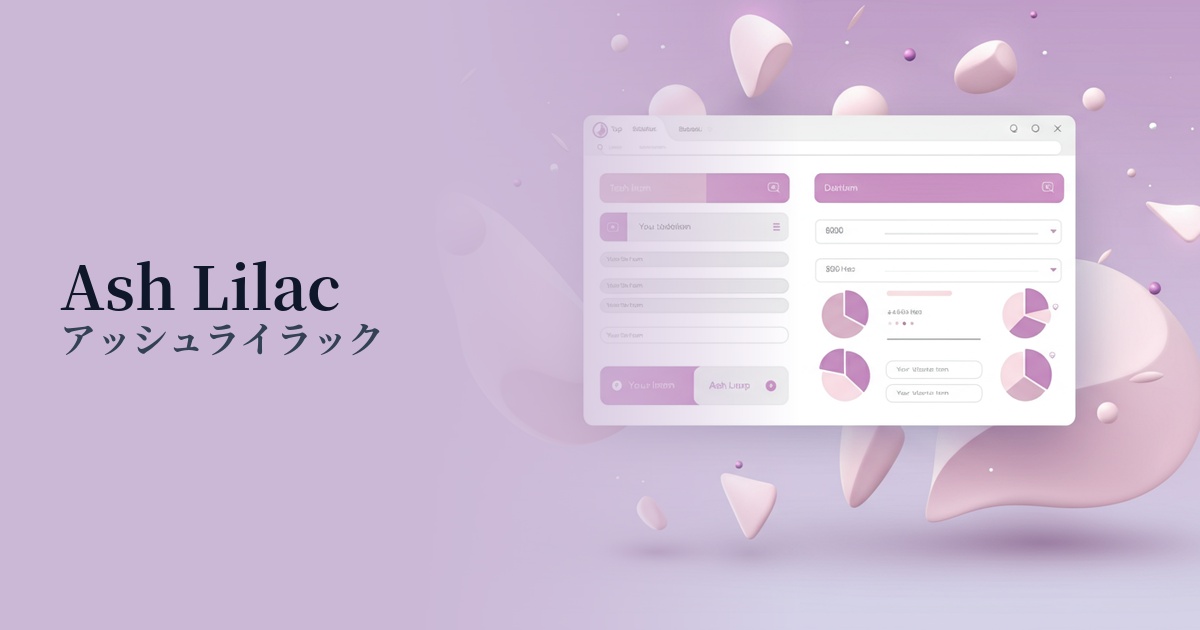
| English name | Ash Lilac |
|---|---|
| Katakana | Ash Lilac |
| HEX | #C8C0D0 |
| RGB | 200, 192, 208 |
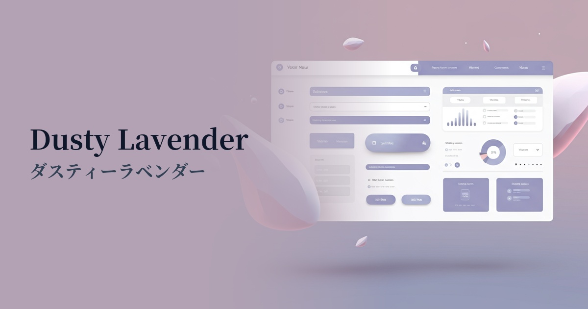
| Design Theme | Muted colors & earth tones |
Why is it a trend? (Background and reasons)
In recent years, muted colors and earth tones have become a major trend in web design, as they evoke a sense of comfort and ease for users. With increasing time spent interacting with digital devices, there is a growing preference for interfaces that are easy on the eyes and create a calming impression. Ash lilac is one of the symbolic colors that embodies this trend.
Ash Lilac (#C8C0D0) is an exquisite nuanced color that combines the elegance of lilac with the calming effect of gray. While not flashy, its quiet and sophisticated atmosphere resonates deeply with users in today's information-saturated world. Its ability to balance organic warmth with digital cleanliness makes it suitable for a wide range of design genres.
It pairs particularly well with minimalism and clean design styles. Using ash lilac in layouts that utilize negative space adds depth and a refined touch to the room. More than just a neutral color, it's an emotionally resonant color that expands the range of expression for designers.
The psychological effects of design and UX
Ash lilac combines the "creativity" and "mystery" of purple with the "neutrality" and "calmness" of gray. This creates an impression of intelligence and sophistication on the user while also providing a sense of psychological tranquility. In UI/UX design, it helps users relax and focus on the content.
This color also helps to cultivate a sense of trust and stability. Its muted, understated tone is suitable for conveying honesty and high quality, making it particularly effective in gaining user trust on websites dealing with high-priced services or specialized information.
Another key feature is its genderless appeal. Because it's less sweet than traditional lavender, it creates a modern and stylish aesthetic that appeals to both men and women. It's a color that perfectly matches the modern brand image that values diversity.
Visibility testing (UI component example)
Practical usage (best practices)
Using it as a background color across a wide area brings a calm and unified atmosphere to the entire site. Compared to white or light gray backgrounds, it is easier on the eyes and creates an interface that is less tiring to view for extended periods. Using dark gray or black for text improves readability.
In minimalist designs, it works effectively as an accent color. In layouts based on white and beige, using ash lilac for buttons, icons, or specific headings creates an elegant pop of color that naturally guides the user's eye.
It's ideal for the UI of services users use daily, such as SaaS dashboards and management screens, and wellness apps. The calm color scheme doesn't interfere with operation, providing an environment where users can easily concentrate on their tasks. In particular, using it in parts of graphs and status displays can present information in a sophisticated way.
Using it as a background color for card-type UIs or for strip-shaped areas to separate sections creates visual rhythm and depth on the page. It helps create soft boundaries between elements and helps organize the information structure clearly.
Recommended color scheme suggestions
Charcoal (#36454F)
When combined with a deep charcoal color, the elegance of ash lilac is further enhanced. It creates a modern and sophisticated impression while ensuring text readability, making it ideal for content-heavy websites and portfolios.
Marigold (#EAA221)
This color scheme combines calming ash lilac with warm marigold accents. It brings a lively and positive atmosphere to a static impression, making it effective for attracting user attention, such as with CTA buttons.
Antique White (#FAEBD7)
By combining it with warm antique white, it creates an overall soft, natural, and comfortable space. It's ideal for lifestyle brands, cosmetics, and interior design websites, as it instills a sense of reassurance in users.