| English name | Primary Blue |
|---|---|
| Katakana | Primary Blue |
| HEX | #2563EB |
| RGB | 37, 99, 235 |
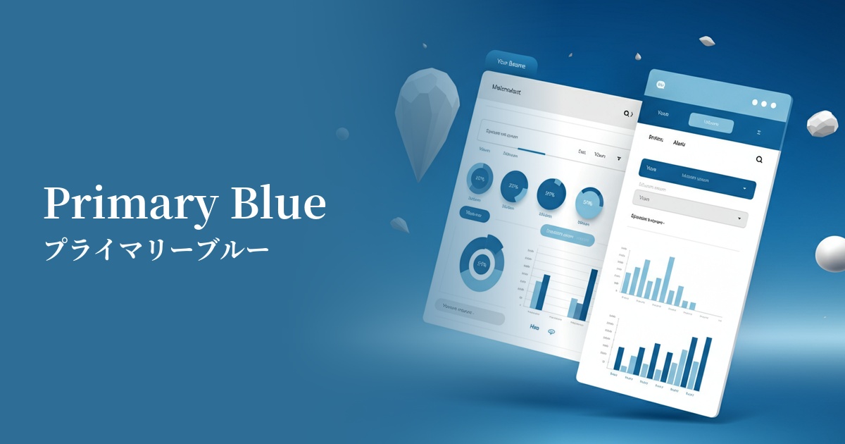
| Design Theme | UI System & Alert Colors |
Why is it a trend? (Background and reasons)
With the recent increase in SaaS and B2B technology services, there is a growing need to convey "trust," "stability," and "professionalism" to users. Primary blue is a color that can intuitively express these values and is therefore used as the base color or accent color in many digital products.
Furthermore, in this digital-first era, clarity of information on screen is paramount. This vibrant, clear blue provides excellent contrast against a white background, helping to ensure the visibility of UI elements such as text, icons, and buttons. This allows users to quickly and accurately recognize information, forming the foundation for a superior user experience (UX).
Furthermore, the growing interest in Web Accessibility (WCAG) is another reason for choosing this color. Because it easily ensures sufficient contrast, it contributes to creating interfaces that are comfortable for a wider range of people, including users with visual impairments and the elderly.
The psychological effects of design and UX
Primary Blue conveys positive impressions to users, such as "trust," "integrity," and "safety." Therefore, it is frequently used on websites and applications for services where reliability is essential, such as financial institutions, healthcare, and public organizations.
At the same time, it evokes images of "intellectual," "advanced," and "efficient." Because of these characteristics, it is used as a color to symbolize innovation in the branding of IT companies and SaaS products that deal with cutting-edge technology.
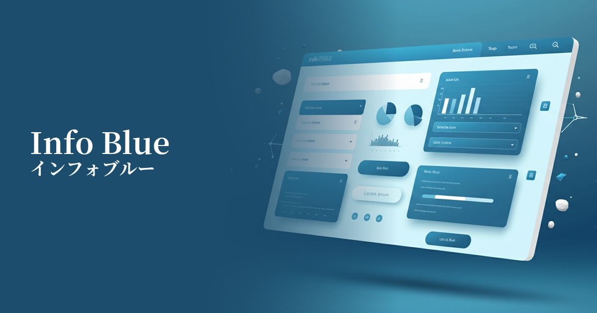
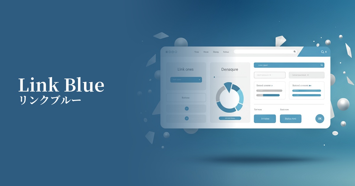
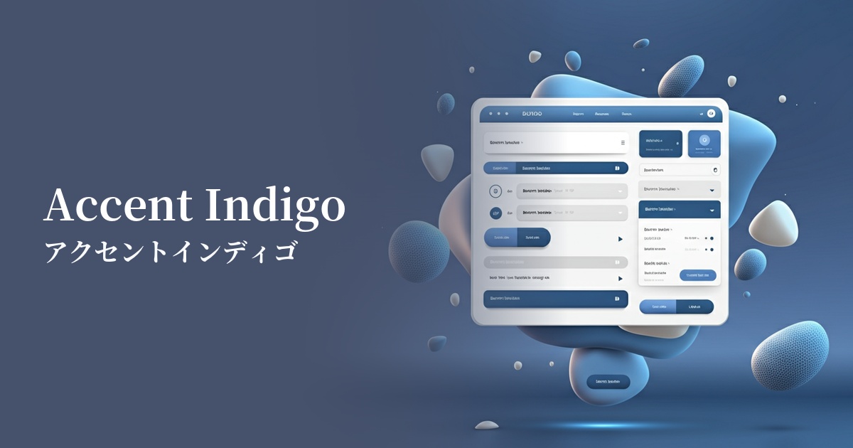
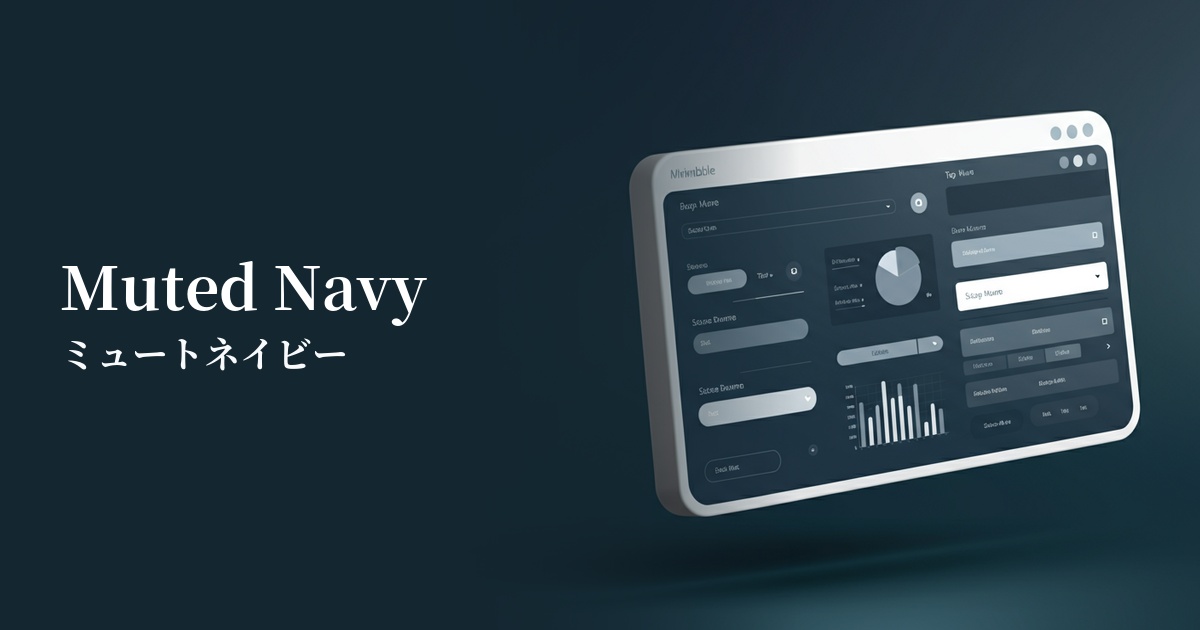
From a UI/UX perspective, it has a psychological effect of calming users and allowing them to concentrate on the task. In particular, it plays a role in reducing the cognitive load on users and supporting smooth operation in dashboards and analytical tools that contain a lot of information.
Visibility testing (UI component example)
Practical usage (best practices)
This color is ideal for Call To Action (CTA) buttons that prompt the most important action. Using this color for buttons such as "Register," "Purchase," and "Contact Us" will attract user attention and lead to improved conversion rates.
Because it is widely recognized as the standard color for hyperlinks on the web, using it in link text allows users to intuitively understand that it is a "clickable element." It is very effective in ensuring basic usability.
In SaaS application dashboards and admin screens, it can be used to clearly indicate where the user is currently interacting by showing selected menu items, active tabs, and focus indicators during form input.
Using it as a key color throughout your site, including your logo, header, and footer, helps build a consistent and powerful brand image. Depending on how you combine it with other colors, it can convey both a cutting-edge and a sincere impression.
This color is effective when used to highlight specific important data in data visualizations such as graphs and charts. When combined with other neutral colors, it naturally guides the user's gaze to the intended area.
Recommended color scheme suggestions
Gainsboro (#DCDCDC)
This combination enhances the vibrancy of primary blue while conveying a clean and trustworthy impression. It's an ideal choice for minimalist designs that utilize white space, or for corporate websites where you want to express integrity.
Marigold (#EAA221)
This color scheme uses complementary colors that enhance each other, creating an energetic look. It's recommended for situations where you want to create a positive and lively atmosphere, such as notifications that strongly attract user attention or limited-time campaign banners.
Charcoal (#36454F)
The reliability inherent in blue, combined with the gravitas of charcoal gray, creates a highly sophisticated and professional impression. It effectively highlights important information within a calm and composed atmosphere in SaaS UIs and data visualization dashboards.