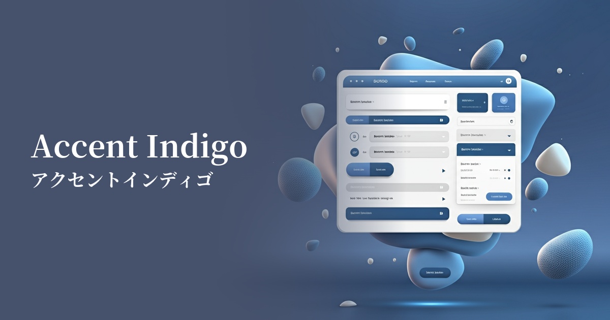
| English name | Accent Indigo |
|---|---|
| Katakana | Accent Indigo |
| HEX | #6366F1 |
| RGB | 99, 102, 241 |
| Design Theme | UI System & Alert Colors |
Why is it a trend? (Background and reasons)
The recent acceleration of digital transformation (DX) has led to a surge in technology-based services such as SaaS and fintech. Consequently, there is a growing demand for color schemes that convey both "trustworthiness" and "innovation" to users. Accent indigo, combining the reliability of blue with the creativity of purple, is attracting attention as an ideal color for this modern brand image.
Another major factor is the growing interest in web accessibility. This color makes it easy to ensure sufficient contrast against white or light gray backgrounds, allowing you to build a visually appealing UI while meeting WCAG standards. It is particularly effective in improving the visibility of important buttons and links.
The rise of dark mode is also boosting the trend of accent indigo. This color looks beautiful against a dark background, effectively highlighting important information and interactive elements. It is increasingly being adopted as a key color in modern, sophisticated UI design that balances functionality and aesthetics.
The psychological effects of design and UX
Accent Indigo evokes the psychological effects of blue, such as "trust," "stability," and "integrity," in the user. This provides a sense of security, especially in products where gaining user trust is crucial, such as financial services and B2B SaaS.
At the same time, the purplish hue evokes impressions of "creativity," "innovation," and "intelligence." This color, distinct from ordinary blue, helps to express innovative technology and a future-oriented brand image.
From a UI/UX perspective, its high visibility effectively guides the user's attention. Its vibrant yet eye-friendly design naturally leads users to important information and the next action they should take without causing fatigue. Using it in CTA buttons, for example, can effectively encourage positive actions.
Visibility testing (UI component example)
Practical usage (best practices)
The most effective use case is as a CTA (Call to Action) button. Applying it to buttons such as "Start Free Trial" or "Add to Cart" on landing pages and e-commerce sites strongly attracts the user's attention and contributes to improving conversion rates.
It's also ideal for dashboards of SaaS products and management tools. By using it for active navigation menus, key data points in graphs, and badges indicating new notifications, you can create an interface that allows users to quickly understand information and interact with it intuitively.
It's also effective as feedback for interactive elements. Using it for text link colors, focus rings during form input, and button hover effects clearly indicates responses to user actions, improving usability.
Using it consistently throughout your website as a key accent color for your brand is also a good approach. Subtly incorporating it into parts of your logo, icons, or section dividers can add sophistication and individuality to a minimalist design based on white or gray.
Recommended color scheme suggestions
Alice Blue (#F0F8FF)
The combination with a very bright, bluish-white creates a clean and modern impression. The vividness of the accent indigo stands out, making it ideal for SaaS UIs and corporate websites where reliability is paramount. It provides users with a refreshing and reassuring experience while maintaining high readability.
Marigold (#FFC30B)
The combination with a vibrant yellow, which is close to its complementary color, creates an energetic, memorable, and dynamic impression. It is effective in expressing playfulness and vitality in campaign websites or creative portfolios where you want to strongly attract user attention.
Charcoal (#36454F)
This sophisticated combination is designed for use in dark mode. The accent indigo glows beautifully against the deep charcoal gray background, creating a futuristic and luxurious feel. Ideal for tech services and entertainment media.