| English name | Beted Navy |
|---|---|
| Katakana | Mute Navy |
| HEX | #596778 |
| RGB | 89, 103, 120 |
| Design Theme | Muted colors & earth tones |
Why is it a trend? (Background and reasons)
In recent years, web design has seen a shift from bright, assertive colors to colors that are gentle on the eyes and create a pleasant impression. Mute navy has gained attention amidst this trend of emphasizing "digital wellness" and "minimalism."
This color retains the "reliability" and "intelligence" inherent in navy, while the addition of a muted, gray-like tone creates a softer, more sophisticated atmosphere. It's not flashy, but it instills a sense of security in users and helps them focus on the content, making it suitable for modern websites with a large amount of information.
In particular, its exquisite balance of professionalism without being overly formal is the reason why it is widely adopted for B2B SaaS products, corporate websites where trustworthiness is crucial, and brand websites that want to express a sophisticated worldview.
The psychological effects of design and UX
Muted navy evokes psychological effects such as tranquility, calmness, and stability in the user. Unlike the "advanced" and "fresh" feel of bright blue, it gives a deeper, more introspective, and thoughtful impression.
From a UI/UX perspective, this color has the advantage of reducing the user's visual burden and making it less tiring to use for extended periods. Therefore, it is very effective as a background color for dashboards where concentration is required, or for article content that you want users to read carefully.
Furthermore, because it is a color that conveys trustworthiness and integrity, incorporating it into the UI design of services where user trust is essential, such as finance, healthcare, and education, can lead to an improved brand image.
Visibility testing (UI component example)
Practical usage (best practices)
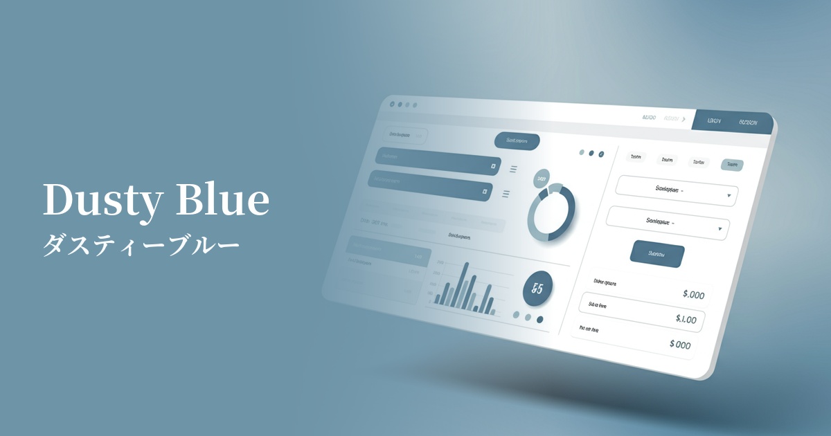
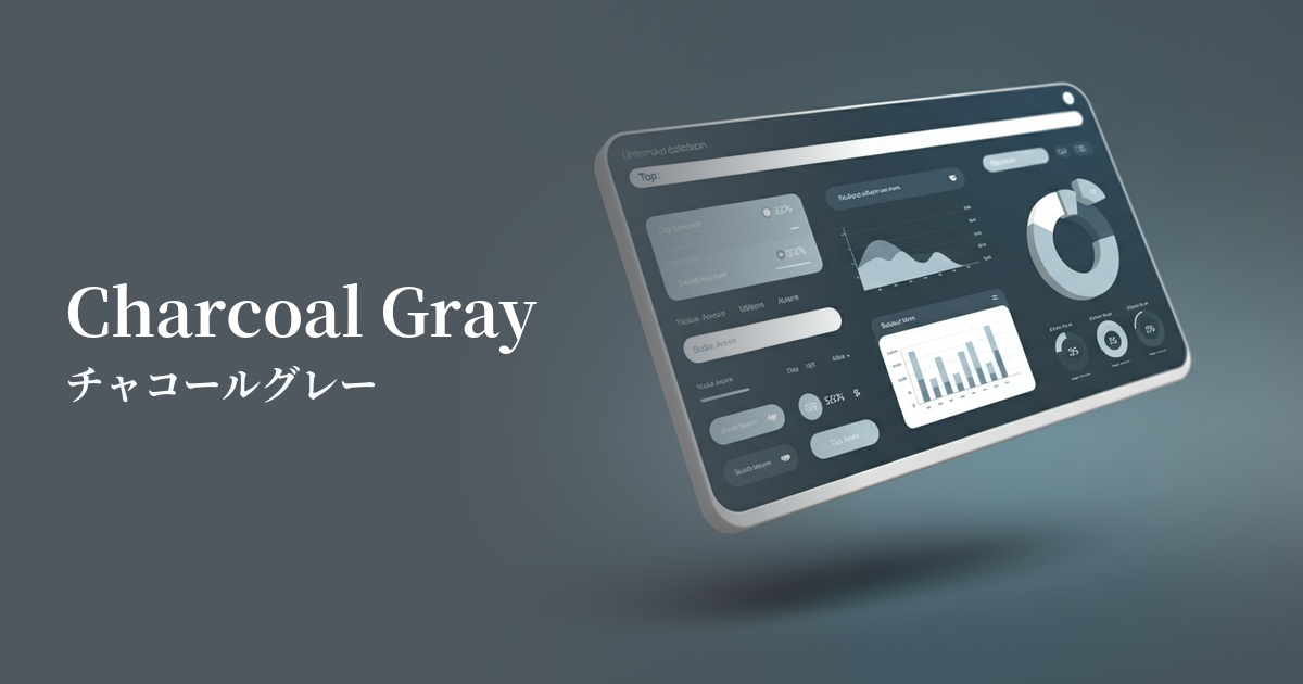
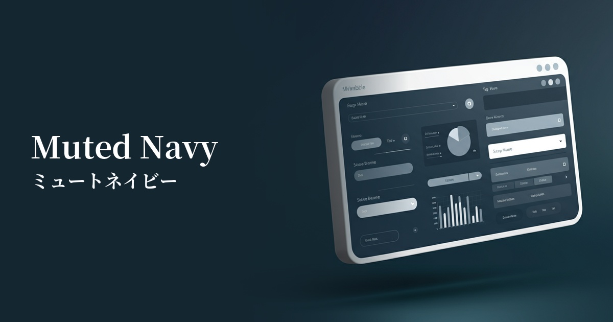
It's ideal for dashboards of SaaS products and business systems. Using it as a background color helps highlight important information elements such as graphs and notifications, helping to keep users focused.
Using this color as the main color on corporate websites and consulting firm websites can build a professional and trustworthy corporate image. Combining it with white text is a classic combination that offers high visibility.
Using this color as the background for the main visual on a landing page (LP) will make the catchphrase and product image stand out. It is especially well-suited for products where you want to convey a sense of luxury or expertise.
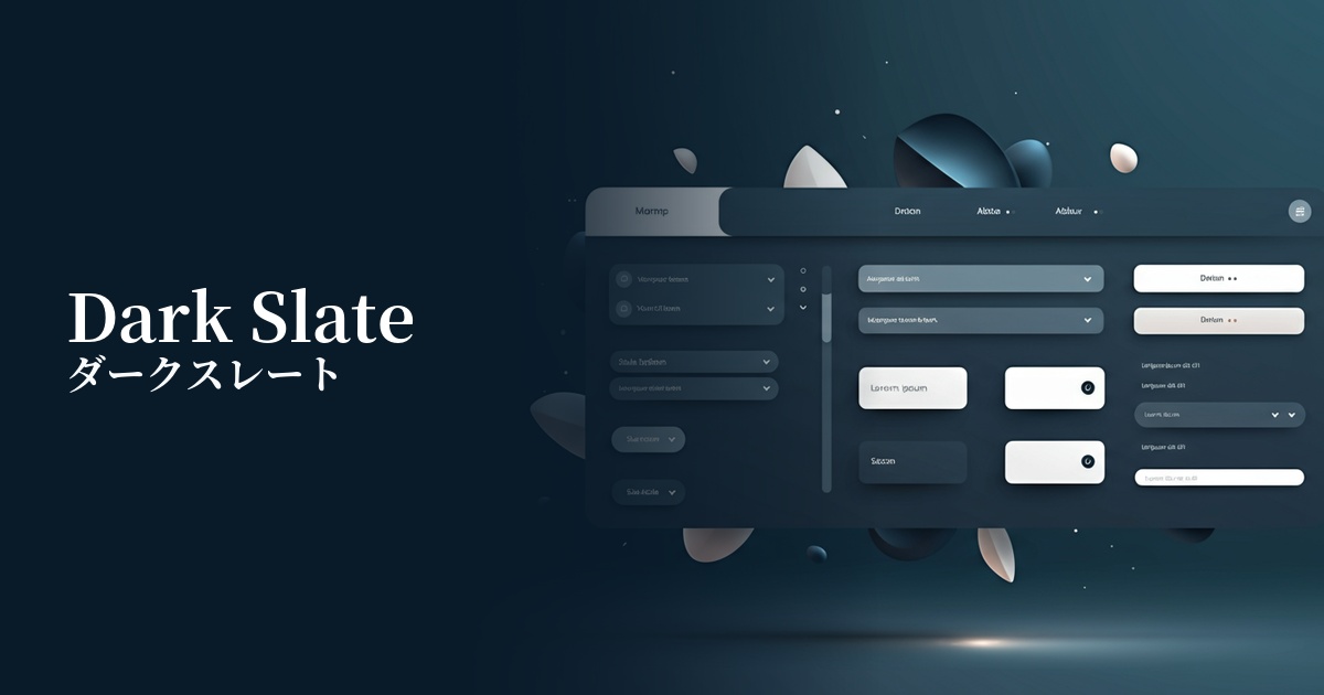
When considering a dark mode design, using muted navy as the base color instead of pure black (#000000) can soften the contrast and create a more eye-friendly, modern dark UI.
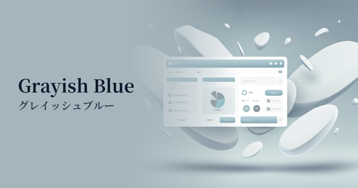
In designs based on light beige or off-white, using this color as an accent for buttons, links, and headings is also effective. It tightens the overall design and gives it a calm, intellectual feel.
Recommended color scheme suggestions
Sandy Brown (#F4A460)
The calm impression of muted navy, combined with the warmth of sandy brown, creates a friendly and trustworthy atmosphere. This color scheme is recommended for natural and organic products, as well as lifestyle services.
Antique White (#FAEBD7)
When combined with the soft, elegant white of antique white, it creates a very sophisticated and clean impression. This combination is ideal for minimalist designs, brand websites, portfolios, and other applications where you want to convey a sense of luxury.
Coral (#FF7F50)
By using a vibrant coral accent against a calm, muted navy background, this design effectively captures the user's attention. When used for CTA buttons or important notifications, it tightens up the overall design and adds a sense of vitality.