| English name | Dark Slate |
|---|---|
| Katakana | Dark Slate |
| HEX | #334155 |
| RGB | 51, 65, 85 |
| Design Theme | UI System & Alert Colors |
Why is it a trend? (Background and reasons)
In recent web design trends, nuanced dark colors are preferred over pure black (#000000). Dark slate is a softer, slightly bluish gray than black, reducing eye strain even during prolonged viewing. This characteristic significantly improves the user experience, especially in dark mode interfaces.
This color strongly evokes impressions of professionalism, stability, and reliability. Therefore, it is increasingly being adopted in fields where trustworthiness is paramount, such as financial services, SaaS platforms, and B2B corporate websites. While not flashy, its understated presence quietly conveys the quality of the product or service.
One of the appeals of dark slate is its overwhelming versatility. When used as a background color, it enhances the content, and when used as a text color, it ensures high readability. Furthermore, because it harmonizes with a wide range of colors, from vibrant accent colors to soft pastel colors, it can refine the overall tone without sacrificing design freedom.
The psychological effects of design and UX
Dark slate conveys a sense of "trust" and "expertise" to users. This color, which combines calmness and gravitas, enhances the credibility of information and gives users a sense of security. In UI design, using it for important operations and settings screens encourages careful user behavior and provides a stable user experience.
Unlike black, the bluish tint is less oppressive and has a psychological effect of calming the user's mind and encouraging focus on content. When used in dashboards and analytics tools with a large amount of information, it reduces visual noise, making it easier for users to concentrate on their tasks.
This color expresses a modern and restrained "elegance." When combined with a minimalist design that eliminates excessive ornamentation, it creates a sophisticated and luxurious feel. It is a very effective color when you want to add keywords such as "intellectual," "sincere," and "progressive" to your brand image.
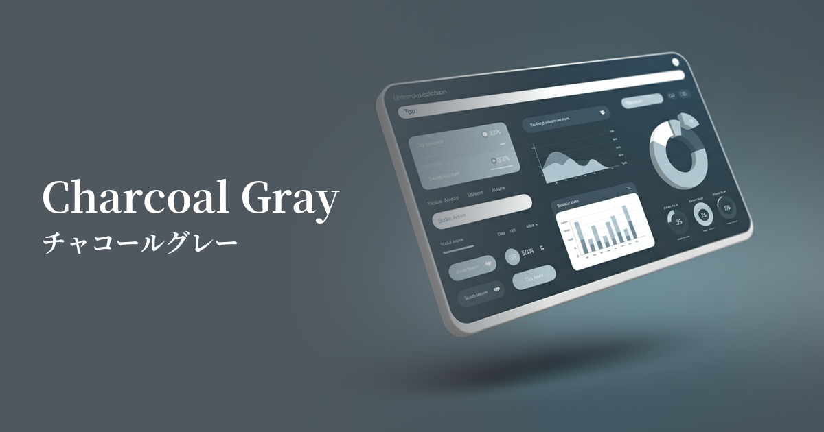
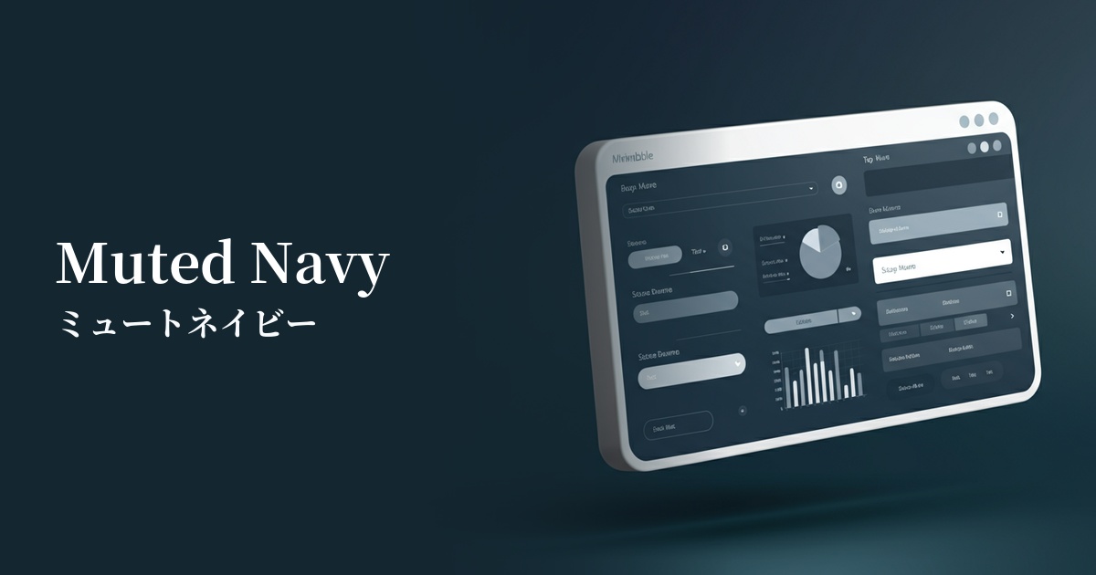
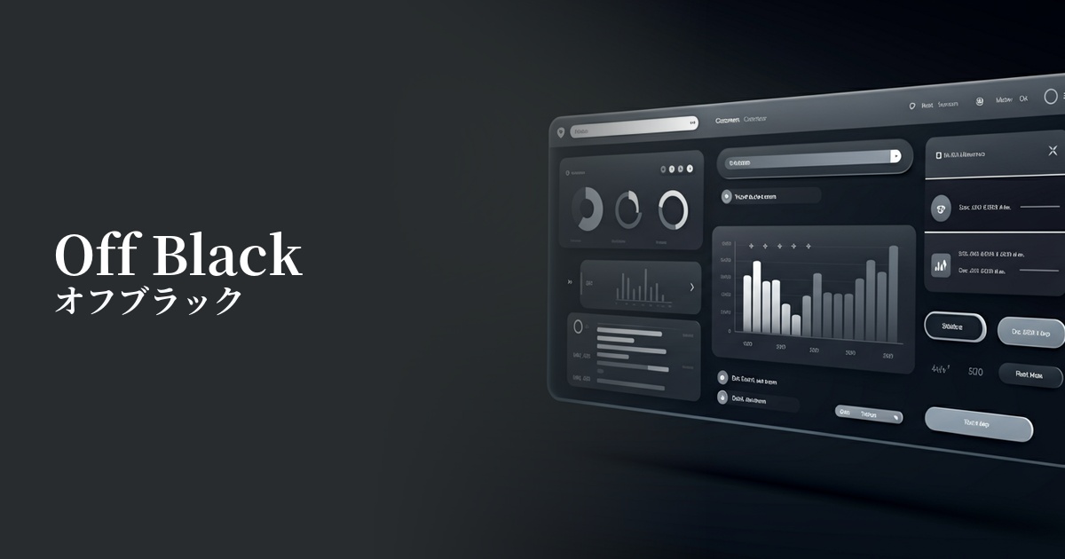
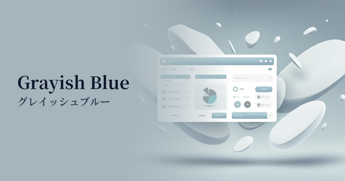
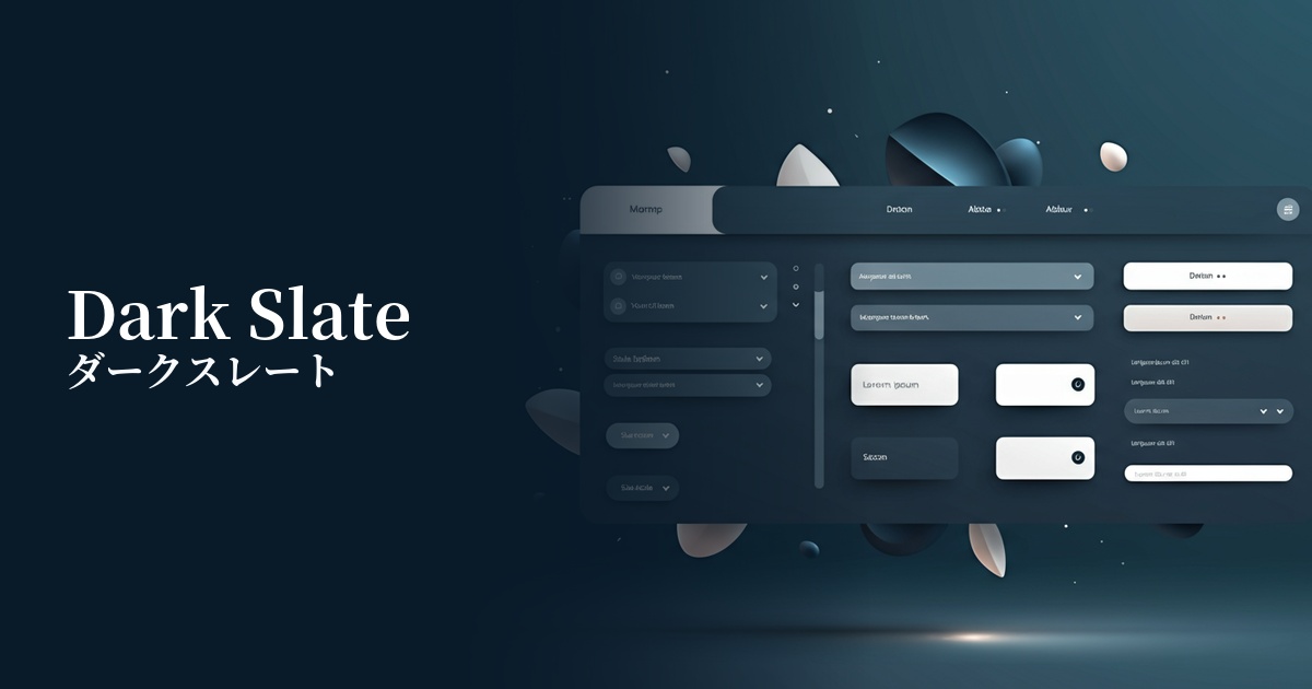
Visibility testing (UI component example)
Practical usage (best practices)
It's ideal as a base color for dark mode. Because it offers a milder contrast than pure black, it reduces eye strain while maintaining text readability. When combined with off-white or light gray text, it creates a comfortable UI that meets accessibility standards (WCAG).
By using this as the background color for sidebars, headers, and card components in SaaS dashboards and admin panels, you can bring structural clarity and professional consistency to the interface. This helps users organize information and efficiently complete tasks.
It's also effective to use it as the main text color or heading color on a white background, instead of black. It creates a slightly softer impression than black, transforming the overall feel of the page into something modern and sophisticated. This is especially useful when you want to enhance the design of long content without compromising readability.
While not the main call to action (CTA), it's suitable for second-tier action buttons that require certainty, such as "Save Settings" or "View Details." Placing it alongside buttons with bright accent colors intuitively communicates the priority of the action to the user.
Recommended color scheme suggestions
Giallo Ginestra (#FDD835)
This color scheme features a calm, dark slate base accented with vibrant yellow. It's ideal for CTA buttons and notification icons that you want to draw attention to, bringing vitality and attention to your design and effectively encouraging user action.
Steel Blue (#4682B4)
Dark slate and steel blue are a sophisticated combination that shares blue tones. They create a unified and calm impression, conveying reliability and professionalism on SaaS dashboards and corporate websites.
Cipria (#F4DDE2)
By adding the softness of powder pink to the rigid impression of dark slate, a modern and approachable atmosphere is created. This allows for the construction of a user-friendly UI design that is both tech-oriented and reassuring to users.