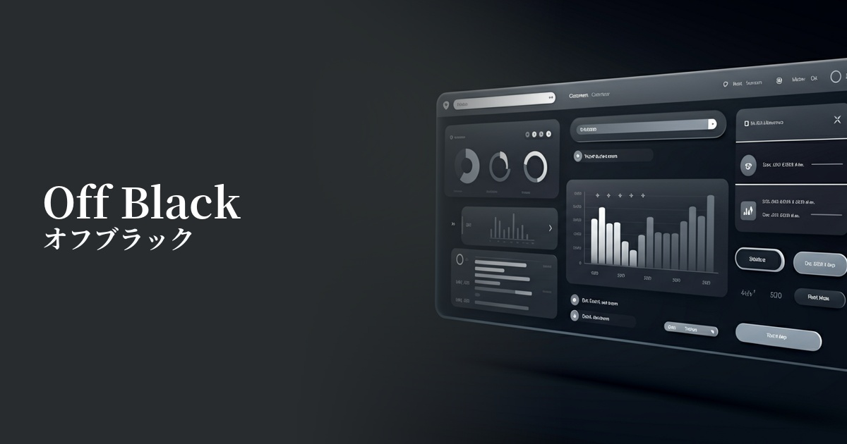
| English name | Off Black |
|---|---|
| Katakana | Off-black |
| HEX | #4A4A4A |
| RGB | 74, 74, 74 |
| Design Theme | Muted colors & earth tones |
Why is it a trend? (Background and reasons)
In recent years, there has been a growing trend in web design to avoid pure black (#000000). This is because, especially when combined with a white background, the contrast can be too strong, potentially causing a phenomenon called "halation" that strains the user's eyes. Off-black is being adopted to solve this problem and provide a more comfortable visual experience.
The widespread adoption of dark mode is a major factor in the rise of off-black as a trend. While a completely black background can sometimes make text and elements appear glaring, using off-black as the base color allows for a calm and sophisticated look while maintaining content visibility. It is considered one of the best options for designing eye-friendly dark UIs.
Furthermore, off-black is highly compatible with current design trends that favor natural and calming tones such as muted colors and earth tones. By combining off-black with these colors, you can unify the overall tone and create a modern, sophisticated, and comfortable design.
The psychological effects of design and UX
Off-black softens the impression of "strength" and "authority" that pure black conveys, giving a more nuanced impression of "sophistication," "elegance," and "modernity." It is effective in expressing understated quality in luxury brands and minimalist designs.
From a UI/UX perspective, this can be expected to reduce visual fatigue for users. Especially on websites with a lot of text content, using off-black for background and text colors reduces contrast, making it less tiring on the eyes even during prolonged viewing. This directly contributes to improved usability.
When used as a background color, it also has the power to enhance other colors. Vibrant accent colors and high-quality photos stand out more against an off-black background, naturally guiding the user's attention to the intended area.
Visibility testing (UI component example)
Practical usage (best practices)
The most common use is as the base color in the "dark mode" of websites and applications. Applying it to the entire background creates a calm and sophisticated interface.
It's also very effective when used as the body text color on a website with a white background. It creates a softer impression than pure black text, refining the overall look of the page without compromising readability.
When used as a background color for sidebars, footers, or card-type components, separate from the main content, it creates a visual hierarchy, adding depth and rhythm to the layout.
It's also ideal as a base color when combining it with accent colors for CTA buttons and icons. The calm off-black background makes vibrant colors look more appealing and effectively encourages user action.
Recommended color scheme suggestions
Navajo White (#FFDEAD)
Using the warm Navajo White font for text and accents makes it stand out against an off-black background, resulting in high readability and a sophisticated, refined impression. It's perfect for minimalist designs.
Coral (#FF7F50)
The calm off-black background, accented with vibrant coral, creates an energetic and modern atmosphere. It's particularly effective for attracting user attention when used in CTA buttons and similar elements.
Cadet Blue (#5F9EA0)
The sophisticated and calming Cadet Blue, when combined with off-black, creates a design that conveys reliability and stability. This color scheme is recommended for SaaS UIs and corporate websites.