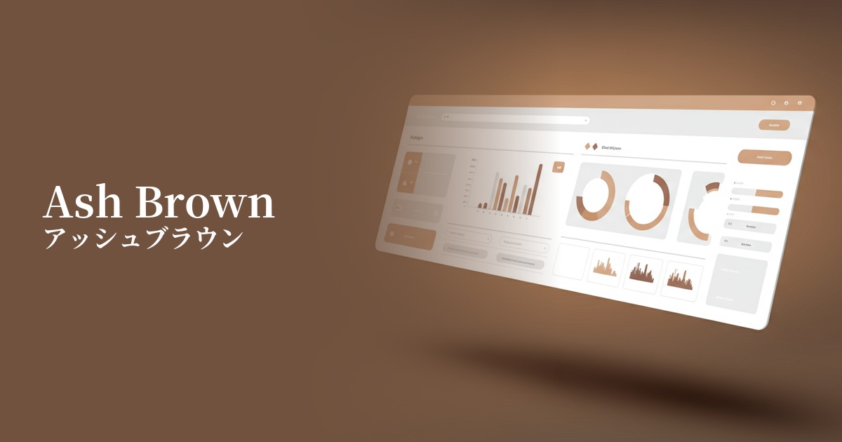
| English name | Ash Brown |
|---|---|
| Katakana | Ash Brown |
| HEX | #A18F83 |
| RGB | 161, 143, 131 |
| Design Theme | Muted colors & earth tones |
Why is it a trend? (Background and reasons)
In recent years, with the growing interest in sustainability and well-being in web design, earth tones that evoke nature have gained attention. Ash brown (#A18F83) is a color that gives a particularly urban and sophisticated impression. Its calm, grayish tone provides users with a sense of security while creating a modern and luxurious atmosphere, making it a popular choice for many brand websites and services.
Furthermore, in the information-saturated digital environment, users tend to seek visual comfort. Low-saturation, neutral colors like ash brown have the effect of allowing users to focus on content without being distracted by other elements. This color, which is minimalist yet warm, is ideal for relieving users' digital fatigue and creating a comfortable space that makes them want to stay longer. Its versatility in blending with any design is also a major reason why it is trending.
The psychological effects of design and UX
Ash brown combines the "stability" and "solidity" associated with brown with the "sophistication" and "neutrality" associated with gray. This creates a psychological effect that instills confidence and calmness in users, fostering a sense of security. It is particularly effective in situations where reliability is paramount, such as financial services and B2B platforms.
Low-saturation, gentle tones create an elegant and intellectual atmosphere. When used in luxury brands, art, or lifestyle media, they effectively convey a sophisticated worldview. While not flashy, they possess a quiet presence and enhance the overall quality of the design.
As an earth tone reminiscent of soil and wood in nature, it has a relaxing effect on users. Incorporating it into designs themed around mental and physical health, such as organic products, interiors, and wellness-related services, enhances its affinity with the concept.
Visibility testing (UI component example)
Practical usage (best practices)
The most effective use of this color is as a background color to highlight the main content. It's easier on the eyes than a pure white background and creates a warmer atmosphere. Be sure to pay close attention to the contrast ratio to ensure text readability.
It also works exceptionally well as a base color when combined with vibrant accent colors. The calm tone of ash brown highlights the vibrancy of the accent color, creating a sense of balance and definition in the overall design.
By using it on UI components such as buttons, cards, and forms, you can visually organize the hierarchy of information. In particular, when applied to inactive states or auxiliary information areas, it helps maintain consistency throughout the user interface without being overly assertive.
This is ideal for e-commerce sites, especially those selling organic cosmetics, handmade products, or high-quality furniture, as it allows you to build a unique brand identity. You can convey the texture and story behind your products to users through color.
Using it instead of black for headings and taglines creates a softer, more refined impression. However, using it in small body text may reduce readability, so it's important to consider the balance with font size and weight.
Recommended color scheme suggestions
Slate Blue (#6A5ACD)
The warmth of ash brown and the intellectual coolness of slate blue blend together to create a modern and trustworthy impression. This combination is ideal for creating a professional atmosphere in business websites and SaaS UIs.
Antique White (#FAEBD7)
The softness of antique white harmonizes with the calming tones of ash brown, creating a very comfortable and natural space. It adds warmth and gentleness to lifestyle brands and organic product websites.
Rosy Brown (#BC8F8F)
Combining ash brown with a similarly muted rosy brown creates a cohesive, elegant, and slightly sweet atmosphere. It adds a sophisticated femininity to cosmetics, fashion, and wedding-related designs.