| English name | Main Alert Red |
|---|---|
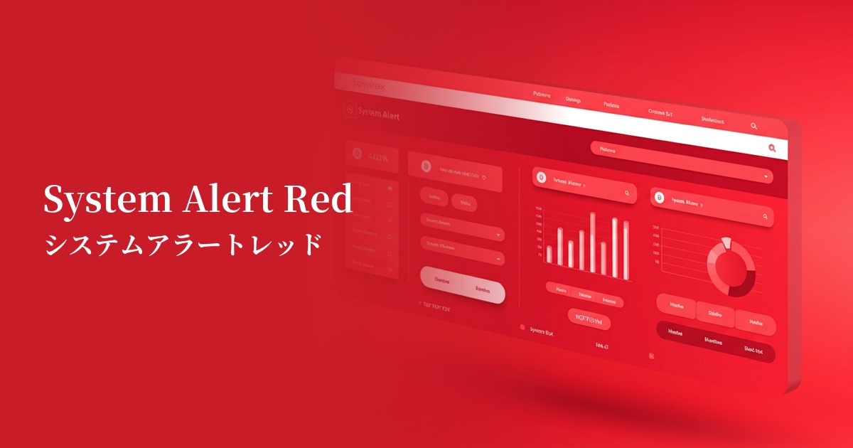
| Katakana | System Alert Red |
| HEX | #FF3131 |
| RGB | 255, 49, 49 |
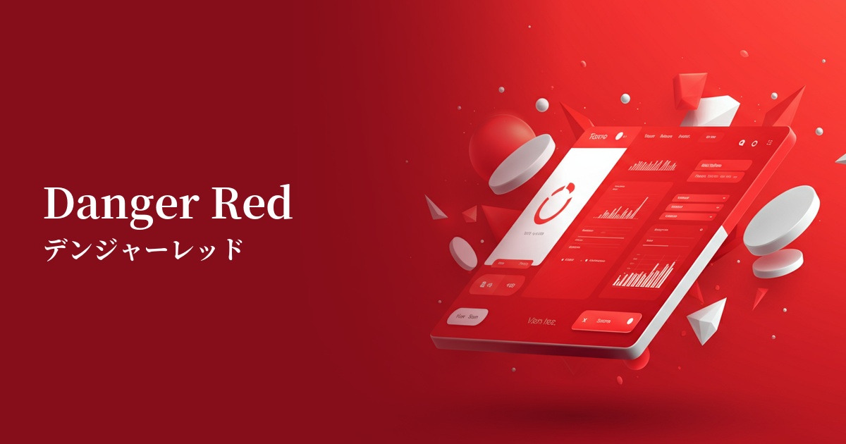
| Design Theme | Neon & Cyberpunk Colors |
Why is it a trend? (Background and reasons)
In recent years, the importance of quickly and clearly conveying information to users has increased in web design and UI design. In particular, in situations where it is necessary to reliably attract the user's attention, such as errors, warnings, and important notifications, there is a demand for highly visible colors such as system alert red.
Another contributing factor is the resurgence of 80s and 90s retro-futuristic and cyberpunk culture as design trends. This color strongly carries symbolic meanings such as "warning" and "danger" on digital screens, and because it gives a futuristic and functional impression, it is being adopted by many tech services and modern websites.
While clean and minimalist designs are prevalent, the technique of using vibrant colors as accents in specific areas is also gaining popularity. By introducing a single point of color into a quiet layout, you can guide the user's gaze to a specific location and effectively lead them to conversions or important actions.
The psychological effects of design and UX
The most powerful psychological effect of this color is "warning" and "danger." It intuitively draws the user's attention and acts as a sign urging careful judgment and action. It is very effective in error messages and deletion confirmation situations.
It also has the effect of conveying "urgency" and "immediacy." Using it for countdowns such as "only a few days left until the sale ends" or for displaying "limited stock" strongly encourages user action and helps prevent lost opportunities.
Because of its extremely high saturation and brightness, it attracts the user's attention more than any other color. This "high visibility" is its greatest asset in UI design, but overuse can stress the user, so its placement must be carefully chosen.
Depending on the context, it can also convey positive impressions such as "passion" or "energy." However, because it has a strong image as a warning color, it is important to harmonize it with the brand's message and the overall tone of the design.
Visibility testing (UI component example)
Practical usage (best practices)
This is ideal for form input errors and validation feedback. Use it for borders around fields where errors occurred and for error message text, so users can understand at a glance what needs to be corrected.
It's commonly used as a confirmation button for "destructive actions" that cannot be undone once performed, such as "deleting an account" or "permanently erasing data." It serves to convey the seriousness of the operation to the user and prevent unintentional errors.
This color looks particularly beautiful in dark mode UI design. The high contrast with a dark background creates a futuristic and sophisticated cyberpunk aesthetic, effectively highlighting key elements.
It's also effective as a badge to indicate important notifications or unread messages. Place it small on top of navigation menu icons or similar elements to ensure users don't miss important information.
Recommended color scheme suggestions
Charcoal (#36454F)
In dark mode UI, system alert red stands out vividly, emphasizing a futuristic feel. This combination is a surefire way to significantly improve visibility, making warnings and important notifications much easier for users to notice.
Gainsboro (#DCDCDC)
In a clean and modern UI, alert red clearly serves its role as a warning color without interfering with other elements. Gray subtly neutralizes the intensity of the red, resulting in a balanced design.
Alice Blue (#F0F8FF)
Combining it with a white background provides the clearest contrast, creating a clean and easy-to-understand impression. It's ideal for system screens where you want to convey information directly to the user, and for simple web applications.