| English name | Laser Red |
|---|---|
| Katakana | Laser Red |
| HEX | #FF0000 |
| RGB | 255, 0, 0 |
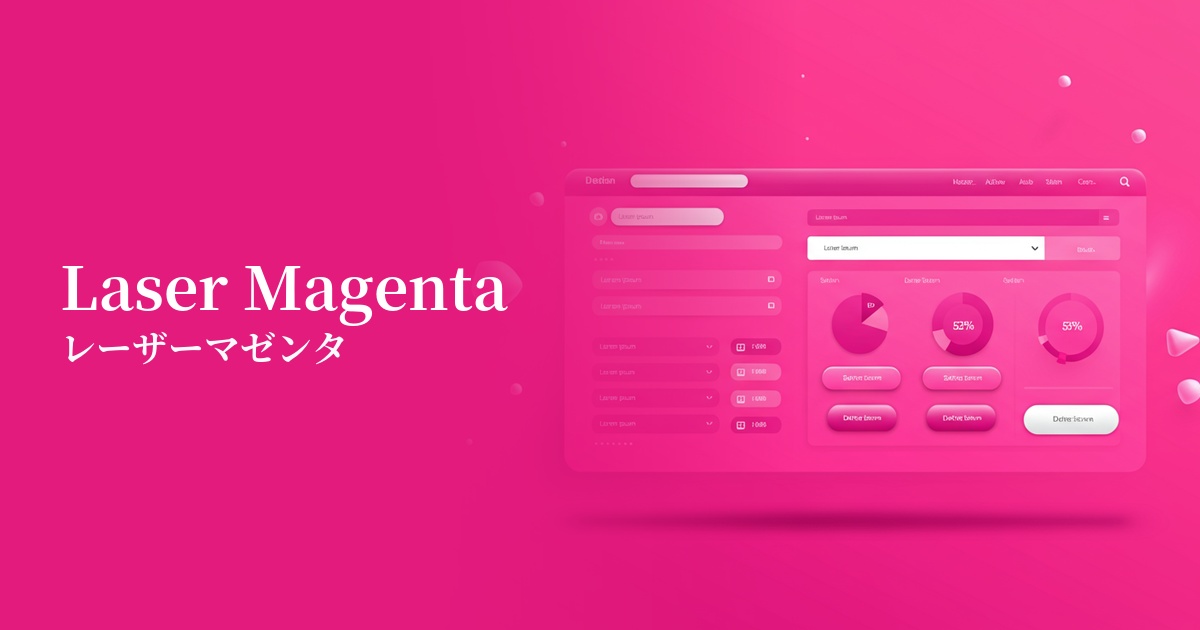
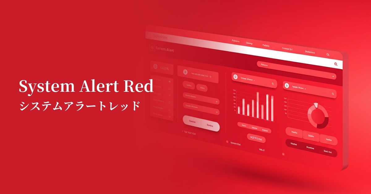
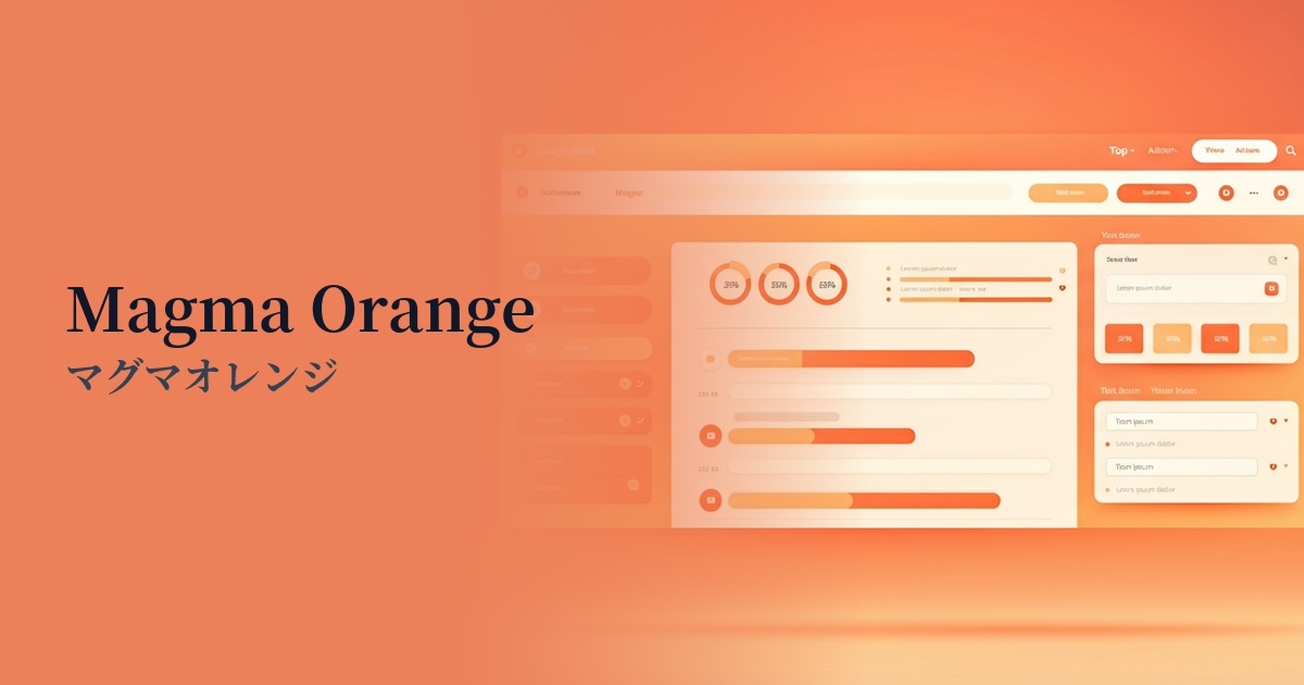
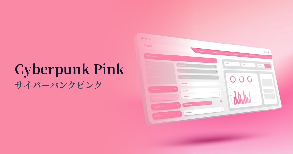
| Design Theme | Neon & Cyberpunk Colors |
Why is it a trend? (Background and reasons)
A major contributing factor is the resurgence of cyberpunk and retrofuturistic cultures in the world of entertainment and fashion. Neon colors, reminiscent of 1980s sci-fi movies and video games, give a fresh and exciting impression in contemporary digital expression.
Technological advancements, particularly the widespread adoption of dark mode, are expanding the opportunities for highly saturated colors like laser red. Because they appear to glow vividly against a dark background, they are favored in branding by startups and technology companies that want to emphasize a futuristic and cutting-edge image.
One contributing factor is the increasing number of platforms where visual impact is paramount, such as social media and video content. Laser Red has become a highly effective choice for instantly capturing users' attention and creating memorable, impactful visuals.
The psychological effects of design and UX
Laser Red is a color that evokes very strong emotions such as energy, passion, excitement, and danger. Its vividness forcibly attracts the user's attention and acts as a powerful trigger to motivate action.
In UI/UX design, these are ideal for elements that require immediate recognition and action from the user, such as warnings, errors, and urgent notifications. However, because of their intensity, overuse can cause stress and fatigue in the user, so their placement must be carefully considered.
In a positive context, it symbolizes forward-thinking, innovation, and speed. Especially in gaming, entertainment, and technology-related services, it helps instill a brand image of being "futuristic" and "exciting" in users.
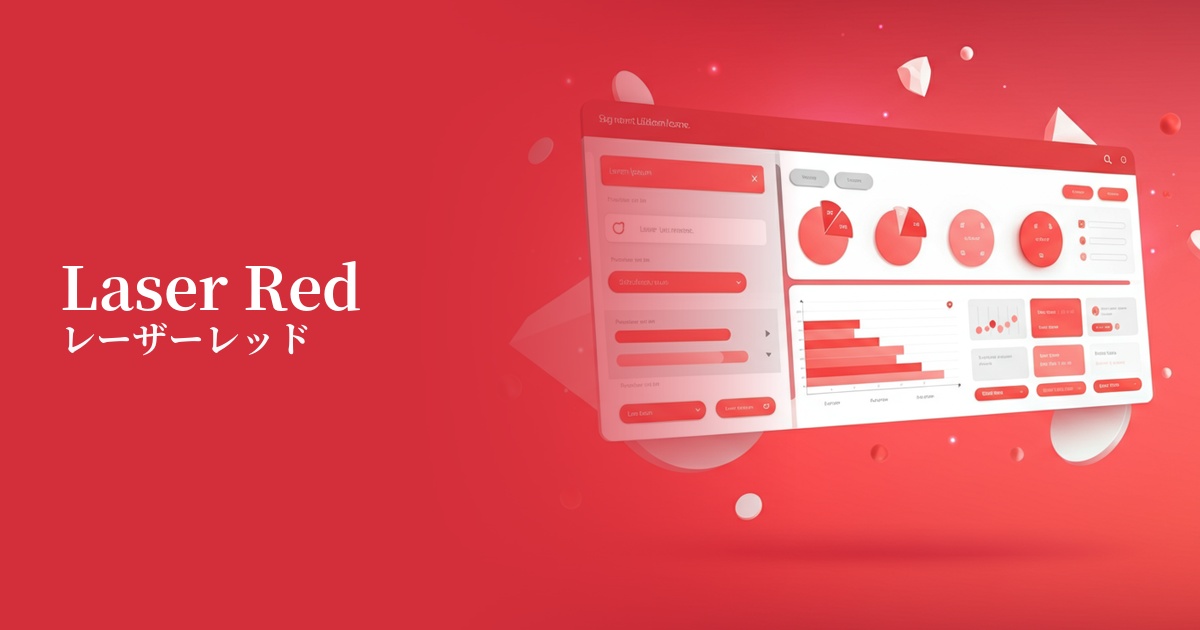
Visibility testing (UI component example)
Practical usage (best practices)
The most effective use is on CTA (Call to Action) buttons. By applying it to buttons that prompt important actions directly leading to conversions, such as "Register" or "Purchase," you can naturally guide the user's gaze and expect an increase in click-through rates.
In UI designs based on dark mode, using dark colors as accent colors is a common practice. By using them selectively, such as for active navigation items, highlighting graphs and charts, and notification badges, you can enhance visibility while creating a sophisticated, futuristic interface.
Using it in the typography or icons of the hero area on a landing page (LP) can instantly capture visitors' attention and powerfully convey your brand message. However, avoid using it extensively as a background color; its primary use should be as an accent color.
From an accessibility perspective, careful attention must be paid to the contrast ratio with the background color. While sufficient contrast can be ensured against white or light gray backgrounds, readability may be reduced when combined with other bright colors, making tool-based checking essential.
Recommended color scheme suggestions
Charcoal (#36454F)
By placing laser red against a dark charcoal gray background, the colors stand out, creating a strong cyberpunk or sci-fi atmosphere. This combination offers high visibility and is ideal for modern, cutting-edge technology websites.
Gainsboro (#DCDCDC)
Combining it with Gainsboro, a light gray, softens the intensity of Laser Red, creating a clean and modern impression. It's ideal for situations where you want to effectively highlight key elements within a minimalist design.
Dodger Blue (#1E90FF)
When combined with vibrant Dodger Blue, the energetic and futuristic impression is further emphasized. It's recommended for creating dynamic designs that evoke excitement in users, especially in game and entertainment UIs.