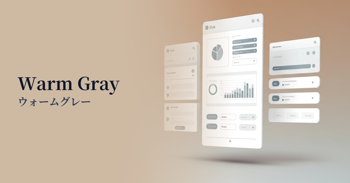
| English name | Warm Gray |
|---|---|
| Katakana | Warm Gray |
| HEX | #BDB6B0 |
| RGB | 189, 182, 176 |
| Design Theme | Muted colors & earth tones |
Why is it a trend? (Background and reasons)
In recent years, web design has seen a growing trend towards eliminating excessive ornamentation and prioritizing comfort and trustworthiness. Warm gray is a color that is gaining attention in the context of such minimalism and neutral design. Unlike achromatic colors, which tend to give a cold impression, it incorporates warm beige and brown nuances, bringing a calm and humane atmosphere.
Furthermore, with the growing popularity of values such as sustainability and harmony with nature, interest in earth tones is increasing. Warm gray is a naturally derived color that evokes images of stone, soil, and dry wood, giving users a sense of security and calmness. Its ability to bring an organic and sophisticated atmosphere into the digital space is why it is favored by many designers.
The psychological effects of design and UX
Warm gray, as the name suggests, is a "warm gray." The neutrality and solidity of pure gray are combined with a beige-tinged warmth, giving users a sense of security and familiarity. This psychological effect contributes to creating a comfortable user experience, especially on corporate websites where trustworthiness is crucial, and on content platforms where users spend extended periods of time.
The understated, elegant color palette is ideal for creating a sophisticated and luxurious impression. When used on fashion brand e-commerce sites or architecture/interior design portfolio sites, it can enhance the appeal of the content itself while elevating the brand's worldview.
In UI design, using a background color enhances the visibility of other elements. Compared to a pure white background, it is less strenuous on the eyes and can softly highlight text and images. This characteristic makes it a good choice as an intermediate option between dark mode and light mode.
Visibility testing (UI component example)
Practical usage (best practices)
This scenario involves using it as the background color for the entire website. Compared to a pure white background of #FFFFFF, it reduces glare and offers the UX benefit of being less tiring on the eyes even during prolonged viewing. It is particularly effective for text-based blogs, news sites, and minimalist portfolio sites, encouraging focus on the content.
It's also ideal for UI components in SaaS applications and admin panels. By using warm gray to separate areas such as cards, sidebars, and headers, you can visually organize information hierarchies in an easy-to-understand way. It also serves as an excellent backdrop for highlighting active elements with more vibrant colors.
On landing pages (LPs), using backgrounds for secondary buttons and input forms, in addition to the main CTA (Call To Action) button, can effectively guide user actions. This allows for a design that makes the main CTA stand out while maintaining a calm overall tone and a sense of trust.
It works well as an accent color, or as a base color when combined with more vibrant colors. For example, combining it with a bright coral pink or a deep green creates a modern and sophisticated impression.
Recommended color scheme suggestions
Slate Blue (#6A5ACD)
The warm gray's gentle tone, combined with the intelligent and calming slate blue, creates a color scheme that exudes trustworthiness and sophistication. It's recommended for business websites and SaaS dashboards where a professional impression is desired.
Terracotta (#E2725B)
The combination of earth tones creates a very natural and warm atmosphere. The reddish-orange of terracotta adds an accent, giving a sense of vitality and approachability to lifestyle brands and organic product websites.
Forest Green (#228B22)
Forest green, reminiscent of a deep forest, harmonizes with the natural feel of warm gray, achieving both tranquility and a sense of luxury. It is ideal for conveying a sense of security and high quality in sustainability-themed websites and wellness-related services.