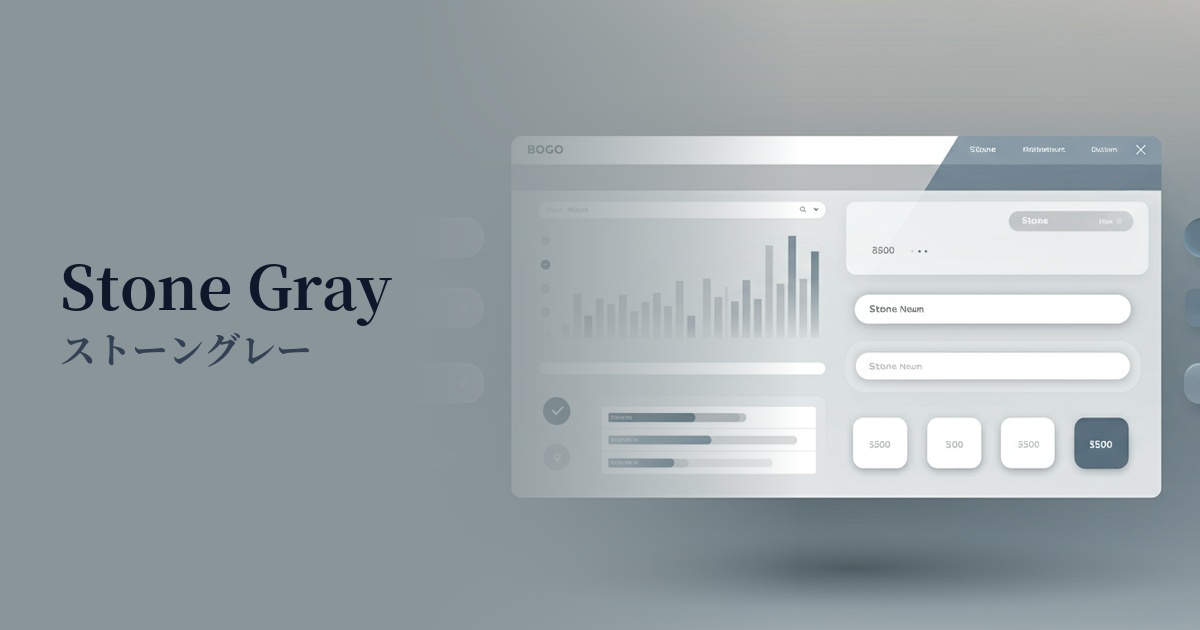
| English name | Stone Path |
|---|---|
| Katakana | Stone Gray |
| HEX | #B0ACA6 |
| RGB | 176, 172, 166 |
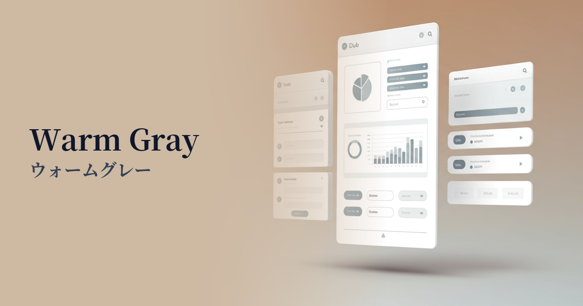
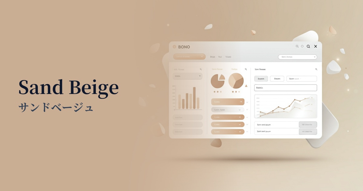
| Design Theme | Muted colors & earth tones |
Why is it a trend? (Background and reasons)
In recent years, minimalism and a focus on nature have become major trends in web design. In the information-saturated digital environment, users tend to seek comfort and tranquility, and calming earth tones like stone gray are gaining attention as colors that meet this need. They are also very compatible with clean designs that avoid excessive ornamentation and focus on the content itself.
As values such as sustainability and organic practices become increasingly important throughout society, their influence extends to the world of design. Stone gray is an earth tone that evokes natural elements such as the earth and stone, yet it also possesses a sophisticated and urban nuance. As a result, it is being increasingly adopted in a wide range of fields, from lifestyle brands to technology-related services.
This color is distinct from mere achromatic gray. Its subtle warmth adds a human touch and approachability to often cold digital interfaces. It's an ideal color for harmonizing seemingly contradictory elements like technology and nature, modernity and organicity, and creating a balanced worldview.
The psychological effects of design and UX
Stone gray, as its name suggests, evokes images of stone and rock, instilling in users psychological feelings of "stability," "solidity," and "calmness." This sense of security and trust is particularly effective in UI/UX design for websites and applications where reliability is essential, such as in financial services, B2B SaaS, and healthcare.
While being a neutral color that doesn't assert itself strongly, it doesn't feel cheap and gives an intelligent and sophisticated impression. Because it functions as a great supporting color that enhances other colors, using it as a background color makes the main content or accent colors stand out, and has the effect of making the overall quality seem higher.
Unlike completely achromatic colors, stone gray, with its subtle warmth, does not give users a sense of intimidation or coldness. By using it as a background for dashboards and web applications that are expected to be used for extended periods, it helps reduce eye strain and provides a calm and focused environment.
Visibility testing (UI component example)
Practical usage (best practices)
The most effective way to use it is to set it as the background color for the entire website or for key sections. It's easier on the eyes than a plain white background and creates a sophisticated depth and contrast between it and the card-style UI or image content layered on top.
It's also ideal for UI components that make up an interface. For example, using it for secondary buttons (not primary buttons), inactive elements, form input fields, and card borders can bring a consistent and understated tone to the entire design.
One approach is to use it as a text color while considering accessibility. Instead of pure black (#000000), using a darkened stone gray can achieve a soft, natural readability similar to that of print media. However, be sure to check that the contrast ratio with the background color meets WCAG standards.
By combining it with a vibrant accent color, you can maximize its effect. For example, using a vivid color for the CTA button on a landing page and setting the background of the surrounding section to stone gray will naturally guide the user's eye to the CTA, contributing to an improved click-through rate.
Recommended color scheme suggestions
Steel Blue (#4682B4)
The calming effect of stone gray combined with the intelligent and solid impression of steel blue creates a trustworthy atmosphere. It is ideal for situations where a professional impression is required, such as SaaS dashboards and B2B services.
Terracotta (#E2725B)
Adding warm terracotta accents further enhances the natural feel of the stone gray. It allows you to express a friendly and warm worldview on organic product and lifestyle brand websites.
Ivory (#FFFFF0)
The soft, bright ivory hue harmonizes with the tranquility of stone gray, creating a minimalist and elegant space. This combination is recommended for clean designs that utilize negative space, and for e-commerce sites where a sense of luxury is desired.