| English name | Cool Gray |
|---|---|
| Katakana | Cool Gray |
| HEX | #AAB2BA |
| RGB | 170, 178, 186 |
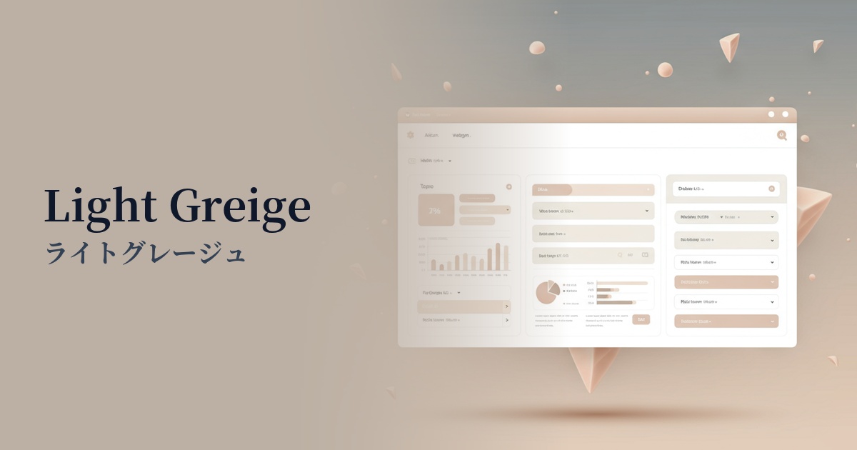
| Design Theme | Muted colors & earth tones |
Why is it a trend? (Background and reasons)
Recent web design trends favor minimalism and clean aesthetics. Cool gray perfectly aligns with these trends. By allowing content to take center stage while providing a sophisticated background, it creates a professional and modern impression.
The adoption of cool gray is increasing, particularly in digital products where conveying trust and stability to users is crucial, such as SaaS dashboards and B2B services. This calm and sophisticated color visually supports the perception of high functionality.
Furthermore, there is a growing preference for nuanced colors such as cool gray with a bluish tint, rather than just plain achromatic gray. This adds depth and individuality to designs and allows for richer combinations with other colors. From an accessibility standpoint, it is also expected to have the effect of reducing eye strain for users, as it offers softer contrast than pure black.
The psychological effects of design and UX
Cool gray conveys an impression of intelligence, sophistication, modernity, calmness, and neutrality. Because this color is less emotionally expressive, it has a psychological effect of bringing a sense of calm and security to the user.
In UI/UX design, it helps create an environment where users can concentrate on the information. For example, using cool gray as the base color on the screen of an analysis tool where data is densely packed makes it easier for users to calmly process the information.
Furthermore, they play an important supporting role in highlighting vibrant accent colors. By making the colors used for CTA buttons and important notifications stand out and naturally guiding the user's gaze, they contribute to improving conversion rates.
Visibility testing (UI component example)
Practical usage (best practices)
Using it as the background color for your entire website easily creates a calm and modern atmosphere. In particular, using a gradient with white or dark gray can create visual depth and a sense of luxury.
It's also ideal for designing UI components. By using it for card backgrounds, form input fields, inactive buttons, and section borders, you can clarify the interface structure while minimizing visual clutter.
When the background is light, using this as the main text color is one option. It reduces the contrast compared to pure black text (#000000), making it less tiring to read, even in long texts. However, checking the contrast ratio is essential to ensure accessibility.
In SaaS product dashboards and management screens, using this color as the background for sidebars and headers creates a functional yet sophisticated impression, encouraging long-term user engagement.
Recommended color scheme suggestions
Dodger Blue (#1E90FF)
The sophisticated and calm impression of cool gray, combined with the vibrant Dodger Blue, creates a design that balances trustworthiness and innovation. It's ideal for SaaS UIs and corporate websites, especially for buttons that prompt important actions.
Rosy Brown (#BC8F8F)
The cool gray's sophistication, combined with the warmth and softness of rosy brown, creates a refined yet approachable atmosphere. This color scheme is recommended for lifestyle brands and designs with a modern, feminine aesthetic.
Sage Green (#9DC183)
The cool gray's minimalist feel is harmoniously blended with the natural sage green, creating a calm and comfortable space. It is effective in conveying a sense of security and cleanliness on websites related to organic products and wellness.