| English name | Fog Gray |
|---|---|
| Katakana | Fog Gray |
| HEX | #D9D9D9 |
| RGB | 217, 217, 217 |
| Design Theme | Neutral & Minimal Background Colors |
Why is it a trend? (Background and reasons)
In today's information-saturated world, users are increasingly seeking simple, calm, and clean designs. Fog gray is softer than pure white, allowing the content itself to take center stage while still conveying a sophisticated impression, making it a perfect match for the modern trend of minimalist web design.
There is growing interest in digital wellness, that is, the ability for users to comfortably use digital devices. The calm and neutral nature of fog gray reduces eye strain even during prolonged screen time and provides users with an unconscious sense of comfort. This comfort is being recognized as an important element in UI/UX design.
From an accessibility standpoint, fog gray is highly effective. A pure white (#FFFFFF) background can be too high a contrast with text, which can be dazzling for some users. Off-white colors like fog gray maintain appropriate contrast with text while reducing eye strain, resulting in a design that is more comfortable for a wider range of users.
The psychological effects of design and UX
Fog gray, reminiscent of mist or a calm, cloudy sky, evokes psychological effects such as calmness, tranquility, and stability in the viewer. Adopting it in the UI helps to reassure users and build a trustworthy service image.
As a neutral color, gray inherently conveys an intelligent and sophisticated impression. Lighter tones, such as fog gray, in particular, create a modern and clean atmosphere, emphasizing a professional image.
Fog gray is extremely neutral and a great supporting color that enhances other colors. It harmonizes with any vibrant or deep color, maintaining the overall balance of the design. It is effective when you want to naturally guide the user's eye to the main content or important accent colors.
Bright tones bring a sense of openness and lightness to a space. Using fog gray as the background for your website allows you to design a spacious, airy interface that doesn't feel cramped.
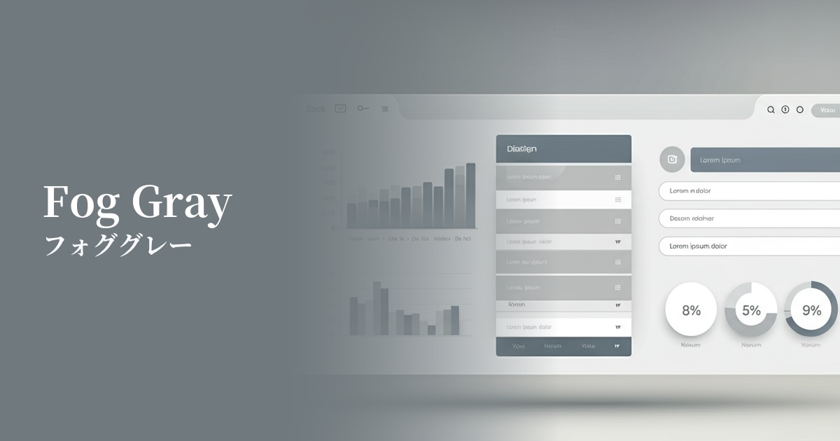
Visibility testing (UI component example)
Practical usage (best practices)
The most popular use of this color is as the background color for the entire website. It makes content stand out and gives a clean, modern impression. It is especially effective for portfolio sites, minimalist e-commerce sites, and corporate websites.
By using fog gray as the background color for card UI elements or specific sections within a white background page, you can visually organize the hierarchy of information in an easy-to-understand way. This helps users intuitively grasp the structure of the content.
By using it for inactive input fields, button backgrounds, and separators between UI elements, it adds subtle nuance and depth to the interface. Because it's not overly assertive, it improves usability without interfering with user interaction.
Using fog gray in the header and footer gently defines the boundary between the main content and the footer. This helps bring a consistent tone to the entire site and creates a cohesive design.
Recommended color scheme suggestions
Dodger Blue (#1E90FF)
By using a calm fog gray background with vibrant Dodger Blue accents, this design conveys both trustworthiness and energy. When used for CTA buttons and links, it effectively encourages user action.
Sage Green (#B2AC88)
Fog gray and sage green are both calming colors that evoke the natural world. This combination creates a pleasant, organic atmosphere and is very suitable for websites of wellness-related or sustainable brands.
Rosy Brown (#BC8F8F)
By adding warm Rosy Brown to a neutral fog gray, this color scheme creates a sophisticated yet approachable and elegant impression. It's an ideal color combination for fashion and lifestyle media.