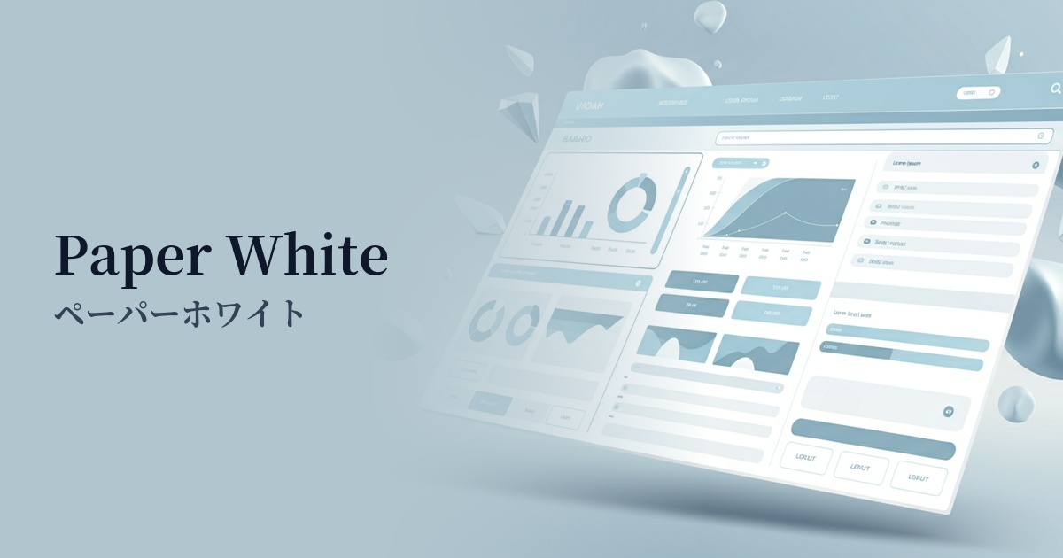
| English name | Paper White |
|---|---|
| Katakana | Paperwhite |
| HEX | #F9F9F9 |
| RGB | 249, 249, 249 |
| Design Theme | Neutral & Minimal Background Colors |
Why is it a trend? (Background and reasons)
The recent trend of minimalism in web design has boosted the popularity of paperwhite. It is gaining attention as a background color that softens the sharpness and coldness of pure white (#FFFFFF), making it easier on the eyes and naturally enhancing the content itself.
In today's world, where prolonged use of smartphones and PCs is commonplace, reducing user eye strain (digital eye strain) is a crucial challenge in UX design. Off-white colors, such as paperwhite, reduce screen glare and provide a comfortable viewing experience even during extended periods.
As its name suggests, this color digitally replicates the texture of paper. By imbuing websites with the reliability and warmth of physical paper, it creates a friendly and high-quality impression on users. It is particularly effective for reading-based content and websites of traditional brands.
Paperwhite is incredibly versatile and has the significant advantage of easily harmonizing with any color. From vibrant accent colors to muted earth tones, it pairs well with any color, making it the perfect canvas for designers to flexibly express their intended brand image.
The psychological effects of design and UX
Paperwhite conveys an impression of cleanliness, sophistication, calmness, and tranquility. It brings a sense of openness and airiness to a space, helping to achieve a minimalist and organized design.
From a UX perspective, the softer contrast compared to pure white reduces the visual burden on the user. This increases focus on the content and contributes to improved readability, especially on pages with a lot of text.
The metaphor of "paper" unconsciously conveys a sense of reliability and authenticity to the user. It suggests a sincere approach to information and products, and is expected to have a psychological effect in building trust in the brand.
This color has extremely little visual noise, making it effective in highlighting other design elements such as photographs, typography, and illustrations. It's the perfect supporting color to make your main content look its best.
Visibility testing (UI component example)
Practical usage (best practices)
It is most effective when used as the background color for the entire website. It is especially ideal for portfolio sites, blogs, online magazines, and minimalist e-commerce sites where you want to emphasize the quality of your content. The ample white space creates a sophisticated atmosphere.
By using it as a background for card-type UIs or modal windows, you can clearly define the hierarchical structure. For example, placing paperwhite cards on a light gray background (such as #F0F0F0) makes the elements appear to naturally stand out, creating an interface with depth.
For optimal text readability, a common combination is paperwhite for the background and dark gray for the text (e.g., #333333). This reduces contrast compared to pure white and pure black, providing a less tiring reading experience even for long texts. However, always check the WCAG contrast ratio standards.
It also works well as a base color for landing pages (LPs) that convey brand image. By eliminating unnecessary decorations and placing a powerful tagline and high-quality images against a clean paperwhite background, you can express a modern and trustworthy brand worldview.
Recommended color scheme suggestions
Charcoal (#36454F)
The soft paperwhite background, combined with charcoal gray text and UI elements, creates a modern and sophisticated impression. This combination achieves a contrast that is easy on the eyes while maintaining high readability.
Sage Green (#B2AC88)
This combination is perfect for creating a natural and organic atmosphere. The cleanliness of paper white is complemented by the calming effect of sage green, creating a comfortable and relaxing space.
Coral (#FF7F50)
This color is recommended when you want to add warmth and vibrancy to a minimalist design. The vibrant coral color acts as an accent, making it effective when used on buttons or links that you want to attract the user's attention, and it gives a friendly impression.