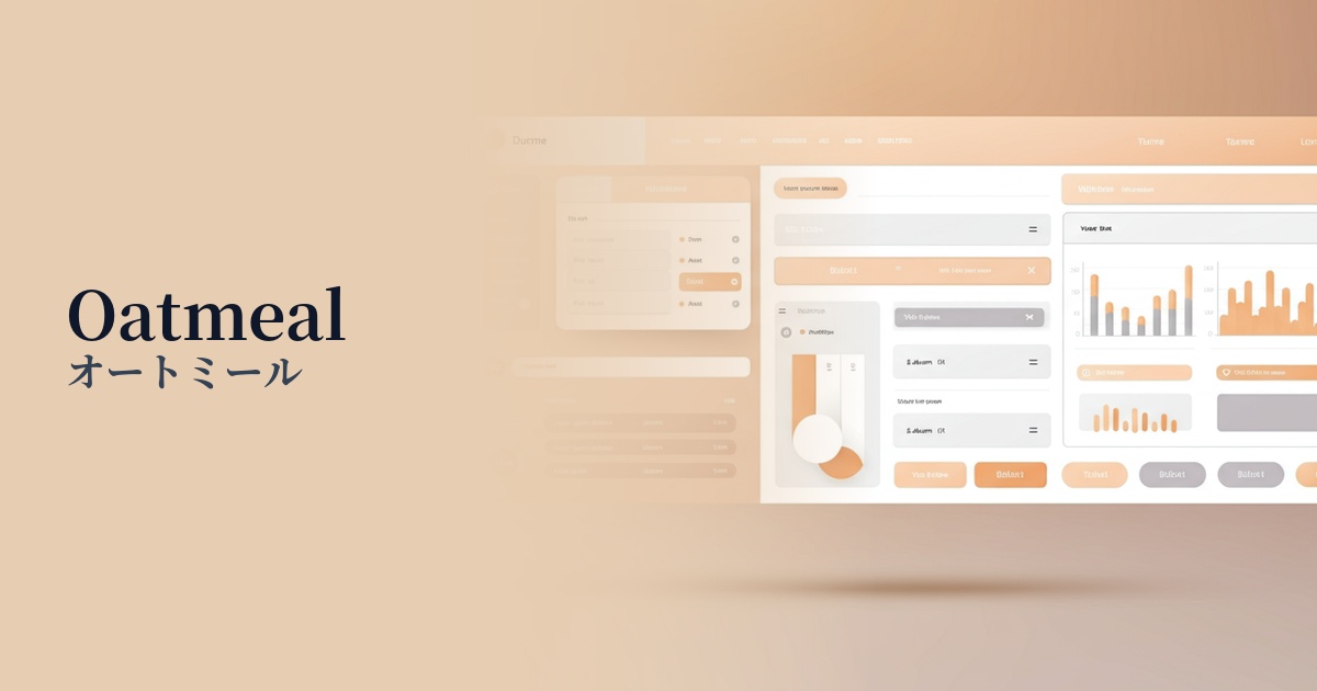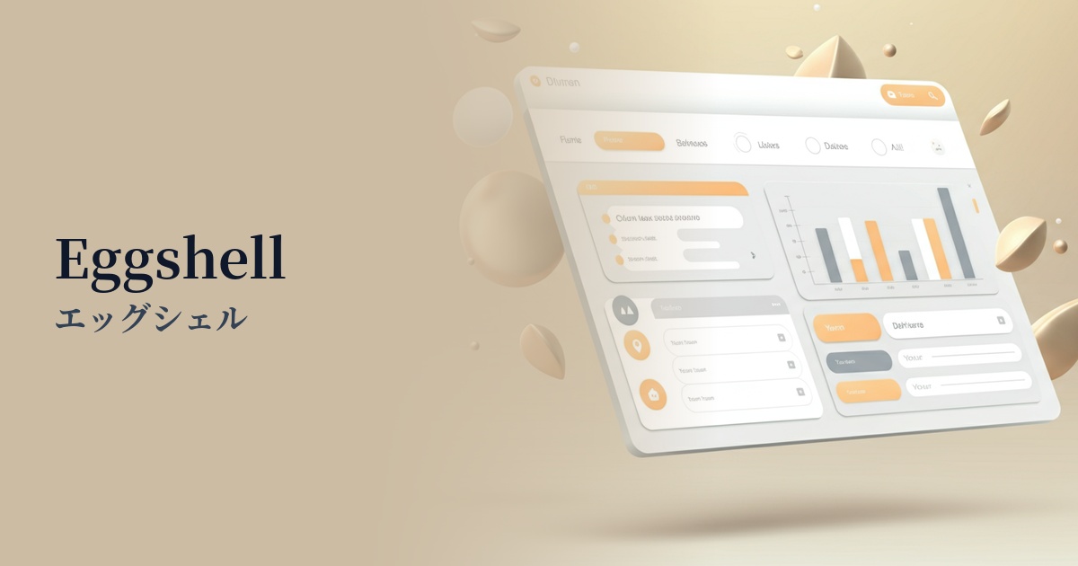
| English name | Eggshell |
|---|---|
| Katakana | Eggshell |
| HEX | #F0EAD6 |
| RGB | 240, 234, 214 |
| Design Theme | Neutral & Minimal Background Colors |
Why is it a trend? (Background and reasons)
In recent years, web design has seen a shift from pure white (#FFFFFF), which can strain the eyes, to softer, more natural off-white shades. Eggshell is a prime example of this trend that is gaining attention. The maturation of the minimalism trend, and the growing demand for not only information organization but also "comfort" and "warmth," are major reasons why this color is being chosen.
This color is incredibly versatile and blends seamlessly into any design style. It's perfect as a canvas to highlight vibrant accent colors, or for creating a natural aesthetic when combined with earth tones. Its understated elegance, which subtly enhances the information or product without overpowering the content, has earned it the support of many designers.
The psychological effects of design and UX
As its name suggests, Eggshell evokes the image of an eggshell, evoking psychological effects such as "nature," "security," and "gentleness" in users. By softening the often impersonal nature of digital spaces and creating a friendly and comfortable atmosphere, it can also be expected to increase user engagement time.
Furthermore, the subtle shades, which are not simply white, convey a sense of refined attention to detail. While not flashy, it creates a quiet and timeless sense of luxury, contributing to the brand image of a company that handles high-quality products and services. Users will unconsciously sense the care and high quality emanating from the site.
Visibility testing (UI component example)
Practical usage (best practices)
The most effective way to use it is to adopt it as the background color for the entire website. In particular, for blogs, portfolios, and lifestyle e-commerce sites where text and photos are the main focus, it brings a sense of unity and a calm atmosphere to the entire page while maintaining the readability of the content.
Even if the main background is white or another color, using eggshell as the background color for card-type UIs or specific content sections can create visual rhythm and depth on the page. It's a very effective technique for creating a subtle hierarchical structure.
Combining it with dark gray or brown text colors ensures high readability while creating a classic and sophisticated impression. Using a serif font for headings further enhances the editorial and elegant design.
Recommended color scheme suggestions
Slate Gray (#708090)
The warmth of eggshell combined with the intelligent and calm impression of slate gray creates a sophisticated and trustworthy design. Its high readability makes it ideal for corporate websites and SaaS UIs.
Terracotta (#E2725B)
Adding terracotta accents, reminiscent of natural materials, creates an organic and warm atmosphere. It adds depth and individuality to lifestyle brands and wellness-related websites.
Sage Green (#B2AC88)
The calm and clean impression of sage green harmonizes with the gentleness of eggshell, creating a comfortable and modern space. This color scheme is recommended when you want to add natural color to a minimalist design.