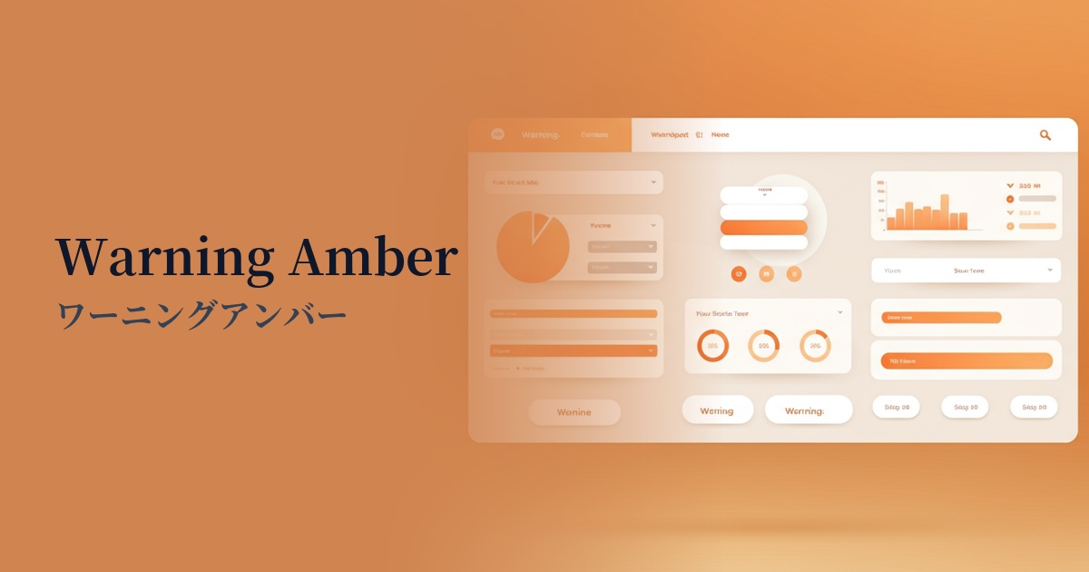
| English name | Warning Amber |
|---|---|
| Katakana | Warning Amber |
| HEX | #F59E0B |
| RGB | 245, 158, 11 |
| Design Theme | UI System & Alert Colors |
Why is it a trend? (Background and reasons)
In recent years, web design has emphasized not only visual appeal but also functionality in effectively conveying information to users. Warning amber is attracting attention as a color that fulfills this role precisely. Rather than being merely decorative, it has concrete meanings such as "attention" and "warning," making it extremely important in UI/UX design.
When communicating the status of a system, it's not always a simple "success (green)" or "danger (red)" dichotomy. Amber is ideal for indicating intermediate states such as "needs confirmation" or "pending." It can draw attention without causing as much stress to the user as red, allowing for a more thoughtful communication design.
Furthermore, the widespread adoption of dark mode is another reason why warning amber is trending. It has the brightness and saturation to maintain high visibility even against dark backgrounds, and it blends seamlessly into modern designs without compromising functionality.
The psychological effects of design and UX
Warning amber, like the yellow light on a traffic signal, has a psychological effect of prompting users to "pay attention" or "check." When this color is used on an interface, users intuitively recognize that "there is information that needs to be checked."
Unlike the strong warnings conveyed by red, such as "danger" or "stop," amber conveys a milder nuance, such as "temporary problem" or "fixable error." This allows you to guide users to the necessary actions without causing them excessive anxiety.
Because it also possesses the energetic aspect of warm colors, it can be used not only for negative warnings but also for positive information communication that you want to capture the user's attention, such as important notifications and updates.
Visibility testing (UI component example)
Practical usage (best practices)
This feature is effective for validation in form input. It's ideal for messages that aren't errors but require user confirmation, such as "Password strength is medium" or "This field cannot be edited later."
In SaaS dashboards and management screens, it is used as an indicator to show the system status. It is useful for representing intermediate statuses that are neither normal nor abnormal, such as "Backup in progress" or "Items awaiting approval."
This is also effective for buttons and text within confirmation modal windows, such as "Are you sure you want to delete this account?". It acts as a buffer before irreversible actions, encouraging users to make careful decisions.
It is also used as an accent color for communicating information that users should definitely read, but which is not extremely urgent, such as cookie consent banners or notices about updated terms of service.
Recommended color scheme suggestions
Charcoal (#36454F)
This combination maximizes the visibility of warning amber in a dark mode UI. The calm charcoal background highlights amber's role as a warning color, giving it a modern and sophisticated look.
Dove Gray (#6D6D6D)
By combining it with a light gray, warning messages can be effectively made to stand out within a clean and minimalist UI. This avoids overwhelming the user and naturally guides their gaze to important information.
Steel Blue (#4682B4)
The warm amber and cool steel blue tones complement each other, creating a dynamic visual contrast. This is effective when you want to clarify the information hierarchy and add emphasis to the entire UI.