| English name | Muted Mustard |
|---|---|
| Katakana | Mute Mustard |
| HEX | #D1B87A |
| RGB | 209, 184, 122 |
| Design Theme | Muted colors & earth tones |
Why is it a trend? (Background and reasons)
In recent years, there has been a noticeable shift in web design from overly vibrant digital colors to more soothing and pleasing "muted colors" and "earth tones." This reflects the growing tendency for users to seek psychological comfort and tranquility in the information-saturated digital environment.
Mute mustard is one of the colors that symbolizes this trend. It retains the brightness and positive energy of yellow, but adds a sophisticated calmness by reducing its saturation. It has a modern yet somewhat nostalgic feel, so it blends naturally into a wide range of design styles, from minimal to retro.
In particular, it has a very high affinity with brands that value sustainability, wellness, and craftsmanship. It is being increasingly adopted by many websites as the perfect color to express the warmth of natural materials and handcrafted work in the digital world.
The psychological effects of design and UX
Mute mustard gives users an impression of warmth, approachability, and intelligence. While possessing the creativity and happiness derived from yellow, its muted tone suppresses excessive excitement, leading to a calm and reassuring psychological state.
In UI/UX design, the "trust" and "comfort" associated with this color are powerful assets. Because it's not too flashy, it can be used on content pages and dashboards where users spend extended periods of time, and is expected to reduce visual fatigue.
Furthermore, while it effectively attracts attention, it doesn't convey as much urgency or warning as red or orange. Therefore, it's ideal for calls to action (CTAs) that encourage the next action without putting pressure on the user, such as "See More" or "Register."
Visibility testing (UI component example)
Practical usage (best practices)
The most effective use is as an accent color. When placed as a CTA button, icon, or link text within a minimalist design based on white or dark gray, it naturally guides the user's gaze and gently supports their actions.
It's also recommended to use it as the background color for specific sections rather than the entire site. For example, applying it to the background of card-type components that showcase customer testimonials or features can differentiate them from other content and help organize the information structure clearly.
Applying muted mustard to key texts such as headings and quotes adds rhythm and depth to your design. However, using it in small texts like body text may reduce readability, so it's important to limit its use to only the parts you want to emphasize.
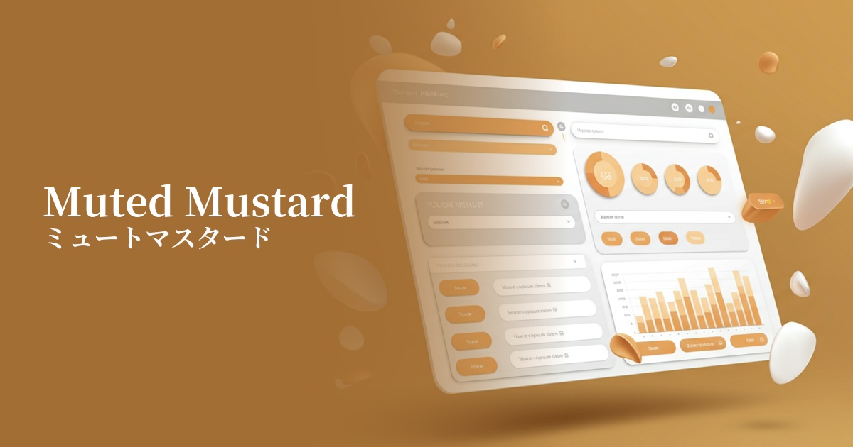
This is also effective for information-heavy interfaces such as SaaS product dashboards. By using this color for parts of graphs and charts, or for displaying active status, you can color-code information while maintaining a calm and consistent overall look.
Recommended color scheme suggestions
Charcoal (#36454F)
When combined with deep charcoal gray, the warmth of muted mustard is further enhanced, creating a modern and sophisticated impression. This color scheme is ideal for corporate websites and portfolio sites where trustworthiness is paramount.
Sage Green (#B2AC88)
By combining it with sage green, another earth tone, you can create a very natural and comfortable atmosphere. This color scheme is perfect for expressing the worldview of sustainable brands, such as those focusing on wellness and organic products.
Rosy Brown (#BC8F8F)
When combined with the muted pink-toned Rosie Brown, it creates a warm, slightly sweet, and gentle impression. It's perfect for expressing a friendly yet sophisticated worldview on lifestyle blogs, cosmetics, and fashion e-commerce sites.