| English name | Plasma Blue |
|---|---|
| Katakana | Plasma Blue |
| HEX | #4D4DFF |
| RGB | 77, 77, 255 |
| Design Theme | Neon & Cyberpunk Colors |
Why is it a trend? (Background and reasons)
The rise of plasma blue is driven by technological advancements and the allure of the futuristic world they create. As keywords like metaverse, AI, and blockchain become commonplace, this vibrant blue is attracting attention as a color symbolizing digital space and virtual reality.
Another major factor is the popularity of "retro-futurism," inspired by cyberpunk movies and video games from the 80s and 90s. This unique atmosphere, where nostalgia and novelty coexist, stimulates the sensibilities of contemporary creators and broadens the range of design expression.
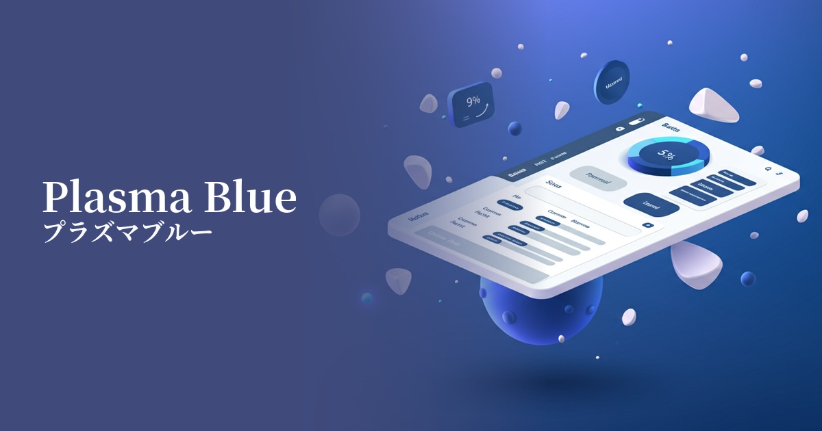
From a UI design perspective, the widespread adoption of dark mode has provided a boost. Plasma blue appears to glow vividly against a dark background, achieving both visual impact and high visibility. For this reason, it is being adopted as an accent color to attract users' attention in many web services and apps.
The psychological effects of design and UX
Plasma Blue possesses a complex psychological effect, blending the inherent qualities of blue—trust, intelligence, and calmness—with the neon colors' characteristic sensibilities of innovation, energy, and a sense of the extraordinary. This gives users a futuristic and dynamic impression.
In UI/UX design, its high saturation and brightness strongly attract user attention, making it effective for use in CTA buttons and important notifications. It can intuitively encourage user action and potentially contribute to improved conversion rates.
On the other hand, because it is a very stimulating color, excessive use can cause visual fatigue in users. Especially when used as a text color, it is essential from an accessibility perspective to pay close attention to the contrast ratio with the background color and take care not to impair readability.
Visibility testing (UI component example)
Practical usage (best practices)
One of the most effective use cases is as a CTA (Call to Action) button on a landing page or e-commerce site. It stands out from other elements and sends a clear signal to the user saying, "Click here."
In UI designs that utilize dark mode, using dark colors as accent colors is a common practice. By limiting its use to icons, active navigation, and selected items, you can create a sophisticated and futuristic interface.
In SaaS dashboards and analytics tools, using Plasma Blue for key data series in graphs and charts helps users grasp information instantly. It helps balance data readability with visual appeal.
When used as a background element in a website's hero area, such as a gradient or abstract graphic, it can create a strong first impression on visitors and convey the brand's cutting edge. However, care must be taken to ensure the readability of the text placed on top.
Recommended color scheme suggestions
Charcoal (#36454F)
Placing plasma blue against a dark charcoal gray background maximizes the luminous appeal of the color. This classic combination effectively highlights elements you want to draw attention to, creating a cyberpunk aesthetic.
Deep Pink (#FF1493)
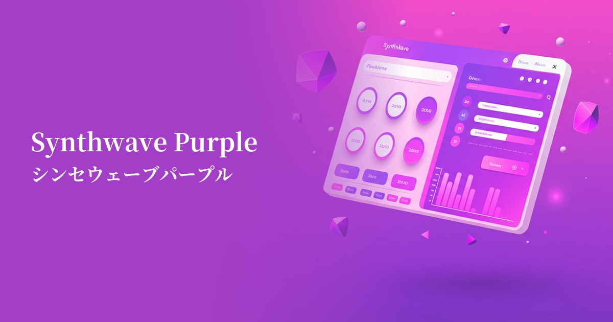
By combining plasma blue with adjacent deep pink and magenta tones, you can create a dreamy, unified gradient reminiscent of synthwave. It's perfect for creating a futuristic yet somewhat retro and emotional atmosphere.
Marigold (#EAA221)
Combining blue with marigolds, a yellow-based color close to its complementary color, creates a dynamic color scheme that makes both colors appear more vibrant. This gives an energetic and playful impression, making it particularly effective for event websites and promotional pages.