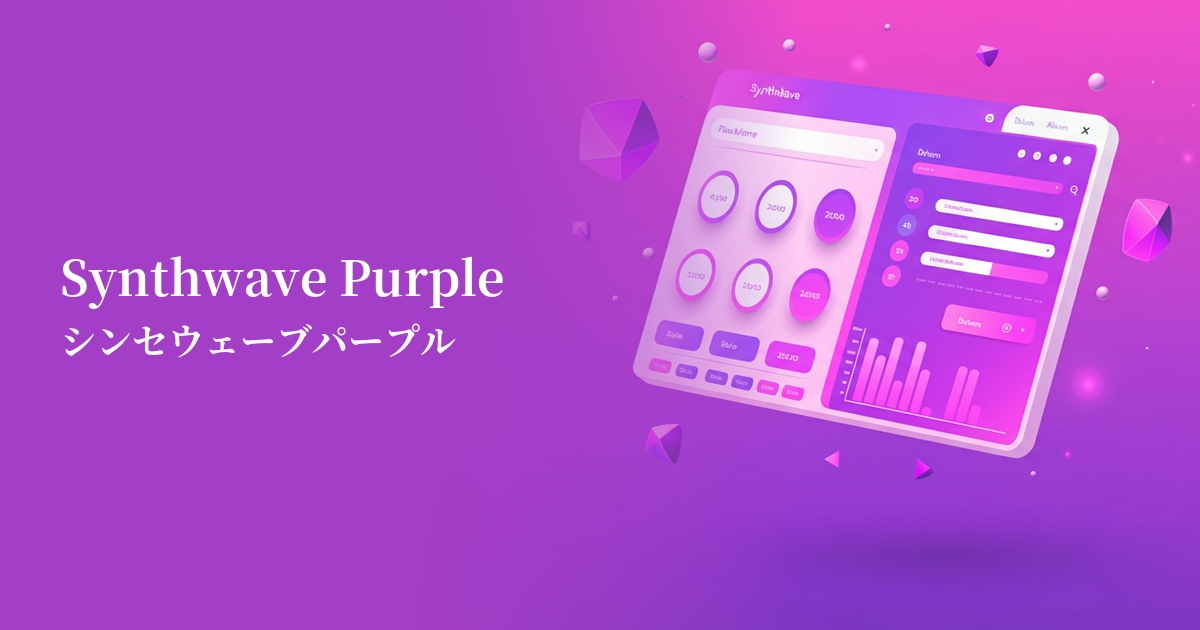
| English name | Synthwave Purple |
|---|---|
| Katakana | Synthwave Purple |
| HEX | #8A2BE2 |
| RGB | 138, 43, 226 |
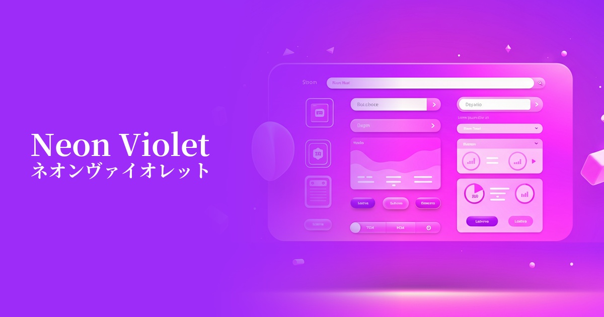
| Design Theme | Neon & Cyberpunk Colors |
Why is it a trend? (Background and reasons)
The rise of synthwave purple stems from a return to 80s culture and the popularity of the "retro-futuristic" concept. Inspired by synthesizer-heavy music and the futuristic visions depicted in science fiction films of the time, this color evokes both nostalgia and a longing for the future, captivating the hearts of contemporary creators.
The widespread adoption of dark mode is another major factor. Against a dark background, this vibrant purple shines like neon, maximizing its visual appeal. It is being actively used, especially in gaming, entertainment, and technology websites and applications, as a color that adds immersion and excitement to the user interface.
As worldviews like the metaverse and cyberpunk become mainstream in digital content, there is a growing demand for colors that can create an otherworldly and fantastical experience. Synthwave purple is emerging as a trend in web design precisely because it symbolizes this digital and virtual space.
The psychological effects of design and UX
Synthwave Purple evokes a mysterious, futuristic, and creative impression. The noble and mystical nature of purple, combined with stimulating digital elements, sparks the viewer's curiosity and draws them into the content.
In UI/UX design, this color is ideal for expressing innovation and originality. Using it in the branding of technology companies and creative studios can convey a unique and distinctive value to users.
However, because it is a highly saturated and assertive color, using it excessively may cause visual fatigue in users. Its psychological effect will be most effectively achieved by limiting its use to specific elements that you want to draw the user's attention to.
Visibility testing (UI component example)
Practical usage (best practices)
The most effective use of this color is as an accent color. Using it in CTA buttons, link text, and important icons naturally guides the user's eye and encourages action. Intentionally using it throughout the site adds rhythm and vibrancy to the design.
Combining this color with dark modes or dark backgrounds is a classic way to bring out its full potential. By using a deep navy or charcoal gray background and adding synth wave purple as an accent color, you can easily create a sophisticated cyberpunk aesthetic.
For hero images and section backgrounds, consider using gradients with other neon colors (such as electric blue or cyber yellow). This adds depth and immersion to the site, drawing users into the world of the content.
This color is also effective in typography. Using it for large headlines or taglines, in particular, makes the message stand out and creates a strong impact. However, it's wise to avoid using it in small text, such as body text, as it significantly reduces readability.
Recommended color scheme suggestions
Cyan (#00FFFF)
The combination with cyan, which symbolizes cyberspace, most directly expresses the world of synthwave. The neon feel of each is amplified, making it ideal when you want to strongly emphasize a futuristic and digital impression.
Hot Pink (#FF69B4)
Adding a vibrant hot pink next to it gives it a pop and glamorous 80s vibe. It's recommended for when you want to highlight your individuality with highly entertaining content or playful branding.
Charcoal (#36454F)
The dark charcoal gray background makes the vibrancy of the Synthwave Purple stand out, improving its visibility. This color scheme gives a modern and sophisticated impression while effectively highlighting the main color.