| English name | Electric Blue |
|---|---|
| Katakana | Electric Blue |
| HEX | #00FFFF |
| RGB | 0, 255, 255 |
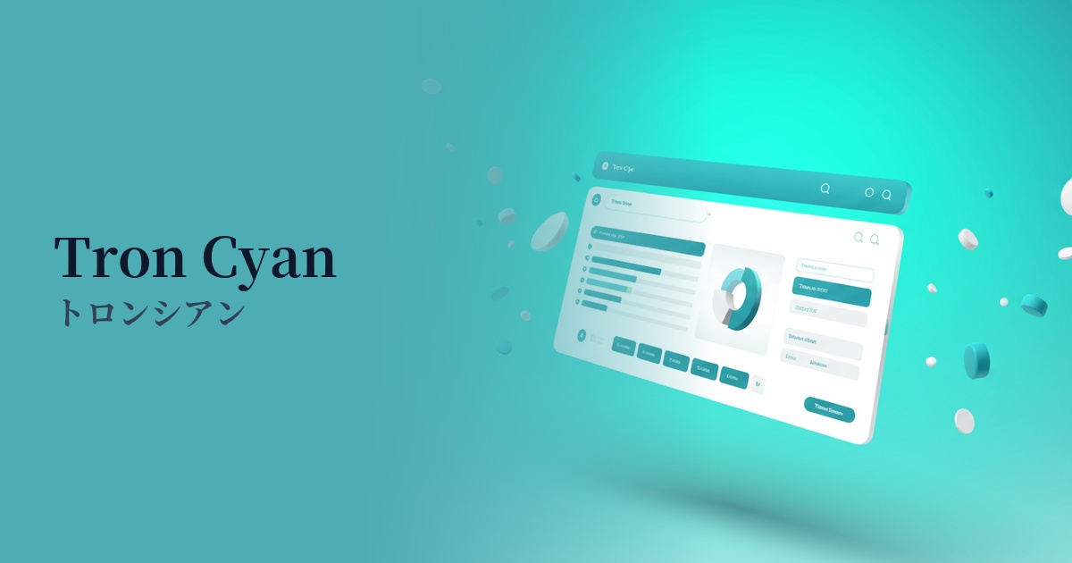
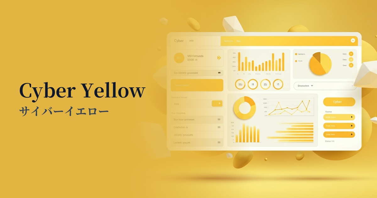
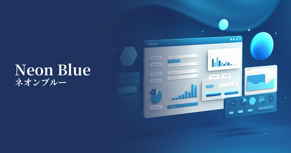
| Design Theme | Neon & Cyberpunk Colors |
Why is it a trend? (Background and reasons)
The rise of electric blue is driven by the global revival of Y2K fashion and cyberpunk culture. As a color symbolizing futuristic concepts such as digital, technology, and virtual space, it is being re-evaluated in the contemporary creative scene.
It is particularly frequently used in branding for companies dealing with cutting-edge technologies such as AI, blockchain, SaaS, and the metaverse. This is because it is highly effective in intuitively conveying an innovative and energetic image to digital natives like Generation Z and Millennials.
Furthermore, the widespread adoption of dark mode has been a major contributing factor. Electric blue shines intensely against a dark background, achieving both visual impact and high visibility. This makes it extremely effective as an accent in UI design.
The psychological effects of design and UX
Electric blue strongly evokes keywords such as "advancement," "technology," "future," "energy," and "speed." It has a psychological effect of giving users the impression that the service or product is cutting-edge and dynamic.
This highly saturated and bright color strongly attracts attention and brings vibrancy and excitement to the entire site. Therefore, using it for interactive elements that you want to encourage users to take specific actions, such as CTA buttons, notifications, and important alerts, can be expected to increase click-through rates.
On the other hand, its intense brightness can strain users' eyes and impair readability if used excessively. Especially when used as a text color, it's essential to consider accessibility, such as ensuring sufficient contrast with the background color.
Visibility testing (UI component example)
Practical usage (best practices)
The most practical use is as an accent color. By unifying the overall tone of the site with achromatic colors such as black, white, and gray, and limiting the use of electric blue to elements such as buttons, icons, and links, you can effectively guide the user's eye and improve usability.
It's perfectly suited for dark mode UI design. Simply placing this color against a dark background creates an immersive, futuristic, and sophisticated world reminiscent of a sci-fi movie interface. It's also ideal for highlighting graphs and charts in data visualizations.
It's also effective to use it boldly in the hero area that determines the first impression of a website, or as the main visual on a landing page. Combining it with gradients or glow effects can create a powerful impact and instantly capture the user's attention.
Recommended color scheme suggestions
Charcoal (#36454F)
The electric blue stands out vividly against a dark background, making it the most effective combination for expressing a cyberpunk or sci-fi worldview. It offers high visibility and gives users a cutting-edge, cool impression.
Magenta (#FF00FF)
This classic color scheme evokes an 80s retro-futuristic vibe reminiscent of synthwave and vaporwave. The colors complement each other strongly, resulting in an energetic, playful, and exciting design.
Gainsboro (#DCDCDC)
This combination is perfect for creating a clean and modern impression. By using white or light gray as the base colors, the vibrancy of electric blue stands out while creating a light, refreshing, and technologically oriented feel.