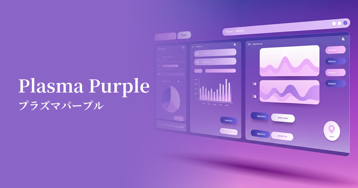
| English name | Plasma Purple |
|---|---|
| Katakana | Plasma Purple |
| HEX | #BC13FE |
| RGB | 188, 19, 254 |
| Design Theme | Neon & Cyberpunk Colors |
Why is it a trend? (Background and reasons)
The reason plasma purple is attracting attention is the trend of aesthetics such as "Y2K revival" and "synthwave," which reinterpret culture from the 1980s to the early 2000s. It evokes the neon signs of futuristic cities depicted in cyberpunk movies and games, and strongly resonates with the sensibilities of the digital native generation.
The widespread adoption of dark mode UI is also a major contributing factor. High-saturation colors like plasma purple stand out against a dark background, giving the interface a sense of vitality and a cutting-edge feel. This can be seen as a sign of a growing interest in more expressive and bold designs, moving beyond the subdued tones of minimalism.
The psychological effects of design and UX
Plasma purple evokes a sense of mystery, futurism, and creativity. The inherent nobility and spiritual imagery of purple, combined with the energy and technological feel of neon, creates a unique psychological effect unlike any other.
From a UI/UX perspective, this color has a very strong attention-grabbing effect. It instantly attracts the user's gaze and guides them to a specific action. Therefore, it is effective in creating a world view for services that deal with extraordinary experiences or cutting-edge technology, and in making users feel "new" and "exciting."
Visibility testing (UI component example)
Practical usage (best practices)
It is most effective when applied to CTA (Call to Action) buttons. In dark mode or achromatic layouts, plasma purple buttons become a powerful visual anchor, contributing to increased click-through rates.
Rather than using it throughout, a sophisticated approach is to use it as an accent color. Limiting its use to elements you want the user to focus on, such as active navigation items, icons, link hover colors, and specific data in graphs, will tighten up the overall design.
Gradients combined with other neon colors (such as electric blue and laser magenta) are perfect for hero areas and card backgrounds. They dynamically express cyberpunk and synthwave aesthetics, captivating users.
In SaaS dashboards and data visualization tools, you can use color to highlight important metrics and alerts. However, using too much color can make the information look cluttered, so the key is to limit its use to the one or two most important elements.
Recommended color scheme suggestions
Charcoal (#36454F)
The deep charcoal gray background maximizes the vibrancy of the plasma purple. This combination is ideal for a futuristic and sophisticated dark mode UI, giving technology-related services a premium and cool impression.
Deep Pink (#FF1493)
When combined with the adjacent hue, deep pink, it creates a very energetic and psychedelic impression. It is recommended for bold and playful designs such as music events and creative portfolios.
Lime (#00FF00)
The combination with lime green, a color close to its complementary color, intentionally creates a dissonant effect, resulting in a powerful impact and a cyberpunk feel. It's perfect for brands with a unique and edgy image, such as those associated with gaming, esports, and street fashion.