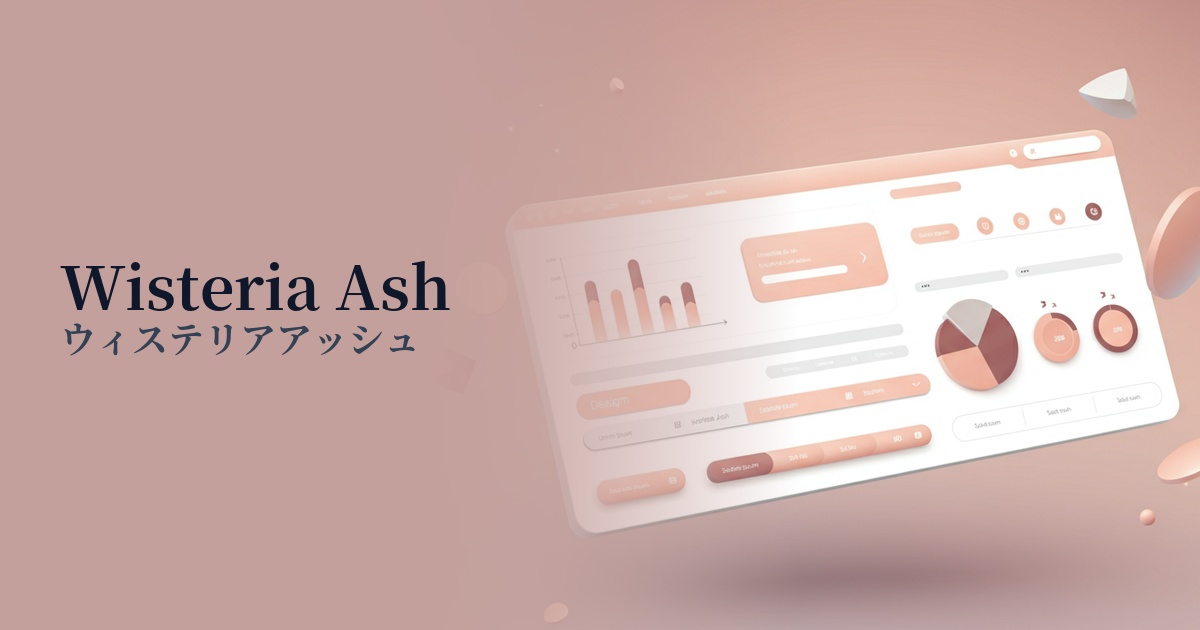
| English name | Wisteria Ash |
|---|---|
| Katakana | Wisteria Ash |
| HEX | #E3E0E8 |
| RGB | 227, 224, 232 |
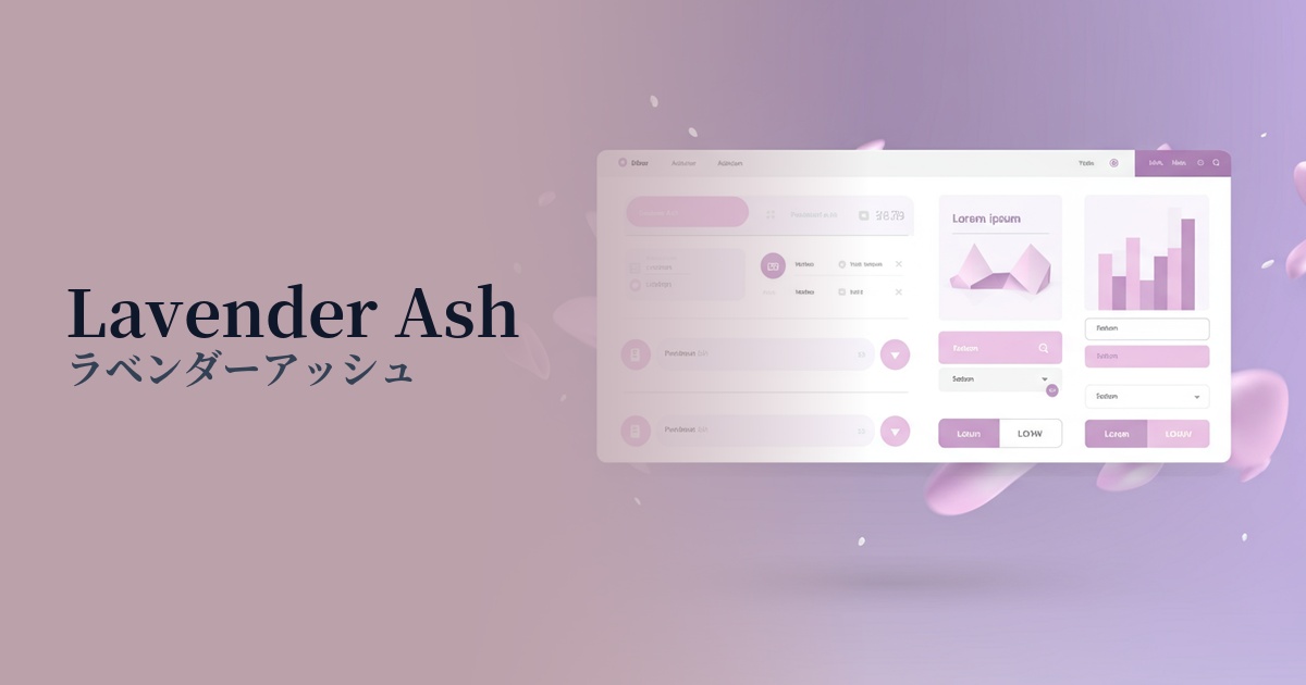
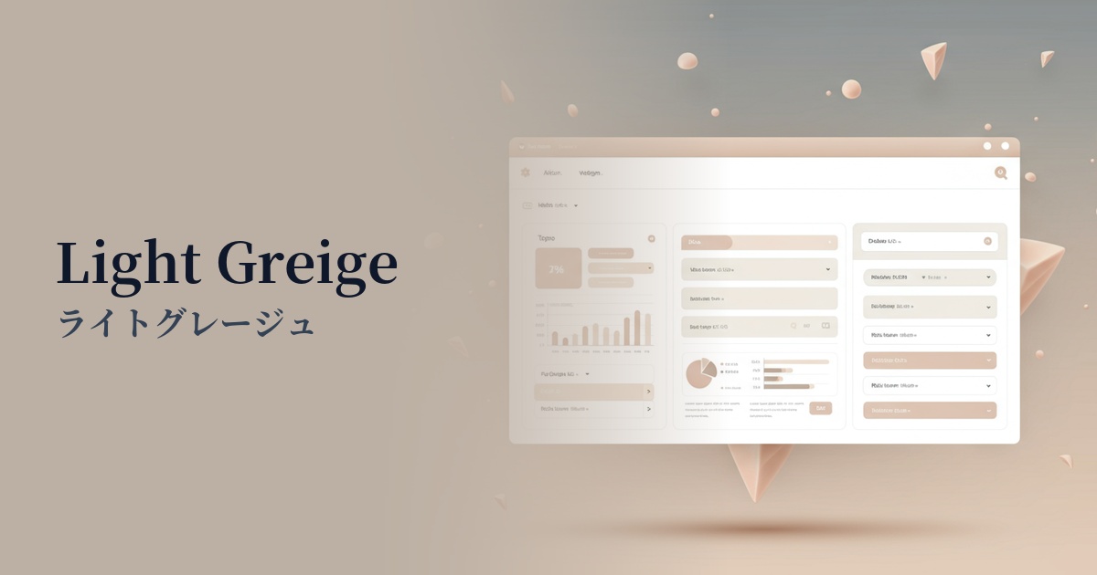
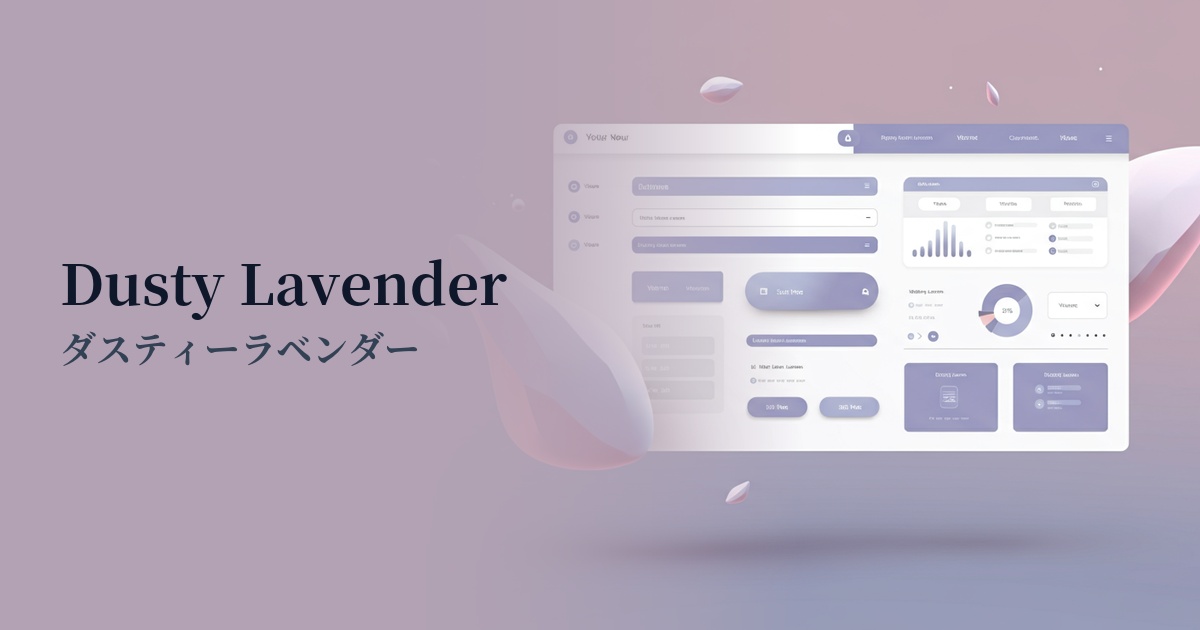
| Design Theme | Neutral & Minimal Background Colors |
Why is it a trend? (Background and reasons)
In recent years, web design has seen a shift away from information-overloaded digital environments, emphasizing minimalist and calming aesthetics. Quiet, neutral colors like wisteria ash are being adopted by many websites because they reduce visual noise and provide a tranquil space where users can focus on the content.
Beyond simple white or gray, nuanced intermediate colors are at the heart of the trend. Wisteria Ash combines the calming tones of ash (gray) with the elegant purple nuances of wisteria, creating a sophisticated atmosphere and depth that sets it apart from ordinary designs.
As the concept of "digital wellness," which emphasizes physical and mental health, gains traction, calm and gentle colors that do not stress users are becoming increasingly popular. These colors promote a relaxed browsing experience and offer the UX benefit of reducing eye strain even when looking at screens for extended periods.
The psychological effects of design and UX
The purplish hue, reminiscent of wisteria blossoms, conveys a sense of luxury, elegance, and sophistication. Using it as the background color for luxury brand e-commerce sites or websites showcasing high-quality services can effectively enhance the brand image.
Because it's based on ash (gray), it has a psychological effect of calming the mind and enhancing concentration. It effectively creates a certain atmosphere in the UI of meditation apps, blogs that offer a quiet reading experience, and portfolio sites where you want to showcase your work in detail.
The neutrality and trustworthiness of gray, combined with the thoughtfulness and intelligence of purple, instills a sense of security and stability in users. It is an ideal choice, especially for UIs where reliability is paramount, such as SaaS dashboards and B2B service websites.
Visibility testing (UI component example)
Practical usage (best practices)
Using this color extensively as the main background color on a page brings a sense of unity and elegance to the entire content. Combining it with a minimalist layout that makes good use of white space further enhances this sophisticated impression.
When the main background is white, using Wisteria Ash as the background color for card UI or specific sections visually organizes the information hierarchy in an easy-to-understand way. The subtle color difference gives the design a pleasing rhythm and depth.
Because it's a neutral color that isn't too assertive, it enhances the readability of dark text colors such as charcoal gray and navy. Furthermore, when combined with vibrant accent colors, it acts as a canvas that further highlights those colors.
By using this color instead of the common gray for the disabled state of form elements and buttons, you can reflect your brand's worldview down to the smallest details of the UI. It's a technique that enhances the overall quality of the design while maintaining functionality.
Recommended color scheme suggestions
Slate Gray (#708090)
Using a calm slate gray for text and key UI elements creates a professional and trustworthy impression. The soft wisteria ash background helps to balance the overall tone, preventing it from becoming too rigid.
Rosy Brown (#BC8F8F)
Adding a reddish-brown accent color, rosy brown, creates an elegant, warm, and feminine atmosphere. This sophisticated and pleasant color scheme is perfect for cosmetic brands and lifestyle websites.
Deep Pink (#FF1493)
By using a vibrant deep pink sparingly for CTA buttons and key links, a modern and striking contrast is created. The calm wisteria ash background maximizes the visibility of the accent color.