| English name | Baby Blue |
|---|---|
| Katakana | Baby Blue |
| HEX | #D6EEFF |
| RGB | 214, 238, 255 |
| Design Theme | Pastel & Macaron Colors |
Why is it a trend? (Background and reasons)
In today's world, where we spend a lot of time interacting with digital devices, users unconsciously seek out visuals that soothe their minds. Pastel colors like baby blue have a gentle hue that reduces visual stress and promotes a calm mood. Baby blue, in particular, is a universal color found in nature, such as the sky and water, and is accepted by many people as a comforting and reassuring color.
In an era dominated by minimalism and clean design, baby blue plays a crucial role. Adding this color to simple layouts based on white and gray prevents the design from becoming cold and impersonal, instead adding a sense of approachability and warmth. It also pairs exceptionally well with designs that utilize white space, creating a sophisticated yet humane atmosphere.
While baby blue was once considered a "boy's color," modern web design emphasizes gender-neutral expression. Baby blue has been re-evaluated as a color favored by both men and women, and is now actively adopted in services and products targeting a wide range of demographics. As a result, it contributes to building a more inclusive and contemporary brand image.
The psychological effects of design and UX
Baby blue evokes images of the sky and clear water, inducing positive psychological effects on users such as a sense of security, trust, and calmness. In particular, using this color in UIs for sectors where user trust is essential, such as financial services and healthcare, can visually reinforce the reliability of the service.
The bright and light tone of this color strongly conveys a sense of cleanliness and openness. When used on websites related to baby products, organic products, or clean energy, it directly links to the clean image of the products and effectively communicates the brand message.
From a UI/UX perspective, baby blue has the effect of not intimidating users and lowering psychological barriers. By using it on onboarding screens for first-time users or dashboards with complex settings, it can alleviate user anxiety and encourage smooth operation.
However, caution is advised when using it as a background color. Because baby blue has high brightness, visibility will be significantly reduced unless sufficient contrast is ensured with the text color. To meet WCAG accessibility standards, it is essential to combine it with text in a sufficiently dark color, such as dark gray or navy.
Visibility testing (UI component example)
Practical usage (best practices)
Using it as the background color for the entire site or specific sections brings a sense of openness and calmness to the entire page. It helps to highlight whitespace between content and create a clean and easy-to-read layout.
It's also effective to use it as an accent color, not as the main color, but for buttons, links, icons, and underlines below headings. In a minimalist design based on white, it can naturally guide the user's eye and prompt them to take important actions.
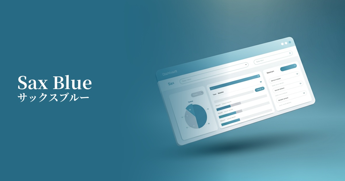
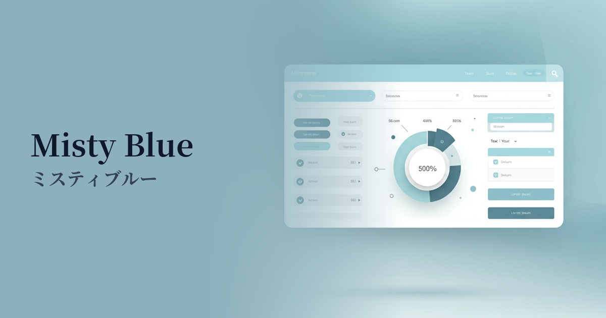
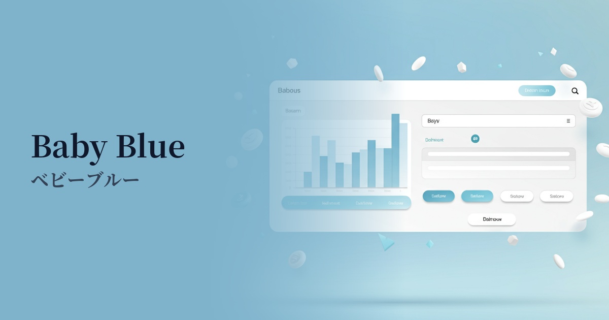
Baby blue is highly effective in dashboards and management interfaces for SaaS products. Even on screens that tend to contain a lot of information, using this color for graphs, notifications, and active tabs helps organize information while creating a comfortable interface that doesn't stress the user.
On landing pages, it's recommended to use a color scheme not for the CTA (Call To Action) button itself, but as the background color for the section containing the CTA. This allows you to make the CTA button (for example, a more saturated orange or green) stand out while maintaining the overall soft tone of the page.
It's also ideal as the main color for illustrations and icons. By incorporating baby blue into flat designs or 3D illustrations with soft shadows, you can create visuals that are modern yet approachable and have a gentle atmosphere.
Recommended color scheme suggestions
Misty Rose (#FFE4E1)
The refreshing feel of baby blue, combined with the warmth of misty rose, creates a very gentle and feminine impression. It's perfect for expressing a dreamy world in baby products and wedding-related designs.
Sandy Brown (#F4A460)
This pleasant, natural combination evokes the sky (baby blue) and sandy beaches (sandy brown). Earth tones add warmth and stability to the design, making it a perfect fit for organic product and lifestyle websites.
Slate Gray (#708090)
The lightness of baby blue is balanced by the sophistication of slate gray, creating a refined and modern atmosphere. This color scheme is highly effective when you want to convey both trustworthiness and innovation in SaaS UIs or corporate websites.