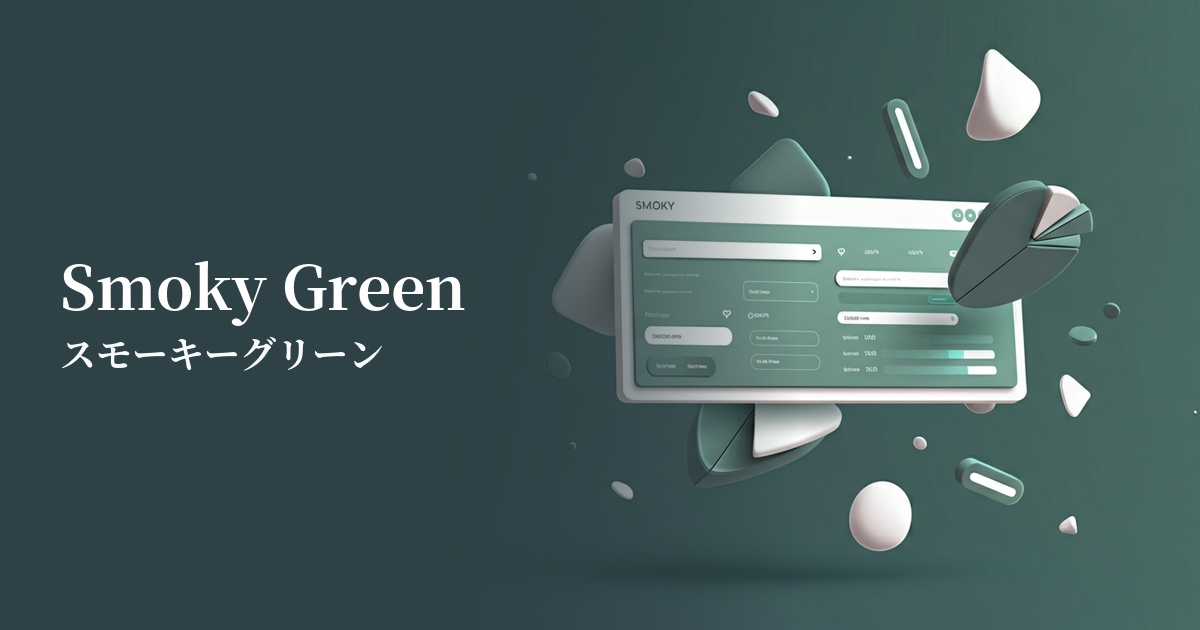
| English name | Smoky Green |
|---|---|
| Katakana | Smoky green |
| HEX | #8BA397 |
| RGB | 139, 163, 151 |
| Design Theme | Muted colors & earth tones |
Why is it a trend? (Background and reasons)
In recent years, interest in connections with nature and sustainability has been growing even in the digital space. Smoky green has become a popular color for many websites and apps because it combines an organic feel reminiscent of forests and plants with urban sophistication.
In today's information-saturated world, users tend to seek visual tranquility and comfort. Smoky green, with its muted saturation, is easy on the eyes and gives a calming impression, making it an excellent match for minimalist designs and UIs that aim to focus on content.
The exquisite tone, neither too bright nor too dark, is characterized by its ease of coordination with other colors. In particular, its versatility in easily creating an elegant and modern aesthetic when combined with neutral colors such as beige, gray, and brown is also contributing to its trend.
The psychological effects of design and UX
The positive images associated with green, such as "nature," "peace," and "health," combined with a muted, grayish tone, create psychological effects such as "stability," "trust," and "calmness." This makes it suitable for corporate websites and service introduction pages where you want to instill a sense of security in users and encourage them to carefully read the information.
The muted, smoky hues convey a sense of luxury and sophistication. They are useful in creating an elegant and intellectual atmosphere in designs that emphasize a specific brand image, such as fashion brands, interiors, and lifestyle media.
From a UI/UX perspective, smoky green is less visually stimulating and can help reduce eye strain. Using it as a background color in dashboards, admin panels, and text-heavy blogs where users are expected to spend long periods of time can help maintain their concentration.
Visibility testing (UI component example)
Practical usage (best practices)
Using this as the main color for the entire site creates a unified and calming aesthetic. It's particularly effective for conveying brand image on websites for natural cosmetics, organic foods, and wellness-related services.
In a minimalist design based on white or beige, using accent colors for buttons, links, and icons effectively highlights important elements while maintaining visibility. It enhances the overall sophistication of the design.
It's also recommended to use it as a background color for content or as an area color to separate specific sections. By paying attention to the contrast with the text, you can add depth and rhythm to the page without compromising readability.
In SaaS product dashboards and settings screens, there's a growing trend to use eye-friendly smoky green for sidebars and headers, considering that users will be looking at these screens for extended periods. This also makes it easier to distinguish them from important notifications (in red or yellow).
Recommended color scheme suggestions
Antique White (#FAEBD7)
When combined with warm antique white, it creates a natural and comfortable space. Combined with the calming smoky green, it gives a gentle and sophisticated impression, making it ideal for organic product and lifestyle websites.
Rosy Brown (#BC8F8F)
Adding a reddish-brown rosy brown as an accent creates a sophisticated and feminine atmosphere. This color scheme is recommended for cosmetic brands and fashion e-commerce sites that want to achieve both a mature and warm look.
Charcoal (#36454F)
Adding charcoal as a contrasting element creates an intelligent and modern impression. It strikes a perfect balance between professionalism and a lack of rigidity, making it ideal for B2B services and portfolio websites where trustworthiness is paramount.