| English name | Matcha Latte |
|---|---|
| Katakana | Matcha Latte |
| HEX | #D5E8D4 |
| RGB | 213, 232, 212 |
| Design Theme | Pastel & Macaron Colors |
Why is it a trend? (Background and reasons)
In recent years, earth tones, such as "matcha latte," which provide users with a sense of peace and comfort, have been gaining attention in the world of web design. A major reason for this is the increasing demand for colors that are easy on the eyes and provide psychological calmness, given the increased time spent interacting with digital devices.
The growing interest in sustainability and wellness is also driving this trend. The organic and natural feel of matcha latte makes it an ideal color for visually conveying the values of environmentally conscious brands and services focused on physical and mental health.
Furthermore, in an era where minimalist designs that eliminate excessive ornamentation are prevalent, its ability to enhance content while giving the entire site a calm and sophisticated atmosphere is another reason why it is favored by many designers. Because it is not overly assertive and harmonizes easily with other colors, it broadens the range of design possibilities.
The psychological effects of design and UX
Matcha latte, as the name suggests, is a gentle and calming green color, like a blend of matcha and milk. This color gives viewers positive impressions such as "nature," "peace," "health," and "harmony."
From a UI/UX design perspective, this can be expected to reduce visual fatigue for users. By incorporating this color into the background of web services and apps that are expected to be used for extended periods, users will be able to concentrate on the content without stress.
Furthermore, it has a psychological effect of fostering a sense of security and trust. In particular, when used in fields where honesty and safety are highly valued, such as organic foods, wellness-related services, and environmental information websites, it can lead to an improvement in brand image.
Visibility testing (UI component example)
Practical usage (best practices)
One of the most effective uses is as the background color for the entire website. It brings a consistent and calm atmosphere to the page without compromising the readability of the content. It's especially recommended for blogs and portfolio sites where text and photos are the main focus.
Matcha Latte is also very effective as an accent color in minimalist designs based on white or light gray. By using it as the background for CTA buttons, icons, or specific sections, you can gently but effectively guide the user's gaze.
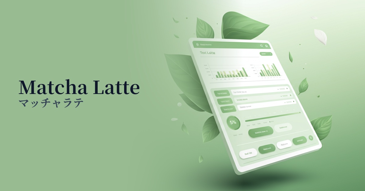
It's also suitable for information-heavy SaaS dashboards and admin panels. Using it as a background for sidebars, headers, and card components helps to reduce screen complexity and make it easier for users to organize information.
For landing pages of wellness products and sustainable brands, using a bold color as the main color can intuitively convey the brand's worldview. Combining it with warm browns or soft pinks will create an even more appealing page.
Recommended color scheme suggestions
Sandy Brown (#F4A460)
The combination of earth tones creates a very organic and warm impression. It's perfect for websites of brands that use natural materials or products with a handmade feel.
Charcoal (#36454F)
Combining a calming matcha latte with a deep charcoal gray creates a sophisticated and modern atmosphere. This is recommended for B2B services and portfolio websites where trustworthiness is essential.
Misty Rose (#FFE4E1)
The mildness of matcha latte and the soft sweetness of misty rose harmonize beautifully, creating a gentle and pleasant impression. It's perfect for cosmetic brands, lifestyle media, and baby product websites.