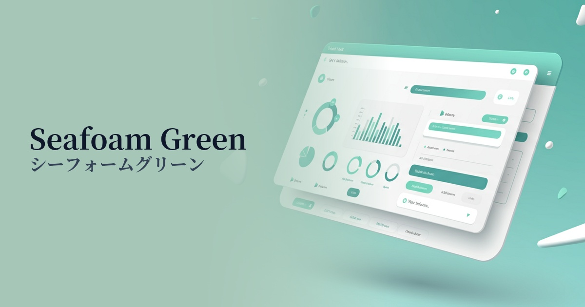
| English name | Seafaam Green |
|---|---|
| Katakana | Seafoam Green |
| HEX | #CFEFEA |
| RGB | 207, 239, 234 |
| Design Theme | Pastel & Macaron Colors |
Why is it a trend? (Background and reasons)
Recent digital trends include a desire to escape "digital fatigue" caused by increased screen time, and a latent need to return to nature. Seafoam green evokes images of calm seas and young leaves in early summer, providing users with psychological peace and comfort. Therefore, it is gaining popularity as a color that matches the psychology of modern users who seek a relaxed atmosphere in online spaces.
While minimalist design and clean UIs are becoming mainstream, there is a growing movement to express approachability and brand individuality by adding a touch of color beyond just white and gray. Seafoam green is an exquisite shade that balances digital sophistication with organic gentleness, and is attracting attention as the perfect color to express the harmony between technology and nature.
The global increase in healthcare and wellness services focused on mental and physical health is one reason why this color is trending. As a color that symbolizes trust, cleanliness, and healing, it is expected to give users a sense of security and promote a positive user experience, which is why it is being adopted by many apps and websites.
The psychological effects of design and UX
The seafoam green color, reminiscent of the calming hues of the ocean, has a psychological effect of soothing and relaxing the user's mind. In today's information-saturated digital environment, it provides a pleasant user experience, enhances the reliability of the service, and can lead to longer user engagement.
The refreshing mint green-like hue gives a clean and hygienic impression. Because of this characteristic, it has a very high affinity with the brand image of companies that focus on clean energy and sustainability, as well as healthcare, organic cosmetics, and food-related websites.
Neutral colors that don't assert themselves too strongly have the significant advantage of being easy to harmonize with other colors. Because they are easily accepted by a wide range of users regardless of gender or age, they are a very effective choice when aiming for inclusive design.
Visibility testing (UI component example)
Practical usage (best practices)
Because of its soft color palette, which doesn't interfere with content readability, it's ideal for use as the background color for an entire website or for specific sections. Compared to a pure white background, it reduces screen glare, offering the UX benefit of reducing eye strain for users even during prolonged browsing.
In a minimalist design using white or dark gray as the main color, these colors are effective when used as accents on interactive elements such as buttons, links, and icons. They effectively capture the user's attention while maintaining a sophisticated impression for the entire site.
In information-heavy dashboards for SaaS applications, using this color for status displays (e.g., completed, active), graphs, and card UI headers helps organize information and create a visual hierarchy. It also clearly distinguishes it from other semantic colors such as yellow for warnings or red for errors.
Especially in wellness and eco-related services, using seafoam green, which matches the brand image, instead of the common orange or red CTA (Call To Action) buttons, can create a sense of security for users and lower the psychological barrier to conversion.
Recommended color scheme suggestions
Coral (#FF7F50)
By combining it with warm-toned coral, the refreshing seafoam green gains warmth and a sense of vitality. This creates a gentle and approachable atmosphere, making it an ideal color scheme for lifestyle and cosmetics brand websites.
Slate Gray (#708090)
The combination with a calm slate gray creates an intelligent and sophisticated impression. It's ideal for enhancing trustworthiness in B2B services and SaaS UIs, and seafoam green functions elegantly as a modern accent.
Navajo White (#FFDEAD)
Navajo White, a shade close to off-white or natural, further enhances a natural and organic feel. It creates a minimalist and comfortable space, making it perfect for websites showcasing sustainable products or natural-oriented services.