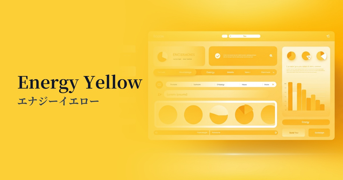
| English name | Energy Yellow |
|---|---|
| Katakana | Energy Yellow |
| HEX | #F8FF01 |
| RGB | 248, 255, 1 |
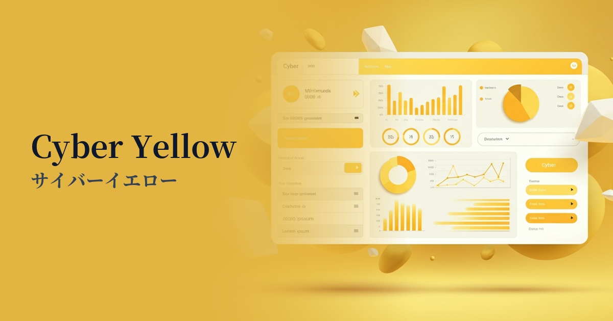
| Design Theme | Neon & Cyberpunk Colors |
Why is it a trend? (Background and reasons)
The popularity of energy yellow is part of larger design trends such as "cyberpunk" and "retro-futurism," which strongly reflect technology and digital culture. As futuristic concepts like AI, VR, and the metaverse become more commonplace, the surreal and energetic neon color is gaining attention as the perfect color to express cutting-edgeness and a digital worldview.
Furthermore, in today's information-saturated world, the "attention economy"—how to capture the user's attention—is also crucial. Highly saturated and bright colors like energy yellow have the power to instantly grab a user's eye amidst a multitude of content. For this reason, they are increasingly being strategically adopted in marketing and branding.
This trend also reflects a shift away from the subdued tones of minimalism towards bolder, more expressive designs. This color helps express a brand's confidence, creativity, and strong determination to stand out. A desire for a break from stagnation and positive energy symbolizing the dawn of a new era is driving the popularity of this color.
The psychological effects of design and UX
Energy Yellow, as its name suggests, strongly conveys a sense of "energy," "vitality," and "speed." It instills an innovative and future-oriented brand image in users and has the effect of evoking positive and optimistic feelings. In particular, it is effective in raising expectations for new technologies and services.
In UI/UX design, this color has extremely high visibility and is a powerful tool for guiding users' attention to specific elements. It is effective for indicating information that you don't want to miss, such as warnings, notifications, and important calls to action (CTAs). However, because of its strong visual impact, overuse may cause users to feel mentally fatigued or anxious, so caution is necessary.
This color, which sets itself apart from traditional corporate colors, also carries nuances of "playfulness," "youthfulness," and "rebellious spirit." It is a very effective choice when you want to express a free and creative brand personality that is not bound by existing frameworks.
Visibility testing (UI component example)
Practical usage (best practices)
The most effective use is as an accent color. Placing energy yellow buttons or icons against a dark background creates a striking contrast that strongly encourages user action. Using it in calls to action (CTAs) that directly lead to conversions such as "register" or "purchase" can be expected to improve click-through rates.
SaaS dashboards and data visualization tools are ideal for highlighting key metrics and alerts. Using this color for active parts of graphs or urgent notifications allows users to intuitively understand the priority of information.
If you want to project a bold brand image, one approach is to use a large color in the hero section or main visual. However, since a large area of color can feel overwhelming, it's important to balance it with sophisticated typography, ample white space, and achromatic colors. Using gradients is also a technique that creates a softer impression than using a single color.
Accessibility requires particular attention. Energy yellow tends to have a low contrast ratio with light colors such as white and light gray, and its use in text significantly reduces readability. To meet WCAG standards, always use a contrast checker and it is safest to use it primarily on dark backgrounds for decorative elements and non-text information.
Recommended color scheme suggestions
Navy Blue (#000080)
When combined with a deep navy blue, the vibrancy of energy yellow stands out, creating a futuristic and sophisticated impression. It's ideal for the UI of technology websites and SaaS applications that want to convey both trustworthiness and cutting-edge technology.
Charcoal (#36454F)
Using charcoal gray as a background softens the stimulating impression of energy yellow, creating a modern and calm atmosphere. This balanced color scheme effectively emphasizes key points while maintaining readability.
Deep Pink (#FF1493)
The combination with deep pink strongly evokes the synthwave and cyberpunk world of the 80s. It's bold and playful, making it stand out on event websites and creative portfolios.