| English name | Border Battle |
|---|---|
| Katakana | Border Gray |
| HEX | #D1D5DB |
| RGB | 209, 213, 219 |
| Design Theme | UI System & Alert Colors |
Why is it a trend? (Background and reasons)
Recent web design trends favor minimalism and clean interfaces. Structural beauty has become more important than flashy ornamentation, as it helps organize information and create an environment where users can focus on the content. Border gray plays a crucial role in supporting this trend by subtly yet clearly defining the boundaries between elements.
Furthermore, the widespread adoption of dark mode is another reason why border gray is gaining attention. In both light and dark modes, its neutral brightness allows it to function as a UI divider without creating visual divisions. It can be said to be an extremely versatile color for building a design system that doesn't break down in either theme.
As design systems and component-based development become more common, the importance of "system colors" for maintaining a consistent UI is increasing. Border gray is adopted in many design systems because it is ideal for elements that are used repeatedly throughout the system, such as borders, separators, inactive states, and understated backgrounds.
The psychological effects of design and UX
Border gray is understated and conveys an impression of neutrality, calmness, and functionality. This understated nature has an important psychological effect in UI/UX design.
This color helps reduce the user's cognitive load. It doesn't create visual clutter, naturally drawing attention to content and key interaction elements (such as CTA buttons). Users unconsciously understand the structure of the information and can use the service without stress.
Furthermore, drawing boundaries between elements clarifies the visual hierarchy. This intuitively conveys that related information is grouped together, aiding in the overall understanding of the interface. When used on inactive buttons, for example, it gently communicates to the user that "this area is currently unavailable for interaction."
Visibility testing (UI component example)
Practical usage (best practices)
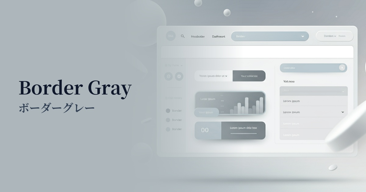
The most common use is as a border for card-based UIs and table layouts. It's less assertive than a black line, but still clearly distinguishes elements, resulting in a clean and uncluttered layout.
It's also ideal as the default border for form input fields and select boxes. By changing the color to the primary color or similar when a user focuses on a field, it becomes clear which area they are interacting with, providing a more interactive experience.
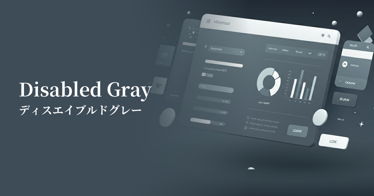
It is also used for buttons and links that are in an "inactive (disabled)" state and cannot be clicked. By indicating that they are unresponsive with color, it prevents user errors and intuitively communicates the current state of the UI.
A horizontal line to separate sections of content (
It is also suitable for tags, etc. It visually indicates topic divisions without disrupting the overall flow of the page, improving the readability of long pages.
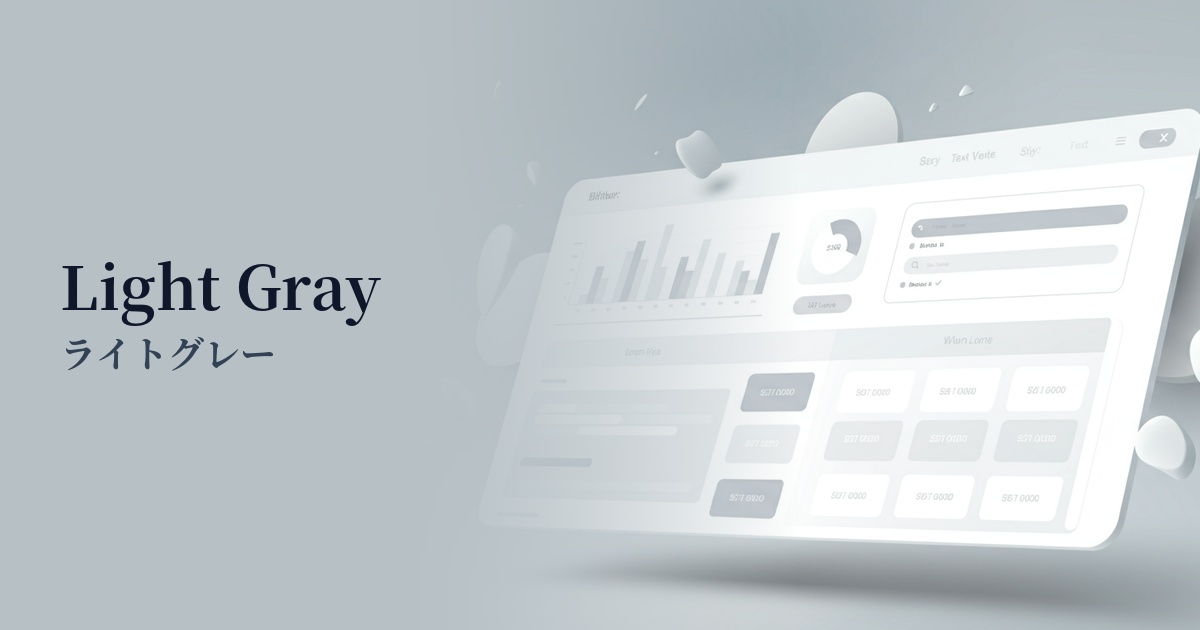
Using it as the background color for supplementary areas such as sidebars, headers, and footers can create a gentle boundary between them and the main content, and can also help to organize the page structure.
Recommended color scheme suggestions
Royal Blue (#4169E1)
Border gray quietly supports the UI structure, while vibrant royal blue highlights key actions. This is a classic combination, ideal for SaaS dashboards and business websites where reliability and functionality are paramount.
Deep Pink (#FF1493)
By using a neutral border gray as a base and adding vibrant deep pink as an accent, the design gains a fun and modern feel. It is particularly effective for creative portfolio websites.
Charcoal (#36454F)
By combining a darker charcoal color with a border gray border, excellent readability and a calm hierarchical structure are achieved. This is ideal for minimalist, sophisticated, and readability-focused designs.