| English name | Disabled Gray |
|---|---|
| Katakana | Disabled Grey |
| HEX | #9CA3AF |
| RGB | 156, 163, 175 |
| Design Theme | UI System & Alert Colors |
Why is it a trend? (Background and reasons)
In recent years, the world of web and UI design has seen an increased emphasis not only on visual appeal but also on "clarity" and "ease of use" for the user. In this context, disabled gray has gained attention as a color that plays an important role in quietly but clearly conveying the state of an interface.
This color is not only useful for indicating "disabled" or "unresponsive," but also from an accessibility perspective. For example, it is used to indicate that a form's submit button is not yet available. Rather than completely hiding it or making it so pale that it blends into the background, it conveys the message "it's not available right now" while maintaining a reasonable contrast, helping users anticipate the next step without becoming confused.
Furthermore, many companies are adopting design systems, and efforts to maintain consistency across UI components are becoming increasingly active. Disabled gray is widely used in these design systems as a basic color to define the "inactive state," and it has become, so to speak, a behind-the-scenes force in building a consistent user experience throughout the application.
The psychological effects of design and UX
The most direct psychological effect that disabled gray has on users is the recognition of a state of "inactivity" or "disabled." When used for buttons that cannot be clicked or options that cannot be selected, users intuitively understand that the element is currently unresponsive.
Because this color is not overpowering, it conveys a sense of "neutrality" or "calmness" within the UI. This naturally guides the user's attention to truly important active elements (such as editable form fields or primary clickable buttons).
While it may seem like a negative feature at first glance, when used appropriately, it provides users with a sense of stability and reliability. Because the system functions as intended and clearly indicates rules such as "this part cannot be operated on at this time because the conditions are not met," users are less likely to feel anxious about encountering unexpected errors.
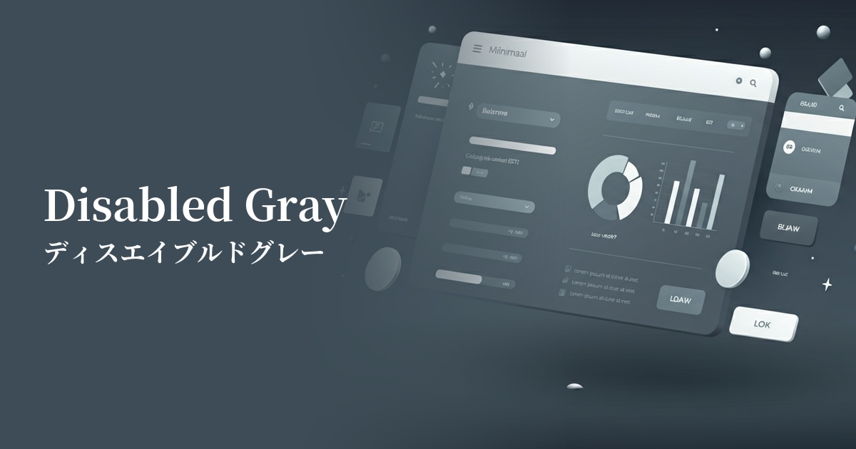
Visibility testing (UI component example)
Practical usage (best practices)
The most common use case is on form buttons. By keeping the submit button disabled in gray until all required fields are filled in, you visually inform the user that there are missing entries.
This is ideal for indicating items that users cannot access or features that are currently unavailable in SaaS dashboards or web application navigation menus. It helps to keep the interface clean and organized.
This can also be used to indicate the "off" state for toggle switches and checkboxes found in settings screens. The contrast with the "on" state (e.g., primary color) becomes clear, allowing you to see the current setting at a glance.
This is also useful for indicating columns in table data headers that cannot be sorted. It clearly distinguishes them from other operable headers, preventing user errors.
It can also be used as a color for supplementary text or placeholder text. It helps to indicate that it is less important than the main content and contributes to organizing the information hierarchy.
Recommended color scheme suggestions
Royal Blue (#4169E1)
By combining it with royal blue, which indicates an active state, the distinction between "what can be done" and "what cannot be done" becomes clear. This is a classic color scheme for achieving an intuitive and functional UI that doesn't confuse users.
Coral (#FF7F50)
By adding a warm coral accent to a calm gray, the design gains a human touch and approachability. The color scheme strikes a balance between inactive elements and elements that you want to draw attention to.
Alice Blue (#F0F8FF)
When combined with Alice Blue, a very light blue background color, it creates a clean and sophisticated impression. Disabled Gray doesn't blend too much into the background, maintaining a reasonable level of visibility.