| English name | Rose Quartz |
|---|---|
| Katakana | Rose Quartz |
| HEX | #F7CAC9 |
| RGB | 247, 202, 201 |
| Design Theme | Pastel & Macaron Colors |
Why is it a trend? (Background and reasons)
In recent years, "digital wellness," which provides users with mental peace of mind, has become increasingly important in the world of web design. The calm and gentle hues of rose quartz reduce visual noise in the information-overloaded digital space and provide users with a pleasant experience, leading to its adoption in many services.
While pink was once considered a feminine color, muted shades like rose quartz are being re-evaluated as sophisticated, gender-neutral colors. As a result, brands across a wide range of fields, including technology, wellness, and fashion, are incorporating this color as a gender-neutral approach.
It is also deeply connected to the trends of minimalism and "soft UI," which expresses a soft, three-dimensional feel. Rose quartz is an ideal color for adding warmth as an alternative to a white background, or for creating a tactile and inviting interface when combined with delicate shadows and highlights.
The psychological effects of design and UX
Rose quartz psychologically evokes feelings of compassion, healing, and security. It helps alleviate user anxiety and fosters a positive and open attitude towards the service, making it particularly well-suited for wellness apps, community sites, and counseling services.
As a color that symbolizes gentleness and affection, it is suitable for brands that want to convey a caring attitude towards their users. For example, on websites related to baby products, cosmetics, and bridal products, it can intuitively convey the brand's spirit of care and delicate worldview.
Beyond simply being "cute," combining it with achromatic colors and sharp design elements can express "approachable innovation." When used in dashboards for complex SaaS applications, it softens the cold impression of the tool and creates an atmosphere that users can use without feeling intimidated.
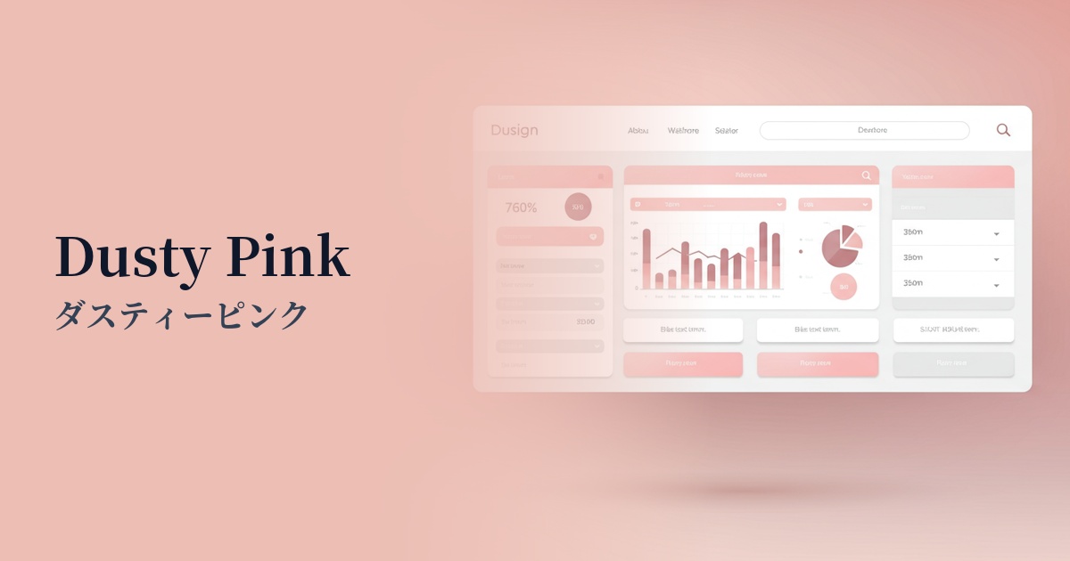
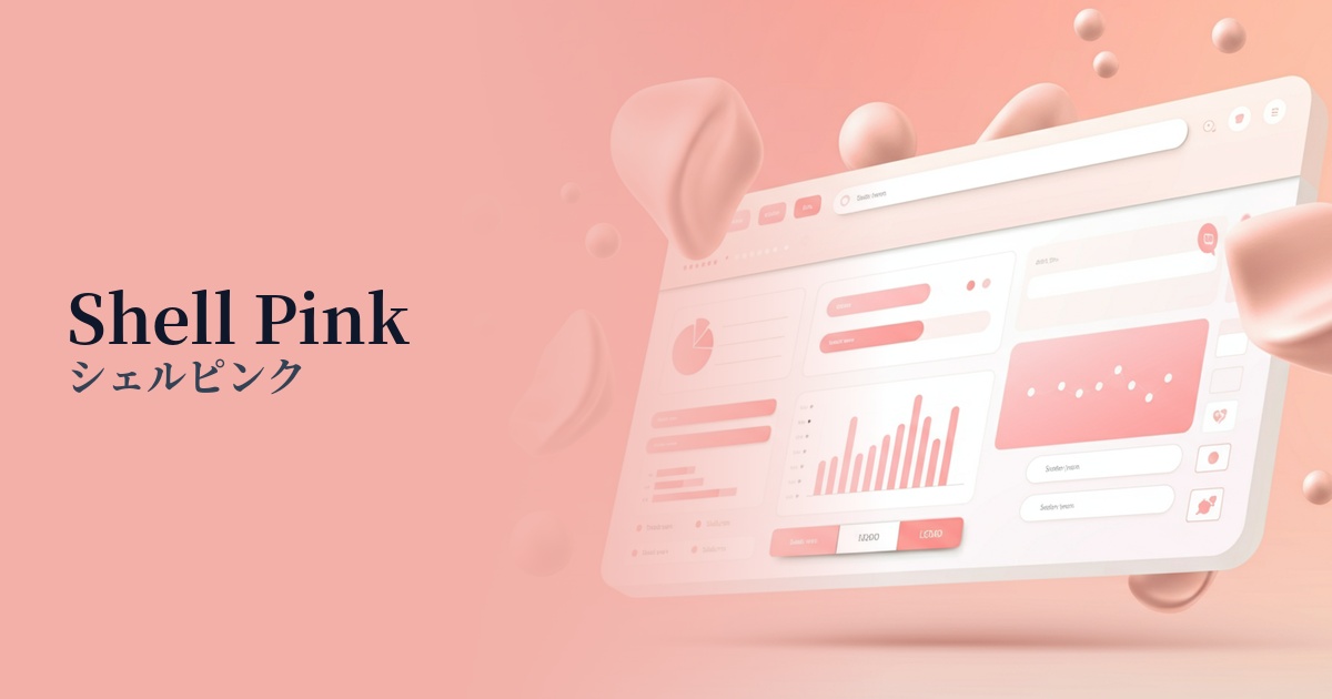
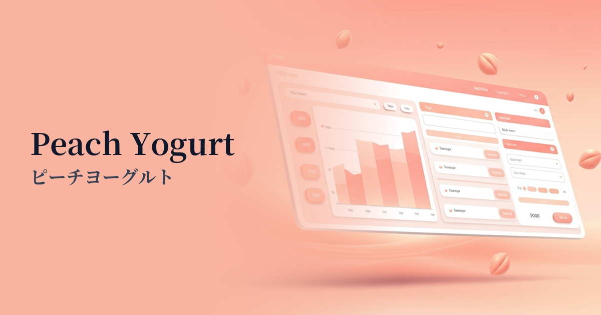
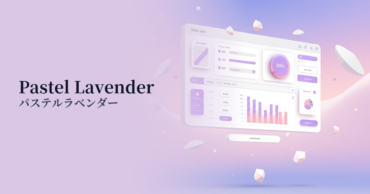
Visibility testing (UI component example)
Practical usage (best practices)
Using it as a background color brings a warm and calming atmosphere to the entire site. It's also less tiring on the eyes than a pure white background, and can help you focus more easily on the content. It's especially recommended for text-heavy blogs and portfolio sites.
Using it as an accent color for CTA buttons, links, and icons can gently encourage user action. This non-aggressive "Why not click?" approach can lead to improved conversion rates.
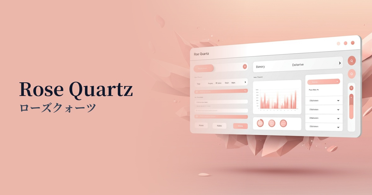
This is useful for highlighting specific items in SaaS dashboards and data visualization designs. It allows you to make information stand out without creating a strong impression like a warning color, thus not causing stress to the user.
Incorporating rose quartz into user registration screens, onboarding, and loading screens can reduce user waiting times and initial setup stress, creating a positive first impression of the service.
Recommended color scheme suggestions
Slate Gray (#708090)
When combined with a calming slate gray, the sweetness of rose quartz is toned down, creating a sophisticated and modern impression. It is recommended for SaaS UIs that aim to balance trustworthiness and gentleness, or for minimalist portfolio websites.
Sage Green (#9DC183)
The natural and organic feel of sage green pairs perfectly with the gentleness of rose quartz. It's ideal for expressing a calming, natural worldview on wellness, cosmetics, and lifestyle brand websites.
Gold (#FFD700)
Adding shimmering gold accents enhances the elegance of rose quartz, creating a sense of luxury. It creates an elegant atmosphere for bridal-related websites and e-commerce sites specializing in special gifts.