| English name | Pastel Lavender |
|---|---|
| Katakana | Pastel Lavender |
| HEX | #E6E0F8 |
| RGB | 230, 224, 248 |
| Design Theme | Pastel & Macaron Colors |
Why is it a trend? (Background and reasons)
The recent popularity of pastel colors in web design stems from users' desire for relief from digital fatigue and a sense of calm. In particular, the gentle and soothing hues of pastel lavender provide comfort to eyes tired from long hours of screen time, offering a pleasant user experience.
Another major factor is the growing emphasis on gender-neutral and inclusive expression throughout society. Pastel lavender has a neutral appeal that is not bound by traditional gender stereotypes, and it has the advantage of being easily accepted by a diverse range of users.
In terms of design trends, the revival of Y2K fashion is also having an influence. As the pop and optimistic mood of the early 2000s is reinterpreted in a modern way, pastel lavender is being chosen by many creators as a color that gives a sophisticated impression that is both nostalgic and new.
The psychological effects of design and UX
Pastel lavender, inspired by the image of the lavender plant, is expected to have a calming and relaxing psychological effect. Incorporating this color into the UI can alleviate user anxiety and tension, creating a gentle and positive impression of the service.
Purple has long been considered a symbol of nobility and mystery. Its soft pastel lavender shade brings an elegant and sophisticated feel to products and brands without being overpowering. It is particularly well-suited to wellness, beauty, and lifestyle services.
From a UX perspective, since the colors are light, careful consideration of visibility is essential. It is important to use them as background colors and combine them with dark gray or navy for text to ensure a high contrast ratio, thereby achieving both aesthetics and accessibility.
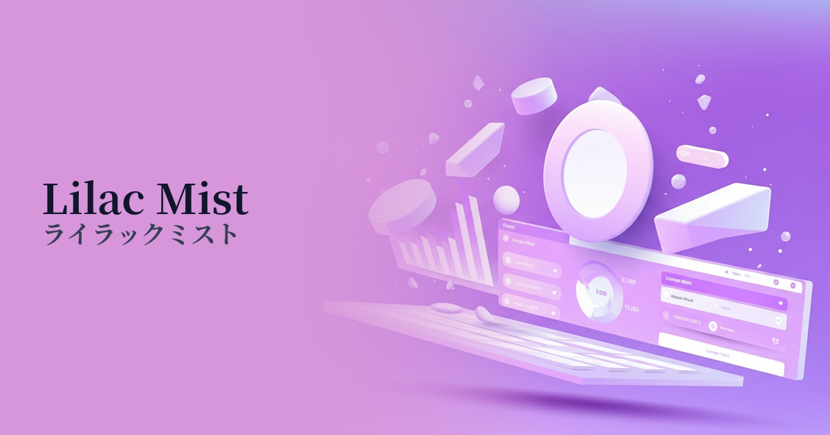
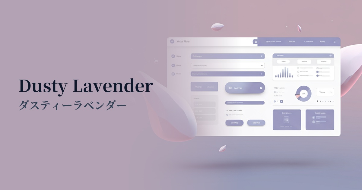
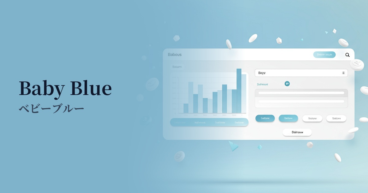
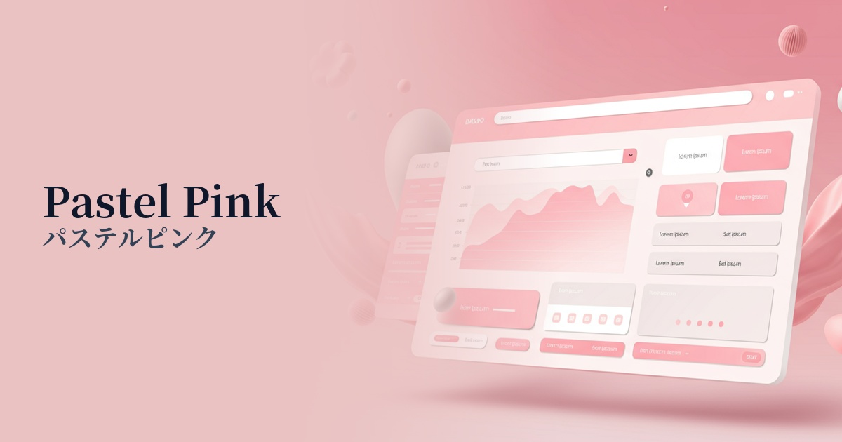
Visibility testing (UI component example)
Practical usage (best practices)
When used as the background color for the entire site, it softly envelops the entire content, creating a unified and gentle atmosphere. When combined with a minimalist layout that uses plenty of white space, it further enhances the sophisticated impression.
It's also effective to use it as an accent color for interactive elements such as CTA buttons, links, and icons. In a design based on white or light gray, pastel lavender gently attracts the user's attention and naturally encourages clicks.
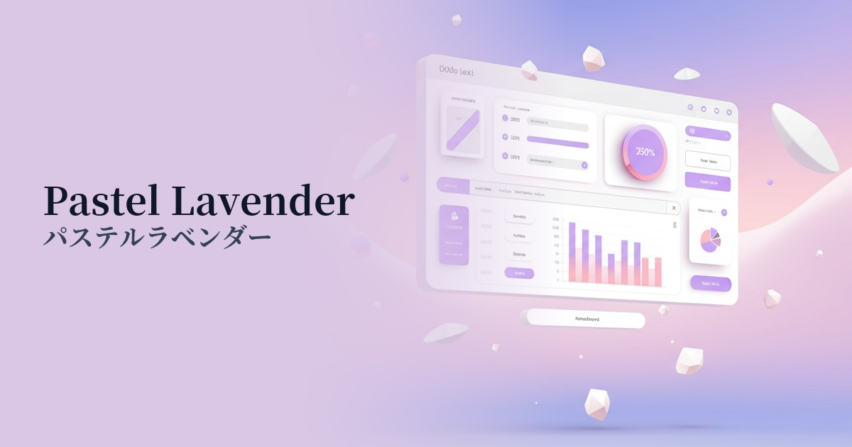
It's also suitable for information-heavy interfaces such as SaaS product dashboards and settings screens. By using this color to highlight the active tab or selected item, you can differentiate it from other information while softening the overall tone of the screen and creating a user-friendly UI.
Gradient colors with other pastel shades like baby blue and peach sorbet are perfect for the background of hero areas and card-style UIs. The dreamy, three-dimensional visuals will capture the user's attention and help express the brand's creativity.
Recommended color scheme suggestions
Mint Green (#98FF98)
The calming effect of pastel lavender combined with the refreshing feel of mint green creates a clean and modern impression. This color scheme is ideal for wellness-related apps and minimalist e-commerce sites, providing users with a sense of cleanliness and reassurance.
Cream (#FFFDD0)
By combining it with a soft cream color, the elegance of pastel lavender is given a touch of warmth. This calm and sophisticated color scheme is perfect for websites that propose a high-quality and comfortable lifestyle, such as cosmetic brands and lifestyle media.
Buttercup (#F3AD3C)
Adding a vibrant yellow, a color that is almost its complementary color, as an accent instantly brings a sense of energy and fun. Using it in creative portfolios or youth-oriented service websites will effectively convey a playful and original spirit.